Park / The Pyramid Connection
-
 07-May 05
- Views 22,414
- Downloads 794
- Fans 0
- Comments 102
-
 No fans of this park
-
 Download Park
794
-
 Objects
239
-
 Tags
Tags
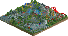
![park_2370 [H2H6] Flying Germans - Adventure Isle](https://www.nedesigns.com/uploads/parks/2370/aerialt2120.png)
...
Easy there killer.
really, you suck at acting up, buddy.
and why did you call us buddies? we're not on the same h2h team so it's more like rivals.
and PS: if it wasn't clear enough for you, i want my team to win, so i will therefore defend my park.
And if this sounds like BS coming from my mouth which it probably does to you, then think of it as a team bias.
Oh well, I suppose people like different things. It just aggravates me when the reasons they give are unfair/exhibit double standards.
I'm voting for the Hurricanes though. The coaster was fun.
But this one was very close in quality. Good jop to the Hurricanes and my Germans for pulling off two beuatiful parks!
(But ours is better)
Jacko, just stop now, it's not worth getting into all this.[/font]
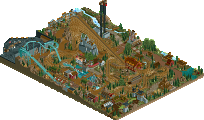
Now let's talk about that woodie. While of course people are entitled to their own opinions, it makes me a bit saddened to see people praising that one. For one, look at the speed graphs, or just watch the thing. It basically maintains the exact same speed the entire time. I didn't realize it at the time, but Phatage had a point when he underlined the importance of varying the pacing in a ride. You cannot really have a ride that is full-speed-ahead charge the entire time, at basically the same speed, and that is enjoyable to watch. Some might cite Psycho Speedway or other Mala coasters, but that has a variation in speed of 50 to 60 mph from the ground to the tops of inversions. The first half of this coaster had an average variation of about 15 mph from crest to trough and the second half had a variation of about 10.
Another thing is, all three of the turnarounds have the exact same pattern of the small right turn leading into the small rightward shallow drop leading into the steep drop. It gets repetitive to watch. And I like creative first drops and enjoy using them, but the first drop looks like it eats up part of the lift hill - overly creative to the point of aesthetic disruption. The hills are not well managed, particularly the third one with the flat section on top. Overall I do not believe it to be a memorable coaster in the least.
That basically leaves that very brief hacked coaster as the only meat behind the park, and even with that cool hacking it sure can't hold the weight of the park up on its own. You guys definitely needed another major coaster in there (and yes, I saw the mine ride).
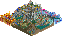
I have plenty of problems with the Hurricanes' park as well, in particular with the multicolored section being dull and substanceless and with some of the stuff clashing. I won't hesitate to compare that part with the back part of the Germans' park as far as weak areas go. But at least the other half of the park looked fun to make, and with, for example, the prison cells, and all the moving parts it was enjoyable. In the Germans' park almost no section looked like it was fun to make. While my decision to vote for the Hurricanes was not a no brainer, I don't see much in the Germans' park that would potentially grow on me over time and cause me to change my mind.
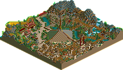
FLYING GERMANS
Brilliant park in a nice classic style that I love. The hacked coaster was very well done but I wasn't a fan of the glass rooves being used for the pyramid (sorry guys). Each section had it's own identity despite being connected by the pyramid idea. Great park and it got my vote.
THE HURRICANES
Sorry guys, but I really couldn't get into this park. It's a style that I can't really enjoy too much. It was interesting and unique in places, but messy in others.
Null vote...
Corkscrewed Offline
The League would like to express its appreciation for the fine season and exciting playoffs. The current finals matchup has garnered great ratings from its close, back-and-forth battles, and the league has gained the solicitation of many sponsors, thereby increasing its profitability.
In particular, we have received a slew of offers from various detergent companies wanting to use The Day After Tomorrowland as an example of their color-preserving abilities. Also, Kodak has approached us with offers to use TDAT in conjunction with its new slogan, "Kodak: We capture every single color in the world, even when they combust your pupils."
The league expresses its thanks and gratitude towards its players for a wonderful season.
i concede. the germans deserve to win, at least this one.
I still think that woodie was really cool.
DJ, you're the coolest guy ever, but seriously. This isn't an attack at you, I'm simply using this as an example of how people sometimes don't look at the 'big picture' (I talked to metalface about this the other day, too). I look at the Pyramid Connection and I see what mantis see's - brilliance. I mean, the architecture drifts in places, but guys, there was ceiling fans in the buildings. That sole detail alone is incredible. I will, however, disagree with mantis on the woody. It wasn't to my liking.
Then again, the Hurricanes have something great, although it's execution is poor. It's basically a rehash of Kumba's PT, only it's been mechanized (if that's even a word). I'll admit that it has it's moments, like the Bot Bistro, which has to be the single best piece of architecture I've ever seen. But then things like the coaster and basically the rest of the park brought it straight to hell. And as if the read-me didn't give one of the parkmakers away ('mite'?
But still, both are impressive in their own ways, only I suppose they're just not for me. So I gave my vote to the Germans, even though I don't want to give either a vote, this match is too important not to vote. Also, if I repeat what anyone has said, forgive me, I'm sort of out of it today and I didn't read everything here.