Park / The Pyramid Connection
-
 07-May 05
- Views 22,414
- Downloads 794
- Fans 0
- Comments 102
-
 No fans of this park
-
 Download Park
794
-
 Objects
239
-
 Tags
Tags
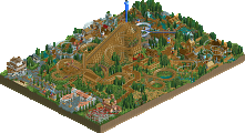
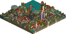
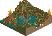
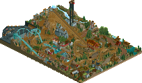
I really didn't like either parks. The Germans' park felt really empty, especially in the Mayan or whatever area. I really didn't like the wooden coaster, I don't care fantasy or not, I hated the colors. The layout was actually pretty neat, but the colors killed it. The rest of China didn't really have much to offer, except some decent foliage around the coaster. The hacked coaster made the park worse for me. I hate these hacked "gimmicks", they turn me off from the park. Egypt was ok, if the whole park was that quality, I probably would have voted for it. Another thing I didn't like, the bareness. I don't care for all this minimalistic crap, please put some foliage in. Please! If the foliage had been like it was around the wooden coaster throughout, this park might have stole my vote.
Hurricanes: I didn't know what the fuck was going on, and it was totally chaotic. I'm not going to go on and on, but my thoughts are pretty similar to Iris's. Something about it though, managed to put a smile on my face, maybe because it was so fricking rediculous. Somehow it almost worked, and that's how it got my vote.
tDATl was too..i dunno, it was just one giant hack fest, and it was hard to cencentrate on one point. I did like the Second Phase for a while, those drones were a nice touch, but then it crashed.
German's park was much, much better. That compact woody was absolutely amazing, as was the pyramid custom coaster.
Good round, and good season. Germans have this, i know it!
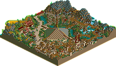
The Pyramid Connection
This park had its moments. The 4-way spliter was fun to watch and a nice centerpiece for this park, holding most of outlying areas together as one park. The pyramid itself however, I didn't like. It wasn't pointy enough imo and could have been done much more elaborately. It just seemed under themed compared to the rest. The woodie in the corner was good. didn't like the name "Dragon Rider" much tho. The other supporting rides were surprisingly all well-themed and set for some nice atmospheres. The theming just didn't pack that punch with me that really drove the theme home. So it basically came down to a "nice" or above-average park for me, but definitely not much of a memorable park.
Park rating
8/10
The Day After Tomorrowland
Obvious style(s) here. This park fits one word in my mind in virtually all of its aspects; Wacky. In certain ways, it demonstrates a high level of skill, but in other ways it was a big let down. Is it me, or are timed explosions getting old? I dunno. They were done well and all, but just seemed to add to the main flaw with the park, , which was too much animated scenery. Combined with the plethera of rides, it really brought the frame rate down to a snails pace on my computer and caused all the rides to be choppy. The architecture was confusing to say the least. A lot of buildings (and themes) didn't make sense to me and made me just not want to stop in a certain of the park for a few minutes. But onto the pros, which probably out-weighed the cons. I do appreciate the risk involved with a park like this. I mean its not a typical theme (whatever theme that may be) that most parkmakers would take on and that to me is a bold statement made by the parkmaker(s). So in the end, this park just barely edged my vote, altough I don't feel nearly as comfortable I did last round voting for the hurricanes. Great park guys.
Park rating
8.25/10
I voted hurricanes, although be it by a slim margin.
Hurricanes
This park really didn't do it for me. The archy was nice in places but just really didnt have a point most of the time. But it all was just a mess of hacks, explosions, and animated scenery...it just never really came together for me. However, I did like some of the hacks, like that drop going down between two buildings, like a staircase. The rocket coaster-like ride was cool, but some of the scenery around it was just too wacky for me. Whoever built this took a huge risk, and I appreciate him/them for taking that risk, but it didn't work for me.
The Pyramid Connection
Flying Germans
This was interesting...didn't know what to think of it as a whole though. The oriental area was very nice, I really liked the woodie, "Dragon Rider", but it was just unbelievably fast the whole way through, almost too fast and intense for my tastes. Still, I liked it. Hmm...oh yeah, the splitter ride in the center was very nice and unlike anything I've ever seen before; it proved to be a nice centerpiece for the park. However, more could be done with it. The rest of the park, eh. The archy wasn't very detailed and just wasn't elaborate enough for me. And the huge spaces of rocks...just seemed rush and all.
Tough call, but I'm going to vote for the Flying Germans. Neither park really was excellent, but just unique in its own way.
My vote = Hurricanes.
Corkscrewed Offline
To be honest, I think the quality this round was drastically below Match 1. And I'm not afraid to say this to my own teammates as well.
To me, both parks fall under the Category of "Great Idea! WTF Happened??"
I will tell you that the original idea for our park was kickass. It was all based on the Mouse Trap game with chain reactions going everywhere. It's similar to that Honda Cog commercial, or the scene in Robots where Fender and that other guy (Ewan McGregor) take Robot City's "transportation system." That would have sprawled around, but the rest of the map would have featured a slew of supporting rides and stuff so that it wasn't just one gimmick holding it together. It'd be one main gimmick and a nice supporting cast. And it also would have been one theme. I had suggested a Futurama theme.
But obviously, the parkmakers here chose their own stuff. I give them credit for blazing paths, but I wasn't really impressed. A good part of it was lack of time, as this WAS rushed. But that's not really an excuse. The person who made a lot of this park and I fought a lot about color scheme and other stuff, and in the end, he went with his own thing. That's fine. You have faith in your work, go for it. But I will still express my unimpressed opinion.
This could have been so much more IMO but it wasn't really.
The Pyramid Connection... another good idea that was RELATIVELY poorly executed.
Actually, you look at the architecture and theming and it's actually good. The parkmakers have shown great improvement and skill recently, and it's not a "bad" park. But it comes off as also unimpressive. People complained about Slob being "safe," but to me, a lot of this was also playing it "safe." The central pyramid was the only place I saw risks being taken. I liked the splitters (hence I took a pic of it), but the pyramid itself was just odd. I'm not a fan of so much glass as on giant thing, I guess... especially in a pyramid.
But Mantis's comments do surprise me. I would say that he's reading too much into it... that this park maybe aimed to be like Epica, but the execution really didn't happen. Who knows... maybe he's onto something that the rest of us aren't, but I just don't see most of the things he pointed out. To me, this was just an idea for a park that would serve as a solid but not overwhelming insertion between two juggernauts.
A nice park that could win in the regular season, but doesn't seem postseason quality.
So maybe I shouldn't be surprised at another nailbiter.
That one which doesn't crashed my pc.
The Hurricane park first run ok (when I could say that a RCT2-park ever run ok on my sytem).
But when the crashes started everything slows dramaticaly down. It looks like a diashow (hope this is the right word) and after the crashes it didn't stop and then....there was the crash.
OK, no matter, the park wouldn't win for me, even without the crash, because maschine-theming is awful.
The F. Germans park, well a little surprise for me at the beginning. Nice idea with the pyramide.
The rest of the park looks really beautiful, especially the china-area. The mayan-area had a little less plants and flowers.
This is the way a good a RCT2-park should look like for me.
A little bonus, it was peep friendly.
The F. Germans park got my vote.
But I'm hoping a little bit that the Hurricanes will win.
I want a real final round.
I dunno, I just really like the park for what it is - like a shrunk down minipark with groovy flatrides and a kick-ass coaster.
inVersed Offline
--
I really like both parks here and it eventually went down to one thing:
Which style did I like best, that style was evidently the Germans who captuted my vote. Great parks both teams
32-32... this is another doozie!
Hurricanes' park is totally better, and not just because it's my team blah blah blah...
I just see Pyramid Connection as a park with a highly unoriginal theme that was executed poorly. And no, it's not just the ugly ass shit smear of a pyramid in the middle, or should I say the "asshole" of the park. Or the train-splitting bullshit once again ripped from Erwindale. It doesn't even copy it right either.. instead of a really cool-looking innovative custom tree, the track shoots out of a glass mountain thing that we have to assume is a pyramid because it's in the park's title. I mean, even copying that coaster in Erwindale has become a cliche. People need to step off the Erwindale train. It was amazing then, but I'm beginning to think we'll never see another park with as original of a concept if people still keep pulling the same shit from their asses.
Anyway, that's not the main point. What really turned me off, as it does with all these types of parks we see nonstop these days, was the same cookie-cutter bullshit. Don't get me wrong, some people can pull it off (like sac or slob, because they pretty much invented it in rct2). But how many more times will we see this same park?? People think it's a fucking recipe for success. "Lines" of flowers, lake in the middle, b&m somewhere, over-emphasis on landscaping, and a total of 3 sections for the park in which I will now break down:
Brown Land
The section that's too afraid to take risks yet because it's the entrance so it just sits there being shitty. No coasters, no water rides, nothing that's tracked. Ever. To make up for any real point, you'll only see architecture which recycles the same RoB shit that's like 2 years old now, with the wall-to-wall portcullis doors and canvas awnings. The rest is painted completely BROWN except for some pretty little flowers in cute little rows.
China
Time to break out the fucking wooden coaster track pagoda roofs. Kind of funny how this theme even ended up here since it's themed to EGYPT (if we couldn't already tell by how the "pyramid" takes up half the map). And people always dick up the color scheme in asian sections. it's not just this park, but for some reason, everyone always thinks the national Asian colors are red, yellow, and green. It could pass for a Jamaican section if it weren't for the banzai's and gongs and other stereotypical shit like a coaster named "Dragon Rider" (although that name could go either way).
Jungle/Jurassic Park/Place where Rapids ride is
Though this section was unfinished, it's pretty obvious what it was going for because I couldn't help but feel like I'd seen it before. Why?? Because slob already did it in UCIOA. and so did sac and diego and artist and steve and the list goes on.. except they can pull it off usually (although, like i said, it gets old). This section seemed like it tried to make the unfinished parts look on purpose by trying to pull off that "barren" look by just raising the land. can't forget the flower rows either.
Anyway....
I bet I sound like the biggest asshole right now, and I really don't mean to because I know the parkmakers worked very hard. My team can be accused of this same technique, so this wasn't entirely about this week in particular, or even H2H.. just how I see parks being made in general these days. But wuteva... i'm sick of them. Hurricanes' park wasn't the best, but at least it didn't try to be like something it wasn't, you know?
Fatha' Offline
Vote goes for the pyramid park, great job guys.