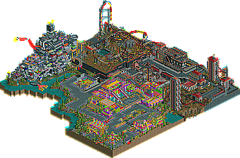
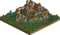
When i opened it an explsion went off (oh great) and more went off as i looked through it, it seemed to make the black area more messy. And basicly the whole park had hacks everywhere i looked, which didnt mean anything to me just a show-off attempt really, ok we had one hack in our team park, but the hurricanes had loads. But having said that i did quite like the big robot thing with the arm and stuff that was a good idea, but the area part that i didnt really like and was abit sickly was the green and yellow area i mean it was alright but just let it down abit.
Overall it was ok but abit too much was going on with explosions and stuff.
Flying Germans:
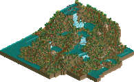
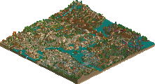
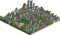
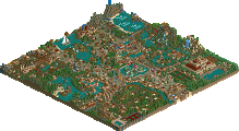
Completely the opposite of the Hurricanes park, it had a much nicer feel to it more calm and the bulidings were nicely paced out. liked all the areas really but my main prob was with the pyramid in the middle with the glass it was a little repetitive perhaps with all the glass but it showed it was a pyramid.
Overall i liked the Flying Germans better.
Vote: Flying Germans
From the overview I would have went with the Germans, but i ended up with the Hurricanes. Not really hard to vote this time 'round. Like, why are there three colors on that ugly pyramid and not four? And there were tons of little 'let downs' in the germans park, where as, but for the spelling of 'rising', the hurricanes park had a ton of lovely little details. This took a lot of work, and i hope it pays off. (its 2-2 now... including my own vote) You can't see a coaster chasing a patrol bot from an overview, but it definitely is fun to look at in game. The Bot Bistro (or the name i actually thought was pretty cool, but can't remember) is beautiful. You've really become the only one to incorporate these colors. Probably your most impressive park yet.
Canes I didn't like this park one bit, it was disgusting, everything from the pointless hacks to the badly colour schemed architecture. Thing i hate the most is when i open the park the game slows down because of the amount of hacks and the things moving on the screen, then about five explosions go off and slow my viewing time of the park down, really is all that needed? I thought the hacks were the total opposite of impressive, they had all basicly been done before and didn't add to the park or atmoshpere at all. The architecture well for most part was awful, the colours really hurt my eyes and the bright area seemed like it shouldnt have been there. I only part of the park i liked was the robot, that was pretty cool but the rest of it was a huge piece of mess, don't get me wrong i like future themes, i do, but when they are pulled of with pointless hacks and as much TT scenery you can pile into the map it makes me think this isnt a park, i understand h2h isnt about making realistic parks and can be fantasy but it really puts me off playing rct for awhile after i see something like that, im sorry i coudlnt get on board with it, good job whoever made it though.
Germans Now this i liked, after viewing the cane's this was really calming and in some parts beautiful, although i think alot of it could have been pulled off better but you did a great job. The wooden was class, i really like it and so was the whole China area, it had alot of beauty. Egypt and the Myan(I think) areas where not bad but didnt compare to China imo. The thing i loved about this park the most was that it was peep friendly and it really reminded me of my old days in rct where all the guests would ride my rides and i loved it. So to whoever made this park i thank you, it really was a great entry.
Nice second round, imo there was no thinking about my vote, i decided straight after i had finished viewing the parks, good job guys.[/font]
I agree with WME here.
The Germans park look better from the overview, but in-game it was rather boring; generic themes, generic theming. Not much more to say about it.
In contrast, the Hurricanes park looks bad from the overview, but is great in-game. While I thought the architecture looked pretty bad both in colour and in structure, all the little details and hacks, and most of all, the sense of humour, won me over. I'm also certain I will look at this park again, because it was so much fun to look at, and because I probably missed half the details.
Vote: Hurricanes.
Horrible is the main word that comes to mind. I agree with artist. The colour selection was totally random and seemed to require little though. Along with the ridiculous structures created quite an eyesore. Random crashes that made very little sense to me as I could hardly follow anything due to it running slowly on my computer as a result of overhacking. Lots of random rides that turn into other bits of track (like the wild mouse that turned into the horrifically coloured wooden coaster for no apparent reason) made everything really hard to follow and it was hard to interpret the meanings or purpose of any of the rides. And what was with the slc car going around on wild mouse and steel twist tracks? I mean, wtf? Anyway, I didn't enjoy this at all, if you couldn't tell.
wow, i hadn't seen our park before and i must say i quite like it. it was clean and tidy, it had good shops everywhere and nice naming. it was peep-friendly and hence had no peep jam. also, i think that's probably the coolest split coaster i've ever seen. i really liked the idea. still i'm not terribly much into this hack. anyway, dragon rider was exciting to look at. the chinese was also my favourite theme. i'm very impressed, guys.
the hurricanes' park was interesting as well. it had these whoa, this is huge moments. you tried hard, it shows, and it pays off somewhat, but i think there was more to see in our park and apart from the hacks hardly anything can appeal. well, the custom ride was absolutely lovely. as for the rest, i don't know, we've had this stuff in the playoffs already and industrial themes have never convinced me in rct2 for some reason.
Voted Hurricanes. Im suprised we are down, I guess its overview voteing coz in-game its pretty clear witch park is better imo.
The Pyramid Connection was nice, I loved the hacked ride, but things like a glass pyramid and that wooden coaster just were weak, it had some nice spots and a good atmospher in most areas, but nothing to write home about.
tDATl as pretty awsome imo. its got a strong story line in the Cyborg theme thats pretty funny, the mall with the go-karts is my fav part with them running both ways and head on. The robot is just wacky in a nice insane kinda way, overall I think it came out well being one of the builders did the last 45% in like 2 days...
I just hope people really take a look at both parks in-game and explore. There is a lot on the line and I hope to see people really looking into the parks befor voteing.
None were Random, the builder made a chain reaction device, it sets off the Drone Production plant (the Cy Device) like dominos, really cool idea if you ask me.
Once again i'm gonna base my reply on other peoples' comments.
Germans first...
Like, why are there three colors on that ugly pyramid and not four?
-WME
The colours reflect the way the faces of the pyramid are facing: South America on the grey sides, China on the green side and Egypt on the beige side (hence the need for coloured glass). I'm amazed you didn't pick up on that - I thought it was a great effect.
The Germans park look better from the overview, but in-game it was rather boring; generic themes, generic theming. Not much more to say about it.
-DJ
Boring? I found it very exciting. Dragon Rider was fantastic - competitor with WME's one in God's Isle for best woodie of the tournament. The rapids were expertly crafted, the 'walk through the mountains' was brilliant. The split coaster was FAR from boring (ie great) and the fact that there were three excellent areas in one H2H park meant that I was interested throughout. Generic, possibly yes, but with a definite personal spin and with lovely details.
It's spelt Montezuma or Moctezuma btw
-Metropole
I thought that their spelling might have been a pun on the word 'zoom' but then again it had an 'a' in it too...
but things like a glass pyramid and that wooden coaster just were weak,
-Kumba
The glass pyramid gave the park focus and continuity. Also, the wooden coaster was marvellous - it had a focussed, compact layout, an interesting first drop, great landscape interaction...and it fitted beautifully into the Chinese area.
Overall, I loved this park. It was understated, detailed (see: ceiling fans in Egypt, hidden details behind Dragon Rider, mountain walk, flat-ride theming) and, above all, beautiful.
Hurricanes, then...
where as, but for the spelling of 'rising', the hurricanes park had a ton of lovely little details.
-WME
Yes, and a lot of them were fun, but with the speed it ran at and the general chaos I found it very difficult to get into. And i'd say there was just as much to look at in the Germans' park, you'd just have to look at little harder to find it.
...and the bright area seemed like it shouldnt have been there.
-Artist
I felt the same way.
all the little details and hacks, and most of all, the sense of humour, won me over. I'm also certain I will look at this park again, because it was so much fun to look at, and because I probably missed half the details.
-DJ
I liked the concept a lot, and I was impressed by some of the hacks (the welcome bot and the custom rides spring to mind) but I felt no atmosphere at all. I would look at the Germans' park a lot more than this one because I feel I could learn a lot more from it and it's generally more enjoyable to explore.
Horrible is the main word that comes to mind. I agree with artist. The colour selection was totally random and seemed to require little though. Along with the ridiculous structures created quite an eyesore. Random crashes that made very little sense to me as I could hardly follow anything due to it running slowly on my computer as a result of overhacking. Lots of random rides that turn into other bits of track (like the wild mouse that turned into the horrifically coloured wooden coaster for no apparent reason) made everything really hard to follow and it was hard to interpret the meanings or purpose of any of the rides. And what was with the slc car going around on wild mouse and steel twist tracks? I mean, wtf? Anyway, I didn't enjoy this at all, if you couldn't tell.
-Metropole
I'd accuse you of not entering into the spirit of the park, but I had the same feelings. I liked the large building with the wild mouse (especially when it went through the water slide tubes) but there seemed to be little continuity in the park - no overriding theme other than 'robots gone wild'. The fact that a parkmaker like me is having these problems with the Hurricanes' park suggests that perhaps they went too far with the craziness, lol.
Overall, I felt that I could have really liked this park if it hadn't been so bitty and active. I know that's part of the concept, but...no, it was too difficult to relate to.
So, the Germans get my vote, and a place in my top 5 of the season. Brilliant park, whoever made it, and I think that after something like this they deserve to win the season. Excellent work, both teams, but the Germans are definitely my pick.
I voted for the hurricanes. Their park was really fun to watch, despite the fact that it slowed down my computer. It seemed like the maker had a lot of fun making this park, and it shows. And I liked all the colors, too. The only thing I don't like is that some of the coaster scenery wasn't named.
The Germans park was really boring. The mexican area is the only good one, imo. The rest were crap. And that split coaster just seemed like a massive gimic to pull in votes. it would have been much better if it actually went through each area, like an actual coaster. And I don't see what's so great about that wooden coaster.
None were Random, the builder made a chain reaction device, it sets off the Drone Production plant (the Cy Device) like dominos, really cool idea if you ask me.
Oh, I should have guessed. Either it wasn't clear enough, or my computer was slowed down to the point that I couldn't follow what was going on. Not sure which.
Anyway, I'm not denying that a lot of effort went into the park, and it required a lot of skill. It's just totally opposite to the style of park that I am into, and I can totally understand how some people prefer it.
I voted for the Hurricanes. Didn't really want to though. For the finals, this week was pretty anticlimatic in my opinion coming off how amazing last week was.
The Pyramid Connection Some of this park was awesome. The Egypt area really grabbed me. I love when people put music into their parks it increases the atmosphere by like a hundred percent. The architecture here was beautiful, the atmosphere was terrific, everything was great. I loved the Tomb Tours attraction and the freefall towers were pulled off real well. If the whole park was this quality it would have taken it for me. The China area was second best, qauint and relaxing. The wooden coaster was a lot better then I first thought it'd be, props to the maker for that. That whole area where the woody was was great...good landscaping, nice choice of colors. The rest of the area was a little lacking...I mean, wooden coaster rooves for Chinese themes have been done so many times now that it's just incredibly stale...especially if you're not going to be creative with it (see: Fire Dragon). The South America area is where the park lost my vote however. This looked incredibly rushed and pretty boring I must say. The completely underground mine train looked like it didn't need to be there...that was just really unnecessary. It should have come up and interacted with the landscape. The rapids were nice but didn't grab me like a great rapids does. As for the actual ride...it was cool I guess. I'm not a huge fan of 'one trick pony' rides...it did it's thing, and then it was done basically. Overall - 7/10
The Day After Tomorrowland Now...this park may be the single ugliest park I've ever seen. Half the park was divided into that black and dull red combination which made me want to throw up, and the other half looked like I already did throw up with the parkmakers (like nobody knows who this is) constant use of completely horribly clashing colors like bright greens, red, purples, blues, etc. that just looked utterly ridiculous and basically ruined most the park for me. To me, it was a park full of letdowns. It started with that 'chain reaction/mouse trap' ride which I thought would be an awesome little ride...but it was so incredibly boring and didn't really do anything cool at all. Then "Phase Two" that big coaster that turns into that little coaster that turns into a shooter ride...I felt like it was too much work trying to see what the hell was going on. I don't awnt to have to 'work at' understanding the damn coaster. Another miss for me. The mall with the Go-Karts was cool, and surprisingly, there was some sick architecture in this area....too bad it was ruined by the disgusting colors. The only part of the park that really grabbed me was the big robot. The Torso Tours was a pretty cool ride...although things like 'wooden caoster 16' really pissed me off.
In the end, I'm not really happing voting for either. It'd be very easy to say that the Germans should win. I only voted Hurricanes cause there was slightly mroe to see in that park that stayed with me. Neither park were really 'finals material' whatever that means...but good luck to all the makers.
I voted hurricanes, and looking at the overview screens i felt that we would lose.
But after looking in game, i found that there was more interesting things to look at in our park. The splitters seem to be just a gimmick for votes, its been done and really isnt interesting unless the coaster has a very good layout.
102 Comments
Corkscrewed Offline
The Day After Tomorrowland
DOWNLOAD HERE
Flying Germans
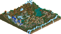
The Pyramid Connection
DOWNLOAD HERE
Finals Park Match THREE Will be Due SUNDAY, MAY 15, 2005.
Corkscrewed Offline
But please don't mention names anyway, for sake of the rules.
Leighx Offline
Hurricanes:
When i opened it an explsion went off (oh great) and more went off as i looked through it, it seemed to make the black area more messy. And basicly the whole park had hacks everywhere i looked, which didnt mean anything to me just a show-off attempt really, ok we had one hack in our team park, but the hurricanes had loads. But having said that i did quite like the big robot thing with the arm and stuff that was a good idea, but the area part that i didnt really like and was abit sickly was the green and yellow area i mean it was alright but just let it down abit.
Overall it was ok but abit too much was going on with explosions and stuff.
Flying Germans:
Completely the opposite of the Hurricanes park, it had a much nicer feel to it more calm and the bulidings were nicely paced out. liked all the areas really but my main prob was with the pyramid in the middle with the glass it was a little repetitive perhaps with all the glass but it showed it was a pyramid.
Overall i liked the Flying Germans better.
Vote: Flying Germans
Evil WME Offline
artist Offline
Canes
I didn't like this park one bit, it was disgusting, everything from the pointless hacks to the badly colour schemed architecture. Thing i hate the most is when i open the park the game slows down because of the amount of hacks and the things moving on the screen, then about five explosions go off and slow my viewing time of the park down, really is all that needed? I thought the hacks were the total opposite of impressive, they had all basicly been done before and didn't add to the park or atmoshpere at all. The architecture well for most part was awful, the colours really hurt my eyes and the bright area seemed like it shouldnt have been there. I only part of the park i liked was the robot, that was pretty cool but the rest of it was a huge piece of mess, don't get me wrong i like future themes, i do, but when they are pulled of with pointless hacks and as much TT scenery you can pile into the map it makes me think this isnt a park, i understand h2h isnt about making realistic parks and can be fantasy but it really puts me off playing rct for awhile after i see something like that, im sorry i coudlnt get on board with it, good job whoever made it though.
Germans
Now this i liked, after viewing the cane's this was really calming and in some parts beautiful, although i think alot of it could have been pulled off better but you did a great job. The wooden was class, i really like it and so was the whole China area, it had alot of beauty. Egypt and the Myan(I think) areas where not bad but didnt compare to China imo. The thing i loved about this park the most was that it was peep friendly and it really reminded me of my old days in rct where all the guests would ride my rides and i loved it. So to whoever made this park i thank you, it really was a great entry.
Nice second round, imo there was no thinking about my vote, i decided straight after i had finished viewing the parks, good job guys.[/font]
trav Offline
Janus Offline
The Germans park look better from the overview, but in-game it was rather boring; generic themes, generic theming. Not much more to say about it.
In contrast, the Hurricanes park looks bad from the overview, but is great in-game. While I thought the architecture looked pretty bad both in colour and in structure, all the little details and hacks, and most of all, the sense of humour, won me over. I'm also certain I will look at this park again, because it was so much fun to look at, and because I probably missed half the details.
Vote: Hurricanes.
Metropole Offline
Horrible is the main word that comes to mind. I agree with artist. The colour selection was totally random and seemed to require little though. Along with the ridiculous structures created quite an eyesore. Random crashes that made very little sense to me as I could hardly follow anything due to it running slowly on my computer as a result of overhacking. Lots of random rides that turn into other bits of track (like the wild mouse that turned into the horrifically coloured wooden coaster for no apparent reason) made everything really hard to follow and it was hard to interpret the meanings or purpose of any of the rides. And what was with the slc car going around on wild mouse and steel twist tracks? I mean, wtf? Anyway, I didn't enjoy this at all, if you couldn't tell.
Germans:
Yeah, pretty good. I liked the idea behind it. Pretty nice. The pyramid wasn't that good IMO, didn't like the use of glass in there though. The architecture was generally nice, nothing to write home about. The landscaping is the parks' forté imo. Very nice, especially in the mexico section. It's spelt Montezuma or Moctezuma btw The rapids ride was pretty ok. I quite liked the twist on top of the mini pyramid/maya type structure. The egypt section was good, perhaps didn't catch the deserty feel like i think an egypt area should, but still nice. The chinese section was cool, i really liked the colour of the woodie which was surprising. Also showed great landscaping. A job well done.
Vote: Germans
posix Offline
anyway, dragon rider was exciting to look at. the chinese was also my favourite theme. i'm very impressed, guys.
the hurricanes' park was interesting as well. it had these whoa, this is huge moments. you tried hard, it shows, and it pays off somewhat, but i think there was more to see in our park and apart from the hacks hardly anything can appeal. well, the custom ride was absolutely lovely. as for the rest, i don't know, we've had this stuff in the playoffs already and industrial themes have never convinced me in rct2 for some reason.
Jo24 Offline
Kumba Offline
The Pyramid Connection was nice, I loved the hacked ride, but things like a glass pyramid and that wooden coaster just were weak, it had some nice spots and a good atmospher in most areas, but nothing to write home about.
tDATl as pretty awsome imo. its got a strong story line in the Cyborg theme thats pretty funny, the mall with the go-karts is my fav part with them running both ways and head on. The robot is just wacky in a nice insane kinda way, overall I think it came out well being one of the builders did the last 45% in like 2 days...
I just hope people really take a look at both parks in-game and explore. There is a lot on the line and I hope to see people really looking into the parks befor voteing.
Metropole Offline
Kumba Offline
mantis Offline
Germans first...
-WME
The colours reflect the way the faces of the pyramid are facing: South America on the grey sides, China on the green side and Egypt on the beige side (hence the need for coloured glass). I'm amazed you didn't pick up on that - I thought it was a great effect.
-DJ
Boring? I found it very exciting. Dragon Rider was fantastic - competitor with WME's one in God's Isle for best woodie of the tournament. The rapids were expertly crafted, the 'walk through the mountains' was brilliant. The split coaster was FAR from boring (ie great) and the fact that there were three excellent areas in one H2H park meant that I was interested throughout. Generic, possibly yes, but with a definite personal spin and with lovely details.
-Metropole
I thought that their spelling might have been a pun on the word 'zoom' but then again it had an 'a' in it too...
-Kumba
The glass pyramid gave the park focus and continuity. Also, the wooden coaster was marvellous - it had a focussed, compact layout, an interesting first drop, great landscape interaction...and it fitted beautifully into the Chinese area.
Overall, I loved this park. It was understated, detailed (see: ceiling fans in Egypt, hidden details behind Dragon Rider, mountain walk, flat-ride theming) and, above all, beautiful.
Hurricanes, then...
-WME
Yes, and a lot of them were fun, but with the speed it ran at and the general chaos I found it very difficult to get into. And i'd say there was just as much to look at in the Germans' park, you'd just have to look at little harder to find it.
-Artist
I felt the same way.
-DJ
I liked the concept a lot, and I was impressed by some of the hacks (the welcome bot and the custom rides spring to mind) but I felt no atmosphere at all. I would look at the Germans' park a lot more than this one because I feel I could learn a lot more from it and it's generally more enjoyable to explore.
-Metropole
I'd accuse you of not entering into the spirit of the park, but I had the same feelings. I liked the large building with the wild mouse (especially when it went through the water slide tubes) but there seemed to be little continuity in the park - no overriding theme other than 'robots gone wild'. The fact that a parkmaker like me is having these problems with the Hurricanes' park suggests that perhaps they went too far with the craziness, lol.
Overall, I felt that I could have really liked this park if it hadn't been so bitty and active. I know that's part of the concept, but...no, it was too difficult to relate to.
So, the Germans get my vote, and a place in my top 5 of the season. Brilliant park, whoever made it, and I think that after something like this they deserve to win the season. Excellent work, both teams, but the Germans are definitely my pick.
tracidEdge Offline
The Germans park was really boring. The mexican area is the only good one, imo. The rest were crap. And that split coaster just seemed like a massive gimic to pull in votes. it would have been much better if it actually went through each area, like an actual coaster. And I don't see what's so great about that wooden coaster.
Metropole Offline
Anyway, I'm not denying that a lot of effort went into the park, and it required a lot of skill. It's just totally opposite to the style of park that I am into, and I can totally understand how some people prefer it.
Metro
Kumba Offline
Metropole Offline
Uhm...No
iris Offline
For the finals, this week was pretty anticlimatic in my opinion coming off how amazing last week was.
The Pyramid Connection
Some of this park was awesome. The Egypt area really grabbed me. I love when people put music into their parks it increases the atmosphere by like a hundred percent. The architecture here was beautiful, the atmosphere was terrific, everything was great. I loved the Tomb Tours attraction and the freefall towers were pulled off real well. If the whole park was this quality it would have taken it for me. The China area was second best, qauint and relaxing. The wooden coaster was a lot better then I first thought it'd be, props to the maker for that. That whole area where the woody was was great...good landscaping, nice choice of colors. The rest of the area was a little lacking...I mean, wooden coaster rooves for Chinese themes have been done so many times now that it's just incredibly stale...especially if you're not going to be creative with it (see: Fire Dragon). The South America area is where the park lost my vote however. This looked incredibly rushed and pretty boring I must say. The completely underground mine train looked like it didn't need to be there...that was just really unnecessary. It should have come up and interacted with the landscape. The rapids were nice but didn't grab me like a great rapids does. As for the actual ride...it was cool I guess. I'm not a huge fan of 'one trick pony' rides...it did it's thing, and then it was done basically.
Overall - 7/10
The Day After Tomorrowland
Now...this park may be the single ugliest park I've ever seen. Half the park was divided into that black and dull red combination which made me want to throw up, and the other half looked like I already did throw up with the parkmakers (like nobody knows who this is) constant use of completely horribly clashing colors like bright greens, red, purples, blues, etc. that just looked utterly ridiculous and basically ruined most the park for me. To me, it was a park full of letdowns. It started with that 'chain reaction/mouse trap' ride which I thought would be an awesome little ride...but it was so incredibly boring and didn't really do anything cool at all. Then "Phase Two" that big coaster that turns into that little coaster that turns into a shooter ride...I felt like it was too much work trying to see what the hell was going on. I don't awnt to have to 'work at' understanding the damn coaster. Another miss for me. The mall with the Go-Karts was cool, and surprisingly, there was some sick architecture in this area....too bad it was ruined by the disgusting colors. The only part of the park that really grabbed me was the big robot. The Torso Tours was a pretty cool ride...although things like 'wooden caoster 16' really pissed me off.
In the end, I'm not really happing voting for either. It'd be very easy to say that the Germans should win. I only voted Hurricanes cause there was slightly mroe to see in that park that stayed with me. Neither park were really 'finals material' whatever that means...but good luck to all the makers.
Richie Offline
But after looking in game, i found that there was more interesting things to look at in our park. The splitters seem to be just a gimmick for votes, its been done and really isnt interesting unless the coaster has a very good layout.