Park / Götheburg
-
 01-May 05
- Views 25,150
- Downloads 1,037
- Fans 7
- Comments 119
-
 85.00%(required: 70%)
 Gold
Gold

Xeccah 100% no Steve 95% yes Kumba 90% no RWE 90% no Cocoa 85% no Liampie 85% no Scoop 85% no bigshootergill 80% no csw 80% no Ling 80% no posix 80% no Sulakke 80% no 85.00% 0.00% -
7 fans
 Fans of this park
-
 Download Park
1,037
-
 Objects
172
-
 Tags
Tags
Corkscrewed Offline
Götheburg
DOWNLOAD HERE
Flying Germans
The Faraway Tree
DOWNLOAD HERE
Finals Park Match TWO Will be Due FRIDAY, MAY 6, 2005.
Flying Germans: As hard as it is to not vote for this park is I have to. I just can't get into these parks. Sorry guys it was a great effort none the less.
The amount of work that has been put into the Faraway tree.
The hurricanes looks well good aswell, look foward to looking at them both now.
Vote= Flying wassits
Both look amazing... downloading now.
The Forgotten Tree, was lovely as well, but way too busy for my likings. Too much going on, there wasn't any real focus. It was just over-loaded IMO.
The Faraway Tree had to many "borrowed" ideas for me.
Isn't this match one?
From the screens, Flying German's park looks more promising.
We'll see how my opinion turns out after looking at the parks in game.
Its really hard tho, its realistic vs fantasy, and maybe the best realistic vs fantasy match-up in H2H. I went with my team of coruse, tho I really liked both, however I think ours was more soild coz:
Götheburg/The Faraway Tree
Coasters: stunning/a nice type of insaneness
Treeing (not counting huge trees
Archy: Simple beautiful/ Simi simple with extra detail
So I give our park the edge, tho not by a whole lot.
It really is like week 2, but with each park being like 5x better, so this will be a good one.
Also it would be really funny to me if we win and Posix loses to a park im sure he is orgasuming over, tho don't forget no-matter who wins its not over yet.
Kumba
Corkscrewed Offline
honestly, i'm not trying to sway any voters at all. i just feel like a lot of ne work is losing originality. i wish people would really put creative thought into their work instead of basing it all off of other's work. tell me if i'm off base here; people are seeing these similarities, right?
I'll post more later...
Canes
An amazing entry, the duelers were
Germans
Another brilliant entry, although i see alot of other people's work in this, like slob/metalface said, fright nights was one of them, the landscape, architecture and foliage looked very similar. The coaster was very fun to watch, i enjoyed it alot, although it was very ghost cell crisis inspired, great none of the less. The trees was what made the park for me, they were very well thought out and amazingly executed, i enjoyed them alot. The clouds, meh, didnt do nothing for me, they didn't really look like clouds imo, missed the puffyness that clouds should have, yes i understand it is hard to capture that in rct but imo it could have been done.
Overrall a nice entry but it cannot match the Cane's park, so my vote went to the cane's. Hope that all made sense.
A truely amazing match up, keep this level of quality up. [/font]
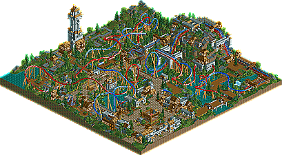
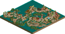
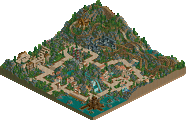
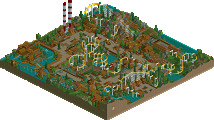
Götheburg - I was extremely impressed with virtually every aspect of this park. The overview is solid, but the park is even better in game. The dueling B&Ms were pretty much flawless imo. So many incredible inversions and elements; I loved every bit of both layouts, except maybe the hacked lift hills. Perfect timing and speed control. The coaster supports were the next best part of the park, also pretty much done flawlessly and with extreme attention to detail. Maybe over-supported in spots, but nothing too crazy. The color choices for the coasters were good too; the red and blue really held the other parts of the more subtle tones used in the rest of park together. The architecture was wonderful. Perfect combos of textures, colors, foliage and landscaping. But I think the most amazing aspect of this park to me is it demonstrates that you don't have to have use bunch of custom scenery to create an amazing rollercoaster park with RCT2, which is unfortunately something a lot of other parks suffer from these days. I have good hunch who built this too. You deserve a big pat on the back man, this is one seriously amazing park.
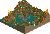
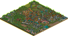
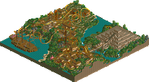
The Faraway Tree - The park does have an amazing overview, with the cloudery, custom tree and what not, but don't let your eyes fool you. Unfortunately, I immediately got that doomed feel of "rushedness" when I first opened it up. The coaster design was certainly unique and definitely fit its name, but I can't really say I liked the whole ride though. It seemed to have a lot of unnessecary winding, twisting flat turns before it got to the actual coaster. There were some parts that were brilliant, such as the spiral lift around the tree trunk and the yellow, high speed section of the ride. Thats about it tho. The rest of the park was pretty bad imo, especially the foliage. Could you guys cram some more foliage in there please? Geez. I realize its part of the theme, but the foliage seriously made me feel like I was looking one big blob of blah. And the architecture green too?...ouch I had some issues with the landscaping too, but it wasn't quite as bad as the foliage. Then the underwater stuff. A good idea, but not done very well. It was completely glitched when i looked at it. Oh, those tree roots things were quite distriacting. All in all, I really felt this park suffered more than it shined, which is unfortunate because it had loads of potential before any foliage was placed. Still a good effort that demonstrates some immense parkmaking skills. I just wish it didnt seem so messy.
I voted for the Hurricanes in the end. The Germans park was just too messy for me.
This park was awesome. Perfect interactions and archy, everything complimented each other so well, just awesome. I even liked how you did the layout with the exit station and the hacked lifts, that was cool. The interactions, colors, everything was great. Not much to fault except the foliage was bare in places and kind of sloppy. I don't like the patches of grass if it isn't mowed. But this park really didn't have much to fault and the coasters were excellent. Also the tower was cool too. Props to whoever made this for an amazing H2H park.
Flying Germans
Great idea and interesting adventure ride. It just was, eh, overdone and messy looking. I'm sorry, I mean, I can tell a lot of effort was put into it, but it just didn't appeal to me. A lot of interesting ideas like being "up in the clouds" and the lift with the coaster going up to it. But it was just messy, and a lot of ideas in it were poorly excecuted, like the underwater-ness you had going on there. Like JKay said though, this does demonstrate some great parkmaking skills. Great ideas and effort, but just didn't work for me.
So I voted for the Hurricanes on this one. Good job on both parks.
Gotheburg was near perfect in it's execution. The architecture was simple, yet did the job tremendously. The landscaping was absolutely awesome as was the foliage. The coaster layouts were very nearly perfectly time and the attention to detail was wonderful. The builder is pretty obvious too.
Not sure about that comment, this park alongside 99.9% of others is full of custom scenery. Unless you meant the emphasis to be on the bunch implying that too many people just load scenery piece after scenery piece, then you would be right.
commecnt on fataway in bit
The Faraway Tree- Where my vote went thanks to team loyalty. This would've been a tough call for me had I not been on one of the teams. Personally I rather like it. Sure the clouds could've been a bit more "fluffy" and the water was glitchy however this park took risks. Where the other park relied on tried, tested and proven ideas this one did things that aren't. The coaster was excellent too, however there was a general lack of rides and to some extent refinement. Somehow this felt like it had more to see than the other park though.
Both are absolutly amazing efforts and both teams desirve to win, this reminds me of last week (well more like 3 weeks ago
ride6
My vote = Flying Germans.