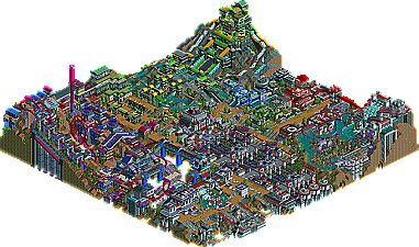
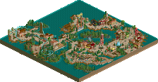
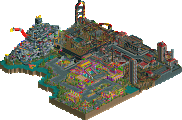
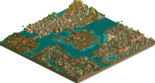
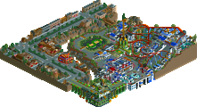
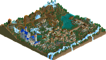
I voted for seal clubbers. Both were close and although the coaster on the clubbers park really sucked at the end, the map edge detail work was what won it for me although it could have gone either way.
It's obviously better than the Clubber's park so that must mean the Clubber's park is very hideous. Neither one of them were that good, so it doesn't even matter. And Kumba.....how the hell is this one of the best RCT2 vs RCT2 match ups?
"Obviously" by what measure? Obviously an opinion... obviously. The voting surely doesn't make the park.
It had its moments, but also had a lot of irritating pet-peeves of mine. I'll list the pros and cons.
Pros
-incredible architecture forms
-the theming in that one corner with mine train was amazing, my favorite part
-some cool ideas pulled off with mediocre execution, especially the themed interiors of buildings
-nice landscaping
-the rapids ride had its moments; i liked how expansive it was
-a nice overview screen
Cons
-that none of the rides were in operation when the park is opened
-you had rides that were incomplete, like the mine train in the corner
-mis-spellings and lack of creative naming conventions
-seemed even more cluttered than AWW
-had numerous gimmick that seems rushed, like the parking lot and numerous wateralls with no source
-the bright blue and teile colors = yuck
-textures were messy
-the coaster, you may have just built the entire thing underground
-thin walls
This matchup really shows how the voting in h2h is almost entirely style based, with the majority justifying their vote on the overview screen. In this case, the germans park has an overview that leans more towards a more traditional style that seems to go more with the general NE public imo, hence the reason its winning at this point. The in-game impression i got from the germans was very lopsided from the overview screen impression. Whereas the clubbers park is more of a unique style that is either "you love it or hate it", but also had its flaws as well. It really shows how rct has become an artform and not nessecarily a game where one park is clearly better than another.
Jon, you're right that the germans won (or thus far at least), but I don't agree we were beat fair and square. imo, its more of a style conflict that ended up benefiting the Germans. Everyone can ignore my first post in this thread; I was just trying to be team player.
Please people, take the 5 or 10 minutes to download the parks and look at them in-game before you vote, i beg you....
just wanted to say ya usually im one of the non posters but in this matchup when i went to view this topic my vote somehow was already cast? i dont know who for or if it was nulled the vote at the time was germans 10 clubbers 8 when i first viewed it, but i didnt get to vote for who i thought had the better park because of that.
I also did not get to vote
I'm assuming it is because this is my first post on these forums and the admins decided anyone who hasn't posted must be a made up name for someone on a H2H team OR their reasoning is that if I have never posted I should not have a right to vote in these polls...
I would have voted Clubbers basically for the reasons JKay has posted.
-had numerous gimmick that seems rushed, like the parking lot and numerous wateralls with no source
What is so bad about gimmicks? If you look at it, everything creative is a gimmick. cBass' Outpost 31 can be considered an entire gimmick PARK. I happened to really like the parking lots, they seemed to balance out the level of elegance and realism.
Thats my opinion, and I think I have a right to it.
I don't see why you guys can't enjoy both parks more, if your waiting for a "perfect" park I think your gona be let down a lot, coz no park is perfect in everyones eyes.
Its truely a matter of opinion and it's clear, there is no such thing as the perfect park, and there will never be. The problem with these parks is that they are quite literally "overdone" to a point where some people get bored really, really, really.... fast. I've grown tired of the whole, done up, quarter tile bullshit that seems to appear in every minipark around now, even in most whole parks for that matter. Its just sad to see how people think its good to try to fit fifty pieces of scenery on the same tile. It doesnt look good, it looks crappy. And im pretty sure a few others agree with me on this.
I personally think the Seal Clubber's park is just filled with useless shit, just to be filled with stuff. For quite a few areas of the map, i dont get anything from it. You get that feeling like, why is this there? It lacks a united atmosphere, imo.
The other map is the same way, but its something you can look at and enjoy a little bit longer. The atmospher may not be too good either, but its fair. And surely, the rides helped it out quite a bit (regardless if some think the entire thing might as well be put underground), unlike the questionable coaster of the other map.... again, imo.
You all are crying for a reason why the Clubber's are losing and people are voting for it, and you have your reason. Well, at least one. Its simple, Water Works is just not as appealing as Springs City....again.....in my opinion (which is what matters here, cuz thats what the vote is based on).
@ JKay, your cons are kinda silly. No rides in operation when the park is opened... what kind of downfall is that? Gimmicks... Mis-spellings...? I begin to question your views of this game sometimes.
I've seen the style of the Germans park done better by like 20 parkmakers...John did the "nice" style better in week 1 of h2h. It's just a shame that a generally substandard 2nd tier "nice" style park is beating an originally themed park with interesting rides and a fresh theme.
Well, I enjoyed both of these parks, but I'm going to have to say the Germans. It kept me interested for much longer and seemed to have a lot more details to discover along the way. I don't really take into consideration what's been done... I look at what I have in front of me and grade from there. Both parks contained some very nice rides with some interesting themes. Good job to both teams.
I've seen the style of the Germans park done better by like 20 parkmakers...John did the "nice" style better in week 1 of h2h. It's just a shame that a generally substandard 2nd tier "nice" style park is beating an originally themed park with interesting rides and a fresh theme.
Just because it's original doesn't mean people think it looks better than the other one. And that's what at least 95% of the people here are voting on--which looks the best.
it still doesnt change the fact that its a 2nd tier park vs. a 1st tier park. You still have to compare the comparative quality. So apparently a tropical island looks nicer than a park themed industrially...makes sense. That says nothing about the quality.
It's the same comparing RCTLL and RCT2 parks. You have to compare the quality, and a first tier RCT1 park should beat a 2nd tier RCT2 park. Its the same with styles. You shouldn't pick a park based on style, but how well the chosen style is done. I don;t think it wouldve mattered what either of the parks would have actually been, most people still would have picked the other based on style without any consideration to the quality.
I'm not saying we deserve every vote, but there's no way that our park is worse. The parks aren't on the same level. It's a been-there-done-that style which is worse than a lot of the parks which have already used the style vs. a good creative park.
Its just sad to see how people think its good to try to fit fifty pieces of scenery on the same tile. It doesnt look good, it looks crappy. And im pretty sure a few others agree with me on this.
To that same token, a park that is just put together poorly (mismatching wall textures, clashing color combinations, awkward transitions, and overusing decorative elements) doesn't look good either. It usually ends up looking more cluttered than the average "one fourth tile" parks that are popular nowadays.
At least Artesian Water Works was more together and cohesive with its textures and blending color schemes (where the colors were actually a 'scheme' ) Eternal Springs City had mismatching wall textures, incredibly ugly color schemes and transitions, and an abundant overuse of different accent items. What was there in Eternal Springs City was true junky clutter. Layering Fisherman's scenery (among a myriad of other things) on top of different textures does not consititute detail or beauty...
Overviews are decieving. For example, most all of Corkscrewed's parks look at least a little awkward from above... but when explored, they are amazing. (And no harm ment, it was just the first example that came to mind ) AWW has that same effect. It seems like a cluttered mess of nothing that fits together, but zoomed in it is more extensive and refined.
It's a shame that the majority of votes do come from overview-seers, because it is hard to really judge a book by its cover. I have a hard time believing people are actually looking at Eternal Springs City, because as hard as I try... all I see is a collection of some big pet peeves with the game. And, given how other parks built in similiar fashion to this have been recieved, it's a bit startling how much 'positivity' this is being met with (given the voting thusfar).
@ JKay, your cons are kinda silly. No rides in operation when the park is opened... what kind of downfall is that? Gimmicks... Mis-spellings...? I begin to question your views of this game sometimes.
wow master Junya. Did I do something wrong?
Firstly, I play the game for my own reasons, mainly as a creative outlet to express my imagination and artistic urge. I dont understand why you're questioning my reasons for playing rct and don't think thats even relavent to the issue at hand. Have I ever questioned your reasons for churning out the same park time after time?
Secondly, the fact that the Germans park had no operating rides bugs me because the park just seems dead when you open it and it leaves the park viewer the responsibility of making the rides operational. I personally like parks that all I have to do is wander around and view the park in full operation. Seems like a simple task of the parkmaker to benefit the park viewer that should always be a given.
Next, gimmicks. Jacko, you're right. I have nothing against gimmicky parks, I just felt the parking lot in the germans park was unnessecary. On the other hand, you could say that AWW had unnessecary gimmicks too, so i guess my point isn't valid.
Lastly, the mis-spellings. True it may not be the ultimate flaw to make or break a park, but it really brings down the overall presentation of the park imo. Also a general pet peeve of mine within my profession that is extended when I play rct.
Having now looked at the Seal Cubbers park I must say I found it very refined and wholefully enjoyible.
I think the reasons you're having such a fit is that the voting isn't going your teams way but face it with some control. I agree that the overviews are very decieving however I found that both parks have a lot to offer. Personally I don't think the coasters in either are all that great, the one in the clubbers was odd and the one in ours was half underground and strange in it's own right. You just have to figure out what viewing angles to use to watch it though, it's enjoyible once you figured it out. As a whole I feel that both teams tried to build parks that were the best and the results were overdone. Personally I probably would've voted for the seal clubbers park had I not been on this team though. It somehow remained very detailed and interesting without looking cluttered. A lot of it had to do with the lack of folidge I think.
Great competition though. Both parks have their weaknesses, sadly style seems to be more important. As much as I want (my team) to win this round I wish that we would loose it. We've won but it's for the wrong reasons.
thx ride6, our team is quite frankly riled up but we hope to remain good sports.
-We arent down by that much, and we would like the polls to stay open for a few more days to let everyone who doesnt check the forums every single day vote. No, we will not be signing up new identites and whatnot.
-I guess a lot of my problem is with the purely stylistic voting. Chapel said he was never into "That style" of park. To him, it wouldn't have matterd what was actually in the park, since our park didn't look like a slob or artist or SAC park, we lose. Based solely on style. That's whats bothering me, as i mantain that ours really is of higher quality. It is like comparing apples and oranges, although I think our park is a better apple than your's is at being an orange. It's just that more people like oranges.
Honestly, they both looked better from the overviews than when I actually explored the parks.
AWW-This style does nothing for me really. Maybe it's just me, but park making skill should not show up in cramming every tile of the park with some brightly coloured 1/4 tile block. There was no flow from one element to another, the buildings just kind of merged together into one mass that had very little character when I looked closely. I don't mind concept parks, but this attempt at one didn't grab me one little bit. On a positive note, everything here was at least complete, the rides were functional and for the most part good.
ESC-This one was actually more disappointing to me in a way. From the screens it looked like a sure winner for me, so when I opened it I was more disappointed with what I ended up seeing. The main coaster was extremely disappointing to say the least. The rest of the park was so much a retread of things I've seen before. It had more atmosphere than AWW, but in the end it's shortfalls and unfinished feeling left me wondering which park to vote for.
It's a shame that the playoffs started this way as I was really hoping to see something more original and creative. In the end AWW got my vote because it was finished, and the rides were better. Very tough decision of two parks that to me were all flash and no substance. Here's hoping for better in the next match up.
92 Comments
RCTNW Offline
cg? Offline
John Offline
The voting surely doesn't make the park.
JKay Offline
It had its moments, but also had a lot of irritating pet-peeves of mine. I'll list the pros and cons.
Pros
-incredible architecture forms
-the theming in that one corner with mine train was amazing, my favorite part
-some cool ideas pulled off with mediocre execution, especially the themed interiors of buildings
-nice landscaping
-the rapids ride had its moments; i liked how expansive it was
-a nice overview screen
Cons
-that none of the rides were in operation when the park is opened
-you had rides that were incomplete, like the mine train in the corner
-mis-spellings and lack of creative naming conventions
-seemed even more cluttered than AWW
-had numerous gimmick that seems rushed, like the parking lot and numerous wateralls with no source
-the bright blue and teile colors = yuck
-textures were messy
-the coaster, you may have just built the entire thing underground
-thin walls
This matchup really shows how the voting in h2h is almost entirely style based, with the majority justifying their vote on the overview screen. In this case, the germans park has an overview that leans more towards a more traditional style that seems to go more with the general NE public imo, hence the reason its winning at this point. The in-game impression i got from the germans was very lopsided from the overview screen impression. Whereas the clubbers park is more of a unique style that is either "you love it or hate it", but also had its flaws as well. It really shows how rct has become an artform and not nessecarily a game where one park is clearly better than another.
Jon, you're right that the germans won (or thus far at least), but I don't agree we were beat fair and square. imo, its more of a style conflict that ended up benefiting the Germans. Everyone can ignore my first post in this thread; I was just trying to be team player.
Please people, take the 5 or 10 minutes to download the parks and look at them in-game before you vote, i beg you....
Buckeye Becky Offline
I'm assuming it is because this is my first post on these forums and the admins decided anyone who hasn't posted must be a made up name for someone on a H2H team OR
their reasoning is that if I have never posted I should not have a right to vote in these polls...
I would have voted Clubbers basically for the reasons JKay has posted.
Just too bad they aren't going to get my vote
Jacko Shanty Offline
I ended up voting for seal clubbers though.
Junya Boy Offline
I personally think the Seal Clubber's park is just filled with useless shit, just to be filled with stuff. For quite a few areas of the map, i dont get anything from it. You get that feeling like, why is this there? It lacks a united atmosphere, imo.
The other map is the same way, but its something you can look at and enjoy a little bit longer. The atmospher may not be too good either, but its fair. And surely, the rides helped it out quite a bit (regardless if some think the entire thing might as well be put underground), unlike the questionable coaster of the other map.... again, imo.
You all are crying for a reason why the Clubber's are losing and people are voting for it, and you have your reason. Well, at least one. Its simple, Water Works is just not as appealing as Springs City....again.....in my opinion (which is what matters here, cuz thats what the vote is based on).
@ JKay, your cons are kinda silly. No rides in operation when the park is opened... what kind of downfall is that? Gimmicks... Mis-spellings...? I begin to question your views of this game sometimes.
gymkid dude Offline
rctfreak2000 Offline
Buckeye Becky Offline
AND I do look at the parks and pick which one I think is best!
So now...after doing that.... I cannot vote in the finals?
I'm sorry, but I'm not real happy about this.
CedarPoint6 Offline
tracidEdge Offline
gymkid dude Offline
It's the same comparing RCTLL and RCT2 parks. You have to compare the quality, and a first tier RCT1 park should beat a 2nd tier RCT2 park. Its the same with styles. You shouldn't pick a park based on style, but how well the chosen style is done. I don;t think it wouldve mattered what either of the parks would have actually been, most people still would have picked the other based on style without any consideration to the quality.
I'm not saying we deserve every vote, but there's no way that our park is worse. The parks aren't on the same level. It's a been-there-done-that style which is worse than a lot of the parks which have already used the style vs. a good creative park.
John Offline
At least Artesian Water Works was more together and cohesive with its textures and blending color schemes (where the colors were actually a 'scheme' ) Eternal Springs City had mismatching wall textures, incredibly ugly color schemes and transitions, and an abundant overuse of different accent items. What was there in Eternal Springs City was true junky clutter. Layering Fisherman's scenery (among a myriad of other things) on top of different textures does not consititute detail or beauty...
Overviews are decieving. For example, most all of Corkscrewed's parks look at least a little awkward from above... but when explored, they are amazing. (And no harm ment, it was just the first example that came to mind ) AWW has that same effect. It seems like a cluttered mess of nothing that fits together, but zoomed in it is more extensive and refined.
It's a shame that the majority of votes do come from overview-seers, because it is hard to really judge a book by its cover. I have a hard time believing people are actually looking at Eternal Springs City, because as hard as I try... all I see is a collection of some big pet peeves with the game. And, given how other parks built in similiar fashion to this have been recieved, it's a bit startling how much 'positivity' this is being met with (given the voting thusfar).
Corkscrewed Offline
JKay Offline
Firstly, I play the game for my own reasons, mainly as a creative outlet to express my imagination and artistic urge. I dont understand why you're questioning my reasons for playing rct and don't think thats even relavent to the issue at hand. Have I ever questioned your reasons for churning out the same park time after time?
Secondly, the fact that the Germans park had no operating rides bugs me because the park just seems dead when you open it and it leaves the park viewer the responsibility of making the rides operational. I personally like parks that all I have to do is wander around and view the park in full operation. Seems like a simple task of the parkmaker to benefit the park viewer that should always be a given.
Next, gimmicks. Jacko, you're right. I have nothing against gimmicky parks, I just felt the parking lot in the germans park was unnessecary. On the other hand, you could say that AWW had unnessecary gimmicks too, so i guess my point isn't valid.
Lastly, the mis-spellings. True it may not be the ultimate flaw to make or break a park, but it really brings down the overall presentation of the park imo. Also a general pet peeve of mine within my profession that is extended when I play rct.
and gym, i completely agree.
Ride6 Offline
I think the reasons you're having such a fit is that the voting isn't going your teams way but face it with some control. I agree that the overviews are very decieving however I found that both parks have a lot to offer. Personally I don't think the coasters in either are all that great, the one in the clubbers was odd and the one in ours was half underground and strange in it's own right. You just have to figure out what viewing angles to use to watch it though, it's enjoyible once you figured it out. As a whole I feel that both teams tried to build parks that were the best and the results were overdone. Personally I probably would've voted for the seal clubbers park had I not been on this team though. It somehow remained very detailed and interesting without looking cluttered. A lot of it had to do with the lack of folidge I think.
Great competition though. Both parks have their weaknesses, sadly style seems to be more important. As much as I want (my team) to win this round I wish that we would loose it. We've won but it's for the wrong reasons.
ride6
Blitz Offline
gymkid dude Offline
-We arent down by that much, and we would like the polls to stay open for a few more days to let everyone who doesnt check the forums every single day vote. No, we will not be signing up new identites and whatnot.
-I guess a lot of my problem is with the purely stylistic voting. Chapel said he was never into "That style" of park. To him, it wouldn't have matterd what was actually in the park, since our park didn't look like a slob or artist or SAC park, we lose. Based solely on style. That's whats bothering me, as i mantain that ours really is of higher quality. It is like comparing apples and oranges, although I think our park is a better apple than your's is at being an orange. It's just that more people like oranges.
Toon Offline
AWW-This style does nothing for me really. Maybe it's just me, but park making skill should not show up in cramming every tile of the park with some brightly coloured 1/4 tile block. There was no flow from one element to another, the buildings just kind of merged together into one mass that had very little character when I looked closely. I don't mind concept parks, but this attempt at one didn't grab me one little bit. On a positive note, everything here was at least complete, the rides were functional and for the most part good.
ESC-This one was actually more disappointing to me in a way. From the screens it looked like a sure winner for me, so when I opened it I was more disappointed with what I ended up seeing. The main coaster was extremely disappointing to say the least. The rest of the park was so much a retread of things I've seen before. It had more atmosphere than AWW, but in the end it's shortfalls and unfinished feeling left me wondering which park to vote for.
It's a shame that the playoffs started this way as I was really hoping to see something more original and creative. In the end AWW got my vote because it was finished, and the rides were better. Very tough decision of two parks that to me were all flash and no substance. Here's hoping for better in the next match up.