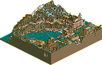
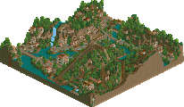
Voted for the Hurricanes. Park was just simply better in my opinion. The touches everywhere were the most fun part, although the park almost was perfect, it still fell a tiny bit short of my expectations, just cause the chemistry wasn't quite there imo. Still, there were some really cool things throughout. The ToT style ride was awesome, the Beemer was pulled off nicely (although a color change would have suited the park better imo. The underground chambers were a very nice touch, but I felt they were a bit redudant and gimmicky. I think maybe one or two of them at most would have been sufficiant, they got a lil old. Still, a cool added bonus to the park, made even better by the underground tour ride. The "water dive machine" did absolutely nothing for me, I think you guys could have added something a hell of a lot better there. The theming was cool, I liked the cascading water stuff, but the ride itself was pretty average.
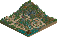
The LL park was pretty nice (pretty obvious who made this one), although it just didn't grab me. Enough for a regular season win IMO but not the playoffs against the caliber of park of AC. The Go-Karts were my favorite part of this one...the coaster was cool, but something we've now seen again and again. Not only that, but it took me minutse of waiting for the train to actually launch before realizing it was set on "Synchronize with Adjacent Stations", and when I finally did that...it crashed. The pink didn't really work for me that much either, but that's not quite as big of a problem.
Still a nice round...but an clear cut winner for me.
Before I say anything, I'd like to commend the Hurricanes on an excellent park. I could probably find little to pick at in terms of quality and well-roundedness.
That said there was one issue with this park that was very evident, which even without my preconceived bias would have become apparent. It looked as though the Hurricanes had taken everything that had worked this season (and previous seasons) for various teams throughout various parks and crammed it into one. The use of land blocks in waterfalls and such has been seen this season, and definitely with caves too. A lot of the big buildings seem to scream Myttica. If a certain element of this park makes one actually remember specific sections of another (i.e. the building with the vertical drop looking like a mini Myttica Hotel), more than just being similar in style, is that truly original? But by far the most apparent "borrowed, tried and true" aspect of this park was of course the setting. How many parks this season have been buildings built on cliffsides above or around a bay. Rockwood, LBRG, CoU, Disastrous Paradise to name just a few. Of course there's millions of ideas that you could spin out with a location like that, e.g. the dam (which was very cool). But I look at that aspect of this park and I see "This worked before, let's go for it again" instead of "Why don't we try this new idea?" I don't think it's a coincidence that the Flying Germans and the Hurricanes bring in basically identical concepts this week, it's a concept that seems to work effectively and so the first instinct is to go with it. But is it really an original setting?
Anyway I don't see us having much of a chance in this round and I will most likely be left in the dust writing this as far as what popular opinion is. But whatever. I'm sorry if this offends anyone especially about the caves and stuff.
No need to apologize for posting your opinions and raising a basic philosophical point that Ed would probably respond to in the form of a six page essay.
Since I'm not voting on this one, due to not having LL, I thought I'd give my opinion on Aviara Cove. I absolutely loved it. There were a lot of diverse and purposeful details, and I thought it all summed up well. The flower/fire poles around Aviara were cool, the dam, the ToT-type ride building, the test sub, and the archy and support structures were all very nice. I didn't care too much for parts of the submarine ride, since I don't like really sprawling rides with lots of underground areas, but I liked the flyer and the water coaster. The water coaster was simple, it was unique enough where I still enjoyed it. Plus, I do tend to favor more compact, "to the point", rides (which I sort of already said). And the first cave was pretty nice, but the other two could've be taken out (especially the one that I didn't think had any purpose). Anyways, I thought the park was generally very well executed with lots of atmosphere. I shall be looking at this one again.
I had to say it three times because this is far and away the best H2H park I've ever seen. It's phenemonal to me what you guys pulled off here. And I say this knowing who I'm speaking too cause it screams two names and two names only. You guys have impressed the hell out of me. I honestly have a whole new level of respect for your artistic abilities. This is just astounding to me. Really, really good.
I'm speaking of course about Aviara Cove (can't say that I like the name though. It's far too generic sounding. This is genius! It deserves a title that inspires the kind of awe that the park does. Something commanding. But I digress...)
If the Vehemences had made it to the playoffs to match up against this park, well the irony of that situation is just too much. To be on a team losing to this park. It's just too funny to me. But damn it, I'm digressing again.
I'll start with the negative stuff since I'm already singing your praises to the high heavens. The area with the B&M flyer was a bit of a letdown to me. The ride itself did nothing for me. This park deserves better than another Beemer. And that loop was painfully slow. It's not an awful ride, just that in comparision to it's surroundings it sticks out. In a bad way. And the station for that ride is a little drab too. I do like the support columns by the lift hill. The stacked block thing sortof works and sortf doesn't. By the lifthill it works very well. I think because you used varying thicknesses and dressed it with hanging vines. By the water, the support columns don't work. And yeah, the track color doesn't seem to fit too well either. And the spinning coaster train as theming thing - I've seen this before. I think it could fly in LL as animated theming, but amidst all the detail of RCT2, it doesn't really work for me and never has. Oh yeah, and I'm not liking the smoke puffs either. Ever.
But that's just one small piece of an otherwise immaculate tapestry of details. This has really got it all. Custom rides - that waterslide thing is wonderfully done, and the tower of terror ride looks a bit messy, but the glass windows at the top made it work for me. When you've got ride and theming working together to create an 'experience' than you've done well. And the building itself is really a marvel. I don't see Myttica at all in that. Myttica actually is not that impressive compared to the buildings people are making now in RCT2. Compare it to the two other RCT2 H2H parks this round. The structure is plain, and the details not as well crafted. But this building here, is better than anything in those other two parks. It's the kind of thing you least expect to see in RCT because it requires a level of planning and design that most people just aren't capable of. I say this knowing that I myself am not capable of this. It's real architecture in the game, not 'RCT architecture' and there's a big difference. Just fantastic.
Almost all of the buildings are well done. Nothing as singularly impressive as that hotel structure, but still excellent examples of small-scale structures. Lots of variations within the same theme. I'm glad people have discovered that buildings don't all need to be in the same color to fit with a theme. I guess that was a natural extension of RCT2's options though. Cause you see that all the time now. (And LL work looks really unimaginitive in comparison). I love the water pouring over some of the structures. And the dam structure is very well done with the running water visible inside it. Oh and all of that sunken city stuff too. Wow. And the arches undes the walkways. It's built like a real city. And those totems/torches. Beautiful. That's creativity to me. It's not the flashiest thing in the world, but it's something new and the presence of those kinds of things gives it an aura of 'newness'. A feeling that this is something I haven't seen before.
But what really sent me over the top, off the scale into 'holyshitwow' territory is when I saw those underground cave areas. Not only have you cleverly used the third dimension to fill in what would otherwise be wasted land space, but you made windows onto beautiful little tableau's that pester you to take a closer look and then reveal themselves as treasure troves of theming detail. Woah. I haven't seen anything like that in RCT before. Like that hidden treasure underneath the flyer station. And the fire god lair in the other corner. You've created a whole imaginary space. cg said something in X-Sector's park topic about the best parks allowing you to experience something. Well this really did that for me. The way you used space made this feel so much more real than just about anything else in the game. And then there was that huge room which the underground tour ride goes through. That gets it. That really gets it. People have been posting screenshots of their Magic Kingdom castles and their Main Street USA's for the longest time but you've got more of Disney in that small little space than all of those parks combined. And you did it undeground! You guys shock and amaze me. Honestly. I'm not worthy.
I also like how you've filled the space. I mean, really filled the space. There's that underwater sub ride. The underground tour ride.The monorails. They weave throughout the whole thing and pull it together. It's not a very big park, but it's just filled to the brim with fun stuff. Oh and the sign on the cliff at the entrance to the cove is neat too. I love that stuff. I love it cause you're not just building a park, you're creating landmarks. Stuff I want to take pictures of. And you know what pictures are? They're 'physical memories'. They're memorable images that exist on paper, not just in your mind. If I could, I would take a picture of that, which means it's something I'm going to remember. The more of that kind of stuff you can put in a park, the more I'm going to remember it when I exit the game. And even when I get up again the next day. This park doesn't even have a standout coaster and it's my favorite piece of RCT work in ages.
Brilliant work guys. I mean it.
After all that, there's really not much I can say about the Mollesters park. LL's got it tough these days. RCT2 perfection with all of the advancements like custom scenery and invisible track hacks and stackable land blocks, is so far above and beyond LL perfection, it just never would stand a chance. And this isn't LL perfection. It's pretty. It's definately got a sense of atmosphere. The coaster looks cool (though it crashes for me - which really kills it. ) And the starting delay thing continues to amaze me whenever I see it. You know what the coaster will do, I don't. So why make me wait 60 seconds to see it? I'm not that patient. Especially since 60 seconds feels like 5 minutes when you're waiting for something to happen. Not good. But the park itself is good work. It's just that 'good' work compared to 'omg I just had a heart attack because I love this so much' work fails to inspire much enthusiasm. But I know you guys spent a lot of your personal time putting this together too and I dont want you to feel like it was all for nothing. The Hurricanes park blowing my mind doesn't make your park any worse. I feel pretty stupid if I compare myself to someone like Einstein obviously, but it doesn't mean I'm stupid.
Very obvious who made both, or atleast, one of them of each matchup.
Damn, "person that made Avaria", you used to be one of the mediocre parkmakers around imo, and while the rest sat back on their lazy asses you improved to.. well. the best. seriously. (and now just let me hope i'm right about who i think is "the person that made Avaria".
that dinghie ride in the corner was cute. i too voted hurricanes. the ll park was a little dull and unorganised for me. also i didn't know how to get optic to work. i kept saying "waiting for permission to depart" for ages. when i unchecked the "synchronise" button it would go but later crash by the cobra roll. strange. a lot of effort was put into the rct2 park and it pays off positively. but these waterfalls slow the game down badly. fucking custom scenery...
Aviara in a walk for me. This is really a great H2H entry and a great combination of talents pooled together here. I agree with WME, that a certain parkmaker has really improved over the last year and become imo the best RCT2 parkmaker. Hoperfully we're talking about the same person.
I null voted as I currently don't have LL installed. Lame I know.
But I looked at the RCT2 and I was extremely impressed. I loved the cliffs and how the path goes around the top of them. The landscaping was quite excellent. The coaster was solid, the colours a little too bright and different from the surroundings for me. There were many ideas in here that I enjoyed and the large buildings containing large rides really worked for me. Great work.
I think it's obvious who made the 'Canes park, but I'm not too sure on the LL.
Anyway, Arriva Cove (A bus company for a name?) was the park I voted for, it was simply brilliant, the architecture was flawless IMO. The coaster did nothing for me though, I didn't really like the layout, theming or the colour of it. But I did like the way you used landblocks. Also, I respect the park because of how long it must have taken to get all of them hacks to work, especially the little dinghy ride, that was a nice little touch.
another vote i didnt vote for what is this crap, i goto view the topic to see the parks and download them and my vote has already been cast, I did not vote nor push null vote this is the first time i opened this topic and my vote is already cast, something is wrong there.
64 Comments
Corkscrewed Offline
Aviara Cove
DOWNLOAD HERE
MoLLesters
The Tissot Archipelago
DOWNLOAD HERE
Finals Park Match ONE Will be Due THURSDAY, April 28, 2005.
iris Offline
The LL park was pretty nice (pretty obvious who made this one), although it just didn't grab me. Enough for a regular season win IMO but not the playoffs against the caliber of park of AC. The Go-Karts were my favorite part of this one...the coaster was cool, but something we've now seen again and again. Not only that, but it took me minutse of waiting for the train to actually launch before realizing it was set on "Synchronize with Adjacent Stations", and when I finally did that...it crashed. The pink didn't really work for me that much either, but that's not quite as big of a problem.
Still a nice round...but an clear cut winner for me.
EDIT: Paragraphed it. Better bitch?
Corkscrewed Offline
Paragraphs.
(Thanks for the vote. Go Canes!)
Panic Offline
That said there was one issue with this park that was very evident, which even without my preconceived bias would have become apparent. It looked as though the Hurricanes had taken everything that had worked this season (and previous seasons) for various teams throughout various parks and crammed it into one. The use of land blocks in waterfalls and such has been seen this season, and definitely with caves too. A lot of the big buildings seem to scream Myttica. If a certain element of this park makes one actually remember specific sections of another (i.e. the building with the vertical drop looking like a mini Myttica Hotel), more than just being similar in style, is that truly original? But by far the most apparent "borrowed, tried and true" aspect of this park was of course the setting. How many parks this season have been buildings built on cliffsides above or around a bay. Rockwood, LBRG, CoU, Disastrous Paradise to name just a few. Of course there's millions of ideas that you could spin out with a location like that, e.g. the dam (which was very cool). But I look at that aspect of this park and I see "This worked before, let's go for it again" instead of "Why don't we try this new idea?" I don't think it's a coincidence that the Flying Germans and the Hurricanes bring in basically identical concepts this week, it's a concept that seems to work effectively and so the first instinct is to go with it. But is it really an original setting?
Anyway I don't see us having much of a chance in this round and I will most likely be left in the dust writing this as far as what popular opinion is. But whatever. I'm sorry if this offends anyone especially about the caves and stuff.
Corkscrewed Offline
Xcoaster Offline
Coaster Ed Offline
I had to say it three times because this is far and away the best H2H park I've ever seen. It's phenemonal to me what you guys pulled off here. And I say this knowing who I'm speaking too cause it screams two names and two names only. You guys have impressed the hell out of me. I honestly have a whole new level of respect for your artistic abilities. This is just astounding to me. Really, really good.
I'm speaking of course about Aviara Cove (can't say that I like the name though. It's far too generic sounding. This is genius! It deserves a title that inspires the kind of awe that the park does. Something commanding. But I digress...)
If the Vehemences had made it to the playoffs to match up against this park, well the irony of that situation is just too much. To be on a team losing to this park. It's just too funny to me. But damn it, I'm digressing again.
I'll start with the negative stuff since I'm already singing your praises to the high heavens. The area with the B&M flyer was a bit of a letdown to me. The ride itself did nothing for me. This park deserves better than another Beemer. And that loop was painfully slow. It's not an awful ride, just that in comparision to it's surroundings it sticks out. In a bad way. And the station for that ride is a little drab too. I do like the support columns by the lift hill. The stacked block thing sortof works and sortf doesn't. By the lifthill it works very well. I think because you used varying thicknesses and dressed it with hanging vines. By the water, the support columns don't work. And yeah, the track color doesn't seem to fit too well either. And the spinning coaster train as theming thing - I've seen this before. I think it could fly in LL as animated theming, but amidst all the detail of RCT2, it doesn't really work for me and never has. Oh yeah, and I'm not liking the smoke puffs either. Ever.
But that's just one small piece of an otherwise immaculate tapestry of details. This has really got it all. Custom rides - that waterslide thing is wonderfully done, and the tower of terror ride looks a bit messy, but the glass windows at the top made it work for me. When you've got ride and theming working together to create an 'experience' than you've done well. And the building itself is really a marvel. I don't see Myttica at all in that. Myttica actually is not that impressive compared to the buildings people are making now in RCT2. Compare it to the two other RCT2 H2H parks this round. The structure is plain, and the details not as well crafted. But this building here, is better than anything in those other two parks. It's the kind of thing you least expect to see in RCT because it requires a level of planning and design that most people just aren't capable of. I say this knowing that I myself am not capable of this. It's real architecture in the game, not 'RCT architecture' and there's a big difference. Just fantastic.
Almost all of the buildings are well done. Nothing as singularly impressive as that hotel structure, but still excellent examples of small-scale structures. Lots of variations within the same theme. I'm glad people have discovered that buildings don't all need to be in the same color to fit with a theme. I guess that was a natural extension of RCT2's options though. Cause you see that all the time now. (And LL work looks really unimaginitive in comparison). I love the water pouring over some of the structures. And the dam structure is very well done with the running water visible inside it. Oh and all of that sunken city stuff too. Wow. And the arches undes the walkways. It's built like a real city. And those totems/torches. Beautiful. That's creativity to me. It's not the flashiest thing in the world, but it's something new and the presence of those kinds of things gives it an aura of 'newness'. A feeling that this is something I haven't seen before.
But what really sent me over the top, off the scale into 'holyshitwow' territory is when I saw those underground cave areas. Not only have you cleverly used the third dimension to fill in what would otherwise be wasted land space, but you made windows onto beautiful little tableau's that pester you to take a closer look and then reveal themselves as treasure troves of theming detail. Woah. I haven't seen anything like that in RCT before. Like that hidden treasure underneath the flyer station. And the fire god lair in the other corner. You've created a whole imaginary space. cg said something in X-Sector's park topic about the best parks allowing you to experience something. Well this really did that for me. The way you used space made this feel so much more real than just about anything else in the game. And then there was that huge room which the underground tour ride goes through. That gets it. That really gets it. People have been posting screenshots of their Magic Kingdom castles and their Main Street USA's for the longest time but you've got more of Disney in that small little space than all of those parks combined. And you did it undeground! You guys shock and amaze me. Honestly. I'm not worthy.
I also like how you've filled the space. I mean, really filled the space. There's that underwater sub ride. The underground tour ride.The monorails. They weave throughout the whole thing and pull it together. It's not a very big park, but it's just filled to the brim with fun stuff. Oh and the sign on the cliff at the entrance to the cove is neat too. I love that stuff. I love it cause you're not just building a park, you're creating landmarks. Stuff I want to take pictures of. And you know what pictures are? They're 'physical memories'. They're memorable images that exist on paper, not just in your mind. If I could, I would take a picture of that, which means it's something I'm going to remember. The more of that kind of stuff you can put in a park, the more I'm going to remember it when I exit the game. And even when I get up again the next day. This park doesn't even have a standout coaster and it's my favorite piece of RCT work in ages.
Brilliant work guys. I mean it.
After all that, there's really not much I can say about the Mollesters park. LL's got it tough these days. RCT2 perfection with all of the advancements like custom scenery and invisible track hacks and stackable land blocks, is so far above and beyond LL perfection, it just never would stand a chance. And this isn't LL perfection. It's pretty. It's definately got a sense of atmosphere. The coaster looks cool (though it crashes for me - which really kills it. ) And the starting delay thing continues to amaze me whenever I see it. You know what the coaster will do, I don't. So why make me wait 60 seconds to see it? I'm not that patient. Especially since 60 seconds feels like 5 minutes when you're waiting for something to happen. Not good. But the park itself is good work. It's just that 'good' work compared to 'omg I just had a heart attack because I love this so much' work fails to inspire much enthusiasm. But I know you guys spent a lot of your personal time putting this together too and I dont want you to feel like it was all for nothing. The Hurricanes park blowing my mind doesn't make your park any worse. I feel pretty stupid if I compare myself to someone like Einstein obviously, but it doesn't mean I'm stupid.
PS - Hurricane parkmakers (who shall remain unnamed), thank you.
Marshy Offline
Evil WME Offline
Damn, "person that made Avaria", you used to be one of the mediocre parkmakers around imo, and while the rest sat back on their lazy asses you improved to.. well. the best. seriously. (and now just let me hope i'm right about who i think is "the person that made Avaria".
I might comment more later .
posix Offline
i too voted hurricanes. the ll park was a little dull and unorganised for me. also i didn't know how to get optic to work. i kept saying "waiting for permission to depart" for ages. when i unchecked the "synchronise" button it would go but later crash by the cobra roll. strange.
a lot of effort was put into the rct2 park and it pays off positively. but these waterfalls slow the game down badly. fucking custom scenery...
Toon Offline
Metropole Offline
But I looked at the RCT2 and I was extremely impressed. I loved the cliffs and how the path goes around the top of them. The landscaping was quite excellent. The coaster was solid, the colours a little too bright and different from the surroundings for me. There were many ideas in here that I enjoyed and the large buildings containing large rides really worked for me. Great work.
Metro
trav Offline
Anyway, Arriva Cove (A bus company for a name?) was the park I voted for, it was simply brilliant, the architecture was flawless IMO. The coaster did nothing for me though, I didn't really like the layout, theming or the colour of it. But I did like the way you used landblocks. Also, I respect the park because of how long it must have taken to get all of them hacks to work, especially the little dinghy ride, that was a nice little touch.
riven3d Offline
Marshy Offline
trav Offline
JKay Offline
riven3d - I know why you can't vote, but don't think I'm at liberty to say why. I'd IM/PM corkscrewed or iris to get an explanation.
...
On the parks, I'm pretty sure I know who I'm voting for, but will wait until I can look at both parks upclose tonight....
Six Frags Offline
SF
Coaster Ed Offline
posix Offline