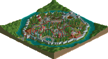
Park / Outpost Prehistorica

Park_950 Outpost Prehistorica

Choose the better park

51 Comments

This park shares comments with 1 other park(View Park)
  • Corkscrewed%s's Photo
    Flying Germans
    Disastrous Paradise

    Posted Image Posted Image

    Posted Image

    DOWNLOAD HERE


    IIIcons
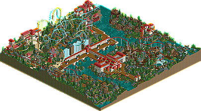
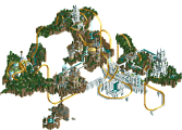
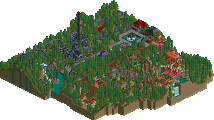
    Outpost Prehistorica

    Posted Image Posted Image

    Posted Image

    DOWNLOAD HERE


    H2H Playoffs Begin MONDAY, APRIL 11, 2005!!!
    Get your parks in by then!!
  • jon%s's Photo
    I voted for the Germans. It's my team after all.

    I liked the IIICons park, it had a nice feel to it. I was not keen on the rides themselves but the architecture and landscaping was wonderful. Didn't feel very prehistoric IMO.
  • Marshy%s's Photo
    The disaster park is excellent, the drop on the splash boats is awsome. The architecture on the hills was pretty good, but wasn't too exciting. The explosions were a great effect, but to be totally honesty with you, I'm bored of these park-opening explosions, but because this is a disaster park, I guess it works.

    I was suprised by the prehistoric park, it was visually brilliant, but I really enjoyed it. It was plain and the architecture wasn't special, but it fitted the theme really nicely.

    After studying the 2 a bit more, my vote is going for the IIIcons park.
    Marshy
  • chapelz%s's Photo
    Loved the architecture in the germans park. So I voted for the Germans park.
  • GigaForce%s's Photo
    Can't believe im actually voting on an RCT2 park, but Flying Germans get my vote
  • tracidEdge%s's Photo
    ^ kind of hard not to vote for an rct2 park here.

    But anyway, my vote also went to the germans.
  • artist%s's Photo
    Hmm they both had flaws.

    Germans park was great, themeing was great and so were the recs of volcanos,oil rigs,tidal waves etc. But the architecture was extremely boring and dull, it is the same sort of theme i have seen like a hundread times and the colour scheme was pretty dull. That wasnt the parks major flaw, the major flaw was that it had no strong coaster, in a way if this park had a coaster it would have been 10x better. shame really.

    IIIcons park was also great but again had flaws the architecture was very weird and imo didn't execute the dino theme that well, although it was a good idea to do the buildings like that i just don't think they came across as good as they could of. The thing i did like about this park was the coasters, they were amazing and the landscaping was perfect in some parts, again if it had better architecture this park would have kicked some serious arse.

    Anyways after ALOT alot of thinking i decided to vote for the IIIcons, their entry just seemed more complete and stronger, really a hard one for me to vote on.

    Ahh well.
  • Steve%s's Photo
    This is sort of odd, seeing all these votes getting directed towards the Germans. Sure, it was a nifty little park, and I enjoyed it, but I thought it had more cons than pros, where as the IIICons didn't. Disaster is cool, I'll give it that much, but I just don't like parks that have huge amounts of explosions and have all these new windows pop up. A terrible way open a park, in my opinion. I enjoyed the river ride here, and I liked the architecture, but some of it lagged a bit. Some parts looked consistant, and some didn't. Don't get me wrong, I liked it well enough, just not as much as the IIICons. Now, Outpost is excellent, in my opinion. It has fantastic duelers, which used it's terrain nicely. I thought a few parts of the architecture were a bit unspired, but the large white buildings and the monorail structures were fabulous.

    Still confused on how it's so one-sided, but good job to both teams for getting in completed parks. Change of pace from last week. :)

    Edited by Steve, 28 March 2005 - 04:27 PM.

  • mantis%s's Photo
    Steve, if you hold the backspace button when you open the park then all the windows disappear.

    I'll look at the parks in a bit and post my thoughts. They both look great from the overviews.
  • chapelz%s's Photo

    This is sort of odd, seeing all these votes getting directed towards the Germans. Sure, it was a nifty little park, and I enjoyed it, but I thought it had more pros than cons, where as the IIICons didn't.

    Hmm...
  • Steve%s's Photo
    lol. Thanks chapel.

    Yeah mantis, I knew that, but it's still so annoying. :p
  • Marshy%s's Photo
    I've been looking at the Germans park for a while now, and I only just noticed the wave over the Mine Ride...sweet!
  • Toon%s's Photo
    Visually, the Germans park was more grabbing, but the coasters in the IIIcons were way better than any rides in the Germans park. I think a lot of people make there vote based on first appearance, but this really should be a lot closer in my opinion. For the record tho, this is a ptarmigan:

    Posted Image
  • cg?%s's Photo
    What a very pretty bird.
  • artist%s's Photo
    chubby little fella
  • JKay%s's Photo

    Visually, the Germans park was more grabbing, but the coasters in the IIIcons were way better than any rides in the Germans park.

    Ditto. This was a tough choice.

    The Germans park was excellent, but it just didnt flow like a park should imo. It mainly had to do with the brown architecture; although structurally brilliant, it got pretty old pretty quick. The volcanos were incredible, especially the lavaflows, as was the custom wave over the track. Whoever made this obviously has played LL before. :yup: Not a bad park it all, it just didn't hold my attention for as long as I hoped. Oh, and i believe you guys meant Pterodactyl Flyers....


    The IIcons park was refreshingly fun. So many rides, so many little touches; it came together very nice. There were some flaws, like the sloppy entrance and somewhat ordinary architecture in places. The rides (duelers in particular) were all stellar. The abundance of rides really held the park together. Without so many rides, this park would've been quite boring imo. You guys did good with ride integration as well.

    In the end, my vote went to the IIcons for having the better rides and theme integration into the rides...
  • Roomie%s's Photo
    I agree with Toon and Jkay. The IIIcons got my vote. it was a tough choice and i had to stare at them for a good period of time but the IIIcons just made me smile that little bit more... And afterall its a game so it should make me smile :)
  • Jacko Shanty%s's Photo
    I wish the coaster in PJ was in DP. Then it would be easier. Both parks had their goods and bads. I liked the Germans' amazing architecture.. (how can 2 colors look so good?). Those volcanoes were quite cool also. DP had an original concept.. sort of like Jurassic Park, you know? Except with rides. A Kiddie Jurassic Park Amusement thing. I loved the use of single-wide paths though, which can be tricky to pull off - which it was, most of the time.

    I ended up voting for Disatrous Paradise though. The architecture was just so jaw-dropping (although PJ's arch had originality, there just needed to be more, I suppose). I liked both parks though, nice work 2 all!
  • Corkscrewed%s's Photo
    What I'd like to know is how you synched those duelers even though the stations aren't next to each other. That's a very nifty hack.

    And personally, to me, this is rides vs theming. Most people are more swayed by theming. The more indepth people actually look at rides. ;)
  • cg?%s's Photo

    Most people are more swayed by theming. The more indepth people actually look at rides.


    Corscrewed I'd like to think of myself as an "in-depth" person, but if forced to choose between theming and coasters, I'd choose theming. This is a parkmaking competition, and theming is more important to the overall experience of a park than coasters.

    Just as a real world example which is the better park: Magic Mountain or Disneyland?

    Maybe you would choose Magic Mountain, but "I'm going to Disneyland!", or would be, and it's because I'm "in-depth".