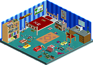
Is that an RCT2 park by the MoLLesters? I'm stunned.
The funny thing is, I know of another one of these bedroom RCT2 H2H parks someone was working on for the Hurricanes before the redraft. Did everybody just come up with this idea on their own? It looks like there's some clever ideas there with the spilled drinks and whatnot but I don't know, the colors you chose don't really go together very well. And there's far too much empty space. The details look pretty cool though. I'd like to see those up close.
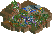
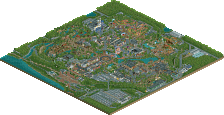
And the Hurricane park looks rather uninspired to me. I'll have to take a closer look, but it seems like you built some cBass type skyscrapers and then just gave up. No station buildings? No coaster theming at all? I guess you tried to be funny about it but come on, anyone can half finish a park. That's part of the challenge of the contest. It looks like the whole thing could be done in a couple days.
I'm sorry but after the matchup in Week 7, this is rather depressing to me. This is the kindof stuff that makes me agree with Posix about the '1/4 tile style' being bad for the game.
Man the bedroom parks were brilliant, i loved both of them. Exellent TT work.
It was like after seeing the first one i was left thinking they could of done some other stuff in it, then i open the other one and it's all there.
Hurricanes park was alright, i really like the skyscrapers but the rest was a little blah.
Voting would have been hard if they were agaisnt each other luckily for me they wern't so my voting was easy.
I was about to delete the ^ post before I realized that they weren't revealing anything, since I'd already announced who made the IIIcons park because it was a victory by forfeit.
Yeah so that means three pairs of people decided to do a giant bedroom in RCT2 individually. Kindof makes you go huh. It worked out to both of your benefit though that you released it in the same week cause otherwise one of them would have been percieved as a copy. For me, I saw DJ and Bob's version first, then the IIICons, then this one so by the third time it kindof loses it's magic. And I think DJ and Bob's (unfinished) version is still the best one I've seen. I guess ultimately the problem I have with these parks is that they don't seem to play to RCT's strengths very well. Like, is this supposed to be an actual park or just a large sculpture? Cause if it's an actual park than you should put more thought into how people would go from ride to ride. And how things would look from the peep's view. What's the main attraction? Do the rides interact with the objects in the room or is it all just scenery? And if it's just a sculpture, than it's kindof a missed opportunity to be something more.
I null voted this one because I won't willingly vote myself out of the playoffs, and I don't want to vote strategically either. Since neither park really shined to me, I figured that would be best.
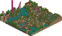
Suck City - The incompleted-ness of this park really brought it down for me. Un-themed coasters could be expected in a Deathmatch, but not H2h.....altho I assume unforseen computer problems were to blame for that. I really liked tall white building near the top corner of the map. very stylish. The rest was just stale and quite unrefined. It seems like you guys tried to throw in random gimmicks to make up for the unfinished portions; like that fountain of piss and the junky buildings with the all the fisherman lights.....all very un-appealing when said and done.
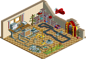
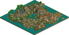
Bedroom 101 - Solid idea with mediocre execution (*thanks yyo*). There's just something about it that seems so un-RCTish. The only aspect of the park that really had any meaning to me was the overview. Zooming in just had no appeal to me, neither did any of the rides. Still, I respect it for the fact that it was finished and its consistancy. Enough to get my vote.
Mollesters get my vote, but neither park really did much for me.
after this week is over I think we should post some of those old screens of mine and janus' room for the heck of it/for the sake of comparison/for nostalgia.
Why should I be kicking myself? im not mad about anthing this week really, even tho its like the twilight zone with all the fuckin room parks... but yeah I would kinda like to kick iris for the re-draft coz P_BOB & and DJ's room was sick, you guys should finish it, you were pretty close if I remember right..
Come on guys some comments on the actuall 2 parks would be nice rather than on Kumba.
If your guys park had been finnished i think it could of been awesome but a kind of rushed ending let it down. Happens to everyone though (look at our park last week)
You know...I kinda doubt that this was 'wiped out by a computer problem'. Kumba was obviously aware that a forfeit would actually help his team, so he just had his team throw together something that would symbolize a forfeit, just indirectly. They don't want to win this week because they want to face the MoLLesters in the playoffs so they made sure they didn't. Whether you want to call that smart or cheap is up to you...but the whole 'wish we could have finished it' thing just isn't going over with me.
Anyways, I think this was the more adventorous of the room ideas, although the other was more skillfully pulled off. Still, some really neat touches like the spilled drink and the bed was pretty nice. Great job and congrats on the forfeit win.
51 Comments
Corkscrewed Offline
Another Bullshit Night in Suck City
DOWNLOAD HERE
MoLLesters
Bedroom 101
DOWNLOAD HERE
WEEK 9 parks are due on WEDNESDAY, MARCH 16, 2005
Titan Offline
disneylandian192 Offline
Coaster Ed Offline
The funny thing is, I know of another one of these bedroom RCT2 H2H parks someone was working on for the Hurricanes before the redraft. Did everybody just come up with this idea on their own? It looks like there's some clever ideas there with the spilled drinks and whatnot but I don't know, the colors you chose don't really go together very well. And there's far too much empty space. The details look pretty cool though. I'd like to see those up close.
And the Hurricane park looks rather uninspired to me. I'll have to take a closer look, but it seems like you built some cBass type skyscrapers and then just gave up. No station buildings? No coaster theming at all? I guess you tried to be funny about it but come on, anyone can half finish a park. That's part of the challenge of the contest. It looks like the whole thing could be done in a couple days.
I'm sorry but after the matchup in Week 7, this is rather depressing to me. This is the kindof stuff that makes me agree with Posix about the '1/4 tile style' being bad for the game.
Corkscrewed Offline
Also, a computer crash wiped out like 65% of what would have gone on the coaster area.
Kumba Offline
artist Offline
It was like after seeing the first one i was left thinking they could of done some other stuff in it, then i open the other one and it's all there.
Hurricanes park was alright, i really like the skyscrapers but the rest was a little blah.
Voting would have been hard if they were agaisnt each other luckily for me they wern't so my voting was easy.
Anolis Offline
Corkscrewed Offline
I was about to delete the ^ post before I realized that they weren't revealing anything, since I'd already announced who made the IIIcons park because it was a victory by forfeit.
Evil WME Offline
Coaster Ed Offline
I null voted this one because I won't willingly vote myself out of the playoffs, and I don't want to vote strategically either. Since neither park really shined to me, I figured that would be best.
Marshy Offline
JKay Offline
Suck City - The incompleted-ness of this park really brought it down for me. Un-themed coasters could be expected in a Deathmatch, but not H2h.....altho I assume unforseen computer problems were to blame for that. I really liked tall white building near the top corner of the map. very stylish. The rest was just stale and quite unrefined. It seems like you guys tried to throw in random gimmicks to make up for the unfinished portions; like that fountain of piss and the junky buildings with the all the fisherman lights.....all very un-appealing when said and done.
Bedroom 101 - Solid idea with mediocre execution (*thanks yyo*). There's just something about it that seems so un-RCTish. The only aspect of the park that really had any meaning to me was the overview. Zooming in just had no appeal to me, neither did any of the rides. Still, I respect it for the fact that it was finished and its consistancy. Enough to get my vote.
Mollesters get my vote, but neither park really did much for me.
Edited by JKay, 08 March 2005 - 11:06 AM.
yyo Offline
I thought it would be the other way around.
For a second I was hoping the MoLLesters park was LL and all that was made entirely out of coaster track. Ah well.
penguinBOB Offline
Blitz Offline
I'd pay money to see how Kumba is takin' this.
Jacko Shanty Offline
Kumba Offline
Roomie Offline
If your guys park had been finnished i think it could of been awesome but a kind of rushed ending let it down. Happens to everyone though (look at our park last week)
iris Offline
Anyways, I think this was the more adventorous of the room ideas, although the other was more skillfully pulled off. Still, some really neat touches like the spilled drink and the bed was pretty nice. Great job and congrats on the forfeit win.