Park / La Barranca Roja Grande
-
 12-February 05
- Views 10,125
- Downloads 584
- Fans 0
- Comments 34
-
 No fans of this park
-
 Download Park
584
-
 Objects
141
-
 Tags
Tags
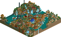
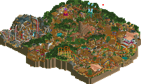
La Barranca Roja Grande by The Hurricanes
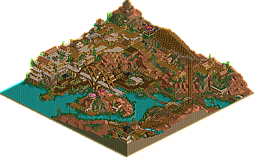
I was quite impressed with the overview of this park, but that changed slightly when I viewed it in game. The architecture was a little too simple for my liking and was not dispersed evenly enough throughout the park imo. To say the least, it was "clumpy". I also felt the colors blended too much and there wasnt enough contrast. Those woods walls didn't really help anything either. The woodie was decent, but had some strange "bumps" in it that really disctracted from the flow. The bridge was very cool, but seemed un-needed, gimicky and not very fitting for the theme. Overall, a nice park, but not the best I've seen from the canes' this season
Cliffs of Utopia by The Flying Germans
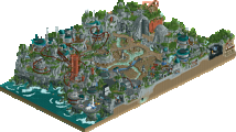
Wow, what a gorgeous park. I'm pretty sure I know who had a hand on this. The park had atmosphere galore and the way the architure was built into the cliff sides was just stunning. The woodie was VERY well-done imo; I especially loved that first drop. I think the most impressive thing was how many rides were actually incorporated into this park without making it look cluttered or over-themed. I mean 4 flat rides, a monsterous woodie, a go-kart track and a splash boats ride; it really shows skill to incorporate that many rides into such a small area but still maintaining atmosphere and flow of architecture. I commend which ever Germans built this park, because it demonstrates loads of skill and was near flawless.
Excellent matchup, but my vote goes to the Germans.
Their entry was fun, and different. I haven't seen that spanish theme in a while, so I was pleased. The bridge was VERY well done, and nice eyecandy. The coaster was fun and different, I really enjoyed it.
The German's entry was nice and all, but I didn't see the real skill to their architecture. There was obviously just a lot of stacking involved. I love that type of block, but it was horribly over-used and killed
Nice job to the both of you though..
Corkscrewed Offline
Hurricanes 25
Flying Germans 53
The Hurricanes suffer their first loss of the season and drop to 3-1-1
The Flying Germans improve to 2-3-0 and jump into second place in the South over the idle IIIcons.
The Hurricanes' La Barranca Roja Grande was made by... hobbes and Drew.
The Flying Germans' Cliffs of Utopia was made by valp and X-Sector. Noooo... actually, NOT X-Sector. The other guy also has a hyphenated name where one half is a letter and the other is a word that starts with an 'S.' Yup, none other than Splash-O! Valp and Splash-O, congratulations on a fine park!
I knew this would be trouble when I saw it. Both parks used the same formula, just different themes, so it'd come down to what people preferred. And in H2H, Schuessler-style isn't really going to get it done in most cases when it goes up against a "busier" style. I don't think LBGR got enough credit, really. It is extremely elegant, and the architecture is simple for a reason: it fits the story. The theme was based on a sort of Native American cliff dwelling people, and you're not going to see ornate, Gothic-intense detail in those sorts of buildings. So their park had a very nice charm that I personally think a lot of people overlook, simply because the "lack of stuff" bores them.
That's not to say Cliffs of Utopia was bad... this was very good as well. The architecture is a bit "messy," but more to classicists than most people. The landscaping is quite impressive, and the beauty here is what really pulls you in. Treeing is pulled off brilliantly, and you just get a great feeling looking at it. It feels serene, peaceful, and relaxing, whereas LBGR gives off more of a parched, arid feeling that's not as psychologically attractive.
Either park would have definitely deserved the win. They really are great works. CoU is definitely Team Po6's best park of the season, and while I'm disappointed that our team can't go undefeated, at least we lost to quality. I can respect that.
So congrats to both teams for making our second one-match week a great success! Hurricanes will have to rebound from this (we can't just assume the Vehemences will lose again), and the Flying Germans can use this as a great momentum builder heading into their next match.
So. Who made Utopia's wooden coaster? I must know.
But, whatever.
Congratulations F(a)Gs...
(Also, Corky: LBRG
Anyway great work Splash and Valp, excellent even since it flowed so well.
ride6
Corkscrewed Offline
You know what I mean by "Schuessler-type" parks. And if you trying to say that I'm making a lame excuse for our loss... well, I expect better of you than to be that irrational.
Anyway, great job all four of you. Two great parks from four designers I don't really see much of, so well done.
La Barranca Roja Grande was definitely a more down-to-earth park, but that doesn't mean it was any worse. Here the buildings-built-into-the-cliffs idea was indeed pulled off masterfully, better so I thought than in CoU. While the architecture was simple in wall texture choice and other aspects, it evoked very well a simply built Spanish settlement somewhere in a canyon in the Arizona desert (however, not so well an Indian settlement =P). The foliage at the bottom of the canyon was also perfect. The woodie had its share of problems, for example that unnecessary 360-degree turn right after the far turnaround, but it was also more inventive than the one in CoU, what with the water splash, and the second drop being the highest and going right down to the riverbed, Steel Phantom style. The bridge was also brilliant. Sure, it might have been a little imposing, but there are towns in which a bridge is the biggest feature which still look nice.
I'm not gonna cast a vote just yet but I might find myself eventually going for Barranca, because it pulled off so well the gorgeous image of a Spanish mission town in a Southwest canyon, in basically the exact form that I would always imagine it in. For Cliffs, there were some things I would switch around (such as the predominance of marble architecture) before it would truly capture the imagination in its finest form. That aside, this might have been the finest H2H round yet this season.
And as it seems that everyone suddenly knows how to build kickass woodies, if we have indeed entered a renaissance of the "landscape woodie" then I have not been happier about anything RCT related in a very long time.
Just got home from a trip with no internet, and it's nice to see a victory.
(BTW... I did the coaster
Corkscrewed Offline
Good job.
yeah i might, but that's up to you guys to judge. If i am do i get any special reward ?
Nah just kidding.
Anayway, thanks for those who vote for CoU. Very appreciated.
So Valp did the coaster lay out, and all the rest was mostly done by me.
I hope you all saw those little details which really add a lot to the atmosphere. I was a bit affraid that a lot of stuff wouldn't be seen by you guys, like the bridge with the waterfall at the edge of the map where those go karts run over. But i guess i was wrong.
La Barranca Roja Grande, was a very good park in my eyes. The coaster didn't really flow, but that's what made the coaster so good in my eyes. It just fit in perfect with the surrounding dry, rough bare landscape. The bride was really cool, and the overall feel was very good. But that's where it ends...the architecture wasn't too good and the park was a bit too empty...If there would have been more to see, it would have probbably resulted into a much closer vote.
But still a very nice park, well done.
Splash