Park / Malaria
-
 31-January 05
- Views 10,927
- Downloads 513
- Fans 0
- Comments 36
-
 No fans of this park
-
 Download Park
513
-
 Objects
159
-
 Tags
Tags
![park_4178 [H2H8 Grand Finals] Heaven's End](https://www.nedesigns.com/uploads/parks/4178/aerialt3929.png)
![park_2401 [H2H6] R3 - Hurricanes - Avatar](https://www.nedesigns.com/uploads/parks/2401/aerialt2145.png)
Corkscrewed Offline
Space Lake River Shrine
DOWNLOAD HERE
Vehemences
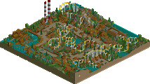
Malaria
DOWNLOAD HERE
WEEK 6 parks are due on THURSDAY, FEBRUARY 10, 2005.
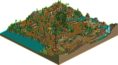
i love the mini steel in the vehemence's project, that area of the park was in my opinion the better of the park. the rest looked a bit rushed. i think the tree is pretty well pulled off. it would be cool if it was totally made out of track like in "Earth".
still, its gonna be tight.
Richie Offline
The Vehemences park was cool, but it was sooo brown. And i hate red/yellow combo flowers. The tree although a nice attempt, didnt really look that good, it would have been much better if it had walkways and stuff like a treehouse. The woodie was ok, but wasnt themed very well. The kiddie coaster was themed very well, loved the tunnel of bushes it went through, the only problem was the 3 lifts, and it went ultra slow.
MoLLesters get my vote.
Corkscrewed Offline
wow thats close
I did not really care for either, so I went Vehe for strategy reasons
I went Vehemences for just a couple of reasons- First off the amount of interesting material. The MoLLsters park was excellent however the majority of the stuff with simply archetecture and many of the trackitecture add-ons were repeated many times throughout the park. Most of the trackitecture didn't seem to have a purpose either... The hover boat thing was awasome and the beema was excellent except for the fact that you gave in and used trim breaks. Personally I see trims as a way to counter a mistake in overall design without changing the layout. No matter how good the layout is I have to count that against it. The Vehemences wooden coaster, dispite lacking trims, was far worse however. On the other hand their park displayed more than reasonible amounts of interesting archetecture and ideas that while done before were made to look fresh and new. The MoLLsters park had the better ideas, I would've loved to see a Daemon-style coaster for the "Time Machine" and a verical stall coaster coming out of that building in the middle of that lake. But alas, it coundn't be...
It's a painful thing for me though because I'd like to vote for both.
ride6
Space Lake River Shrine was one great park. The sculptures were well done, the rides were themed appropriately, and the coaster is right up there with the suspended from SG as probably my favorites so far in H2H. Good landscaping, nice buildings, good park.
Malaria, on the other hand, was another great park. Sure, the wooden coaster was unorthodox, and the mini was very slow, and there was just so much brown... but it all comes together. The tree is absolutely wonderful- one of the best RCT2 sculptures I've seen, and the whole mysterious island/indian thing works very well. Good landscaping, nice buildings, good park.
Where does my vote go?.... Originality is key.
The MoLLesters are a powerful team- they've got one heck of a lineup. Still, in five weeks of competition including four of their parks, all we've seen from them is the same basic technological/futuristic theme dressed up with different little ideas, colors, and rides. It's been several weeks now knowing what to expect, and honestly, I'd like to see something different. What happened to the Blood Islands, the Spirits Bays, the Anuradhapuras?
Tech vs. Shrek? I've seen quite a bit of Tech lately. In a close one, I choose "Shrek."
Malaria is a nice park. It is. I enjoyed looking at the architecture and the placement of the flats is well done. I also couldn't take too many points off for the wooden coaster scaling and wrapping around the mountain, nor for the idea of the tree.
But it's not that I want to see the parkmaker's name figuratively stamped upon every face of the park screaming "You all know who did this." That would ruin the surprise and the fun of mentally guessing. It's that I want to see a sign that not anyone could have, or would have, done something like this. I'm not harping on the tree in the park, because that was a nice exception. It just looks as though Malaria was built in the general NE RCT2 image of today, not in someone's unique and original image of what it should be. It looks like the constructor of the buildings and other things in the park was simply an agent of the NE style, not of his own style.
I look at the building spanning the path near the park entrance (the one with portcullis doors), or the one to the right of the entrance, or the station of the wooden coaster. That I can name off the top of my head, Turtle, Titan, WME, slob, OCF, ride6, or at least two people on the Vehemences might have built something like that. Now I'm not criticizing any of the above parkmakers because they've managed to use that style and mix it in with unique, individual, and original stuff, which is laudable. I look at a Turtle park, or a WME park, and I see Turtle or WME. But I don't see "creator of park" here alongside those kind of buildings. That I believe is this park's main drawback. It's too anonymous.
Valp, you may be right. We might have gone one too many on the futuristic parks. But at least this park isn't at all Hanson, or Symphony of Pollution, or Kihme. It's got it's own style - less cluttered and with more majestic buildings. Judging by the other parks it doesn't look like Loopy, rctfreak, roomie, thorp, Twisted or Micool might have built something like this. That I consider one of its nicest aspects.
Anyway, good job to the Vehemences and good luck to both teams as this plays itself out.
on the second look (to post about it) i got more of a sense that i liked some parts of it. If there's one parkmaker missing in that above list it would have to be posix. No, the buildings have nothing to do with that, but look at those paths and double fences. I think that aspect is quite possibly the best of the park. I do agree with panic that seems that these two parkmakers, probably lesser known parkmakers pulling out their very best, seem to take all kinds of things from other parkmakers and blend them together. I think it does that, blend together, but there is something telling you there is something missing, and i think that's what panic pointed out. Still, the building near totem is lovely. I think what kills me is the inconsistency of it all. It's.... strange almost haha. And the tree is hideous, with that branch sticking out and stuff. The idea isn't original at all either... I think i'll make an awesome, original tree once. One that really captures the majestic feeling this one (and others imo) were trying to capture. I'd say make those branches long and covering paths, add some leaves later but not too many. No one wants that ugly 1/4th tile with the round green blob to turn big now do they? Anyways, haven't voted yet but if the LL park is less cluttered as was above mentioned, i'll presume it will go to the LL park. If it isn't great either i guess i'll have to reconsider and think about it...
I'd like to see the MoLLesters switch it up a bit, though.
The Coaster is too slow imo
The Vehemences looks like a bad copy of slob or steve, especially when you look at the architecture. The gardening was nice but that was the only thing I like in this park
So the Mollesters get my vote
I voted for Malaria. Great little park but the beemer in the other park was great.
-X-