Park / Paradise Island
-
 11-January 05
- Views 11,374
- Downloads 689
- Fans 1
- Comments 43
-
1 fan
 Fans of this park
-
 Download Park
689
-
 Objects
233
-
 Tags
Tags
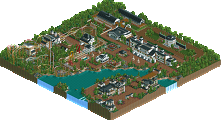
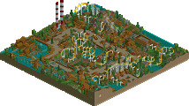
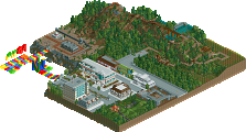
Corkscrewed Offline
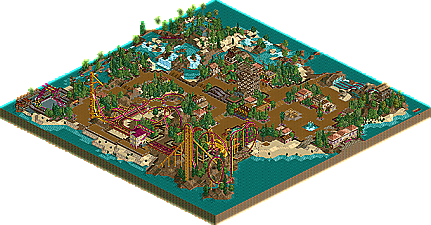
Paradise Island
DOWNLOAD HERE
Seal Clubbers
The Cave
DOWNLOAD HERE
WEEK 4 parks are due on JANUARY 20, 2005.
Seal Clubbers' park was hella original. It was going to be my vote from the screens. Although, my mind changed after viewing both parks in the game. "The Cave" is a bit too rando imo. I love the concept though. If the content inside of the cave was better it would have been just an awesome park. Architecture wasn't the best.
Hurricanes' park was fun. I really enjoyed the rides, and the originality in them. I've seen the theme before. Everything in this park really flowed and meshed well together.
Good job to both teams
This is the park that won my vote, the park in-game is a lot better than the screens look. The hacks in this park are above amazing and the fishhook coaster thingy or whatever it was, was totally out of this world. The architecture was nice too, i would even go as far as saying it was 'beautiful' in places. As soon as i looked at this, i knew it would win my vote. I think i have an idea which pair did it... I will let you know if i am right when Corky announces it.
This entry sure is better than that 'xenon' crap last round...
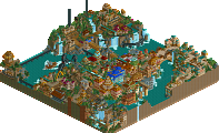
The Cave
As soon as i saw the screens of this park i could instantly recognise who made it, the landscaping is stunning and the whole concept and idea behind it is also stunning. The coaster i felt let it down though, overall a very nice entry with some of the best landscapage i am yet to see- but lacked rides imo.
Good round, Paradise Island has to be the best in H2H3 so far though.
-X-
They both look fantastic from the screens, i'll post more feedback when they've downloaded...
The Hurricane's entry on the other hand was fantastic. The architecture was simple yet wonderful and it had a very nice atmosphere. That coaster is also my favourite type of coaster, the fish-hook.
So my vote goes to the Hurricanes.
I think that if there was more in the caves or something, it might have done something for the park.
So, the Hurricanes receive my vote...
anyway, hurricanes get my vote, even though i didn't LOVE the park as everyone else seems to. the hacking was very high level, but sometimes i think that's unnneccessary. i don't want to sound all negative though. the coaster, while completley unrealistic, was pretty enjoyable. good job maker(s).
Corkscrewed Offline
Our team's park, however, floored me. The atmosphere was brilliant, and Tropical Blast was an awesome coaster. There's lots of little things that really addict me to it, and the hacking is very effective. This is a perfect example of how hacking should be used: to further the ends. It's not blatantly obvious, but you do notice it, but the hacking improves the park. It's not just there as a show off. So for me it was not a hard choice. I'd honestly say I'd vote for Paradise Island even if it wasn't a Hurricane park. But that's just my opinion of course. As long as there's no tie this time.
A fishhook coaster? Gotcha.
Coaster track supports? Um... ya!
Rotating rapids dock? You bet.
Stationary rides? Of course.
Tropical theme? To boot!
And I don't even think most of it was done well. Paradise Falls was a waste of time with no theming (trees and flowers don't count!) anywhere to be found. I liked the layout of the fishhook, but the fishhook itself was rather unnecessary in the layout and only there for the novelty. The architecture, minimalistic as it was, didn't add or subtract from the atmosphere. And... I don't think ANY of the stalls were named? Some signs here and there don't even touch my radar, but shops and stalls?
I usually love the LL-inspired style, but this was a miserable borderline copy of an already WAY overdone theme in LL.
The Cave is an amazing concept failed miserably. I see now why neither of you would show screens of it when it was in production. And quite honestly, that makes me angry when the team could have given feedback and support to improve on the park. The lack of foliage on the hillside was ridiculous. It was very empty and the architecture was half-decent, at best (what one building there was of it, I guess). The coaster was okay although the colors didn't fit in and it felt empty without any supporting rides.
...Do I sense a null vote coming on?
It depends on what you want: a seen-it-all-before LL wannabe, or a original-but-shitty thingamajig.
Both equally as poor, IMO.
I'll start with our park - Good idea. That's the best I can say... it obviously took a long time, and letting the landscape do the talking was brave. However, something to support the idea was needed, more rides, some architecture, and foliage. Honestly, if you guys were going for a realistic natural haven, foliage would have helped... It looked sloppy in places (the ice on the hillside).
Hurricanes park - It's nice, but it has been overdone. The foliage was weak in most places, and the hacking stood out horribly. The only hack that I think worked well was the dinghy slide idea. The coaster layout was nice, but the ending was so barren...why? The architecture was all 2x2 with supporting structures either side, which got a bit boring after a while.
I voted for my team, obviously, but I wasn't overly impressed with this round.
Better atmosphere, better rides, better coaster, better theming, less-than-original idea... versus a park that reminded me of our Monopoly Tycoon: good idea, but the execution could have and should have been better.
both were really below par. Especially the Hurricane's park, since I know the parkmaker can do much better, and use a different color scheme (because I've seen the deep purple/yellow combo far too often).
John expressed the rest of my feelings.
Maybe we can throw in a third choice for you next season...
The Cave's idea was pure brilliance. I mean, using land blocks for waterfall arches is one thing, but making a giant cavern is entirely another. The landscaping in general carried very familiar traits of a certain member of the Seal Clubbers. I can't say I didn't like the "rolling hills" landscape on top; however it just seemed too easy to pull off. It was just smooth landscaping, and all of it green. The bridge was awesome, though.
Now the caverns were again kind of a disappointment. I agree totally with Gymkid that large numbers of buildings didn't fit in there, and I wouldn't have liked to see any more than were there. But, jagged rocks folks. Say what you will about using them as filler, but I think they would have worked very nicely in there to evoke a more unpredictable and rough environment. Also, if you are going to use so many land blocks to make the roof, take some and make some makeshift stalactites and stalagmites while you're at it. The problem was that it was just too empty. I actually was entertained by the coaster but again, felt that it would have been better suited dodging jagged rocks and stalact/lagmites.
The river rapids ride in the Hurricanes' park was cool as hell. I felt, as others have said, that I had seen many of the ideas used before in LL or RCT2. The fish-hook coaster not making it up the first hill the first time = APE. The rotating platform = Three Villages. The water slides = SFWoE, kind of. Nevertheless, it was a nice park. One other thing, though - what's with using short twister trains? In my opinion it's a miserable and unrealistic idea.
Null vote so far. Leaning towards Cave but not enough to cast a vote yet.
The Hurricanes' theme has been buttraped by LL, and so have all the ideas. Sure, it has atmosphere, but it doesn't have anything new.
Way to go Seal Clubbers.