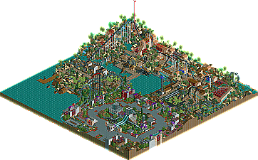
Park / Symphony of Pollution

Park_924 Symphony of Pollution

Choose the better park.

  1. Hurricanes: Sierra Glen 65 votes [52.00%]
    Percentage of vote: 52.00%
  2. MoLLesters: Symphony of Pollution 60 votes [48.00%]
    Percentage of vote: 48.00%

106 Comments

This park shares comments with 1 other park(View Park)
  • Corkscrewed%s's Photo
    Hurricanes
    Sierra Glen

    Posted Image Posted Image

    Posted Image

    DOWNLOAD HERE


    MoLLesters
    Symphony of Pollution

    Posted Image Posted Image

    Posted Image

    DOWNLOAD HERE


    WEEK 3 parks are due on JANUARY 10, 2005.
  • tracidEdge%s's Photo
    I can't open the Hurricanes park. I'm missing an object...

    Hangpep2/010000001BF38F0D
  • Corkscrewed%s's Photo
    Funny... it's completely exported... I'm not sure what to say.
  • tracidEdge%s's Photo
    Yup, I redownloaded and I'm still missing it. Which really sucks too because it looks like a good entry.
  • X250%s's Photo

    I can't open the Hurricanes park.  I'm missing an object...

    Works fine for me, anyway i voted for the moLLesters' entry as i liked the atmosphere and the invert was pretty cool. Sierra Glen was nice too with an excellant suspended coaster and landscapage but there was a few of the 'little things' that had not been accounted for, like covering shops for example... However, two nice entries. :)

    -X-
  • thorpedo%s's Photo
    I voted MoLLesters, but not because I'm on that team.

    Sierra Glen was beautiful and serene and had a heck of a coaster, and while the coasters in Symphony of Pollution were very lacking, I found Symphony of Pollution so much more fun to look at, not as a whole, but at the little things that they have hacked in there...it's just more fun to poke around in.

    I think that Sierra Glen went for more of a "natelox" style in RCT2, but that style should only be saved for RCT1..as it looks much better there than in RCT2. Sorry guys, it was a really great park though.

    Go MoLLesters!
  • posix%s's Photo
    slob, i love you...


    do you hear me? i love you !!!

    2000th post.
  • iris%s's Photo
    I voted MoLLesters.

    It's obvious the Hurricanes is made primarily by slob, with a very natural, surreal atmosphere...but seemed to be missing that key element that draws me in like most of his other work, so it left me a bit flat. The MoLLesters on the other hand was sloppy in places, but a completely original idea that was brought to life beautifully by Micool (quite obvious I think). Just looks like it took more skill, ingenuity, and creativity...not that it's necessarily 'better'.

    Good job to both teams.

    Focker out.
  • Themeparkmaster%s's Photo
    Can I just ask that people keep quiet about who has built parks in H2H, even if you guess, because it just throws the anonymity rules out of the window straight away. If someone on my team gives away who made our parks or the makers of the park had left a clue to who has made it inside the park then it says in the rules that the park is DQ'ed. This rule is basically useless when people blurt out who made it, even if it is obvious to some, which could perhaps sway the voting (you know how impressionable some people at this site are).

    As for the parks, I really liked them both even though they are complete opposites in terms of style and theme. All I can say is may the best park win ;)
  • iris%s's Photo
    I really don't think anonymity is an issue in this round. Two of the most straightforward parkmakers in their approach building things that is not unlike anything they have in the past...both being well known for the style as well. You act as if I didn't say it, then nobody would have known. If everyone can tell right off the bat without even opening the parks who made them...I really don't think you have to be hard pressed about trying to keep it a secret...loses the purpose.
  • Stargazer%s's Photo
    If it was Micool, that was horrible, the colours were just urgh.
  • Corkscrewed%s's Photo
    Micool already went last week.
  • Themeparkmaster%s's Photo
    Well for one Iris you got it wrong and two it was directed at Posix's post if you check the times they were posted you would tell. I don't think it's that much of a problem but it is done every round and there is no point for the anonymity rule if people who guess (not everyone can) post who it is. We might as well get rid of it all together or make sure it is abided by, by everyone.
  • posix%s's Photo
    there have been parkmaker guesses in h2h2 as well and it was never a problem. honestly, i can't guarantee that it was slob, but i'm 99% sure. no one else's parks can make me feel that way.
  • Kumba%s's Photo
    Come on that LL park was clearly Gut... ah nm... ;)

    Our park was really pretty, great coaster, great landwork, awsome atmospher. That LL thing looks great from the overview, but in-game not great at all. My vote Hurricanes
  • Micool%s's Photo
    Really posix...it made me feel bored... ;)

    And iris, I didn't touch the thing.
  • Valp%s's Photo
    This one's kind of tough for me... style vs. substance.

    Sierra Glen is truly beautiful. Its simplicity and understated elegance is quite striking, and Peregrine is probably my favorite coaster so far this season. I also liked the underground teacups. However, there's just not much there. I mean, it's basically just a coaster, a few flats, and some vending machines all set in this land of beauty. Just... empty. Plain.

    Symphony of Pollution, on the other hand, is messy. Polluted, and not just the theme. It all seems just thrown together- "oh, here's an idea, there's an idea, put both of 'em in. Oh well, the stats aren't so good; at least the coaster's decent." Okay, negatives out. I did like Toxic Terror and the cafe inside the loop. The concert hall, while simple, was very nice, and the idea for the park in itself was excellent and pulled off fairly well.

    I'm not ready to vote, but I don't want to null this one. I'll have to take a second look and think about it.
  • jon%s's Photo
    Definetly the MoLLesters. I didn't enjoy the Hurricanes entry very much. It was nice but thats all. The architecture seemed fairly basic. The coaster was good though so it wasn't all bad.

    Good job to both teams but the MoLLesters get my vote.
  • artist%s's Photo
    I did'nt like Hurricanes entry at all really, it bored me. I would like that sort of stuff in rct1 but when its rct2 i expect more out of it.

    My vot goes to the MoLLesters.
  • cg?%s's Photo
    Both parks bored me, so I chose the most beautiful: "Sierra glen."