Park / Toilet Bowl
-
 01-August 04
- Views 21,257
- Downloads 595
- Fans 0
- Comments 21
-
 No fans of this park
-
 Download Park
595
-
 Objects
66
-
 Tags
Tags
![park_3192 [MM2014 R2] The Inspiration Well](https://www.nedesigns.com/uploads/parks/3192/aerialt2803.png)
1.Phoenix Rising by Toon
16.Nero's Fury by the legacy
--Winner: "Phoenix Rising" by Toon (5-0)
8.Controlled Thoughts by leighx
9.Warped by Richie
--Winner: "Controlled Thoughts" by leighx (3-2)
5.Terra Firma by Turtle
12.Flying Dutchman by dragonfly
--Winner: "Terra Firma" by Turtle (5-0)
4.Galbadia City by Metropole
13.Toilet Bowl by MachChunk
--Winner: "Galbadia City" by Metropole (5-0)
Congrats to the winners, in what was in my opinion our strongest bracket. Every match-up was completed, and we had beautiful entries from one of the site's biggest superstars, and four of the site's most intriguing rising stars. Toon was standard Toon, Metropole proved he's worthy of the hype, and Turtle, leighx, and Richie all gave solid performances. Great job to those who didn't quite make it as well.
Round 2 Match-Ups:
1.Toon
8.leighx
5.Turtle
4.Metropole
Phoenix Rising- wow, what an entry! The firelit windows were my favourite touch, as well as the unorthodox lift/corkscrew combination. You have a knack for cool invert-launches, Toon! Really nice layout, too - flowing and interesting, with little touches like the waterfall making it even cooler. Plus, your architecture is just unparalleled. Wonderful job - keep us updated on IOA, won't you?
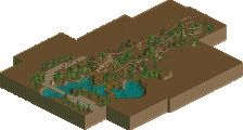
Terra Firma- this was a great entry, especially in the 'all round themed' way of thinking. The coaster layout kicked ass, cos the speed and inversions were all pitch-perfect. The colours worked, the architecture was pleasing and the landscaping was impeccable - kinda Posixy, I thought. Good job, Turtle!
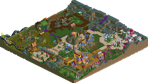
Galbadia City- I really liked the building that enclosed the top bit of the lift and the pre-drop build up, especially since it was built into the well landscaped mountain. I thought the coaster was generally sluggish, but at least it was consistent in that respect! The colours and custom path made for a unique theme, though, and this just makes me even more anxious to see Soul Calibur! *goes to look at 4D screens again* Great job, Metro. Enjoy Malaysia!
Controlled Thoughts- I can really appreciate the effort that went into this one, but something about it didn't completely click with me. I really liked the landshaping, and the immersion was quite audacious, but, to be honest, I thought the layout of the coaster was pretty poor and the pacing terrible. I found it difficult to follow the architecture, too, but I could see that thought went into it. I think it just lacked that refined touch that would have put it further up this list, but I thought it showed great effort and potential.
Warped- well I loved the custom music and the colours and mapwork, but the coaster was really quite lacking. Too many helixes, which, although nice, kinda got a bit boring. I would have liked to have seen more inversions and coolness. Also, although the architecture that was there was wicked, I thought there could have been more of it. A good job, though, Richie.
The Flying Dutchman- hmm, i'm not sure what to think. On the one hand the rainbow fucking kicks ass, but on the other other hand the buildings all look like they're toysized...the scale seemed all wrong, anyway. Also the coaster layout was a little awkward. Still, it was quite interesting for what it was.
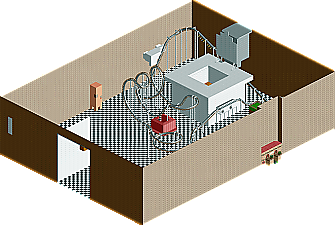
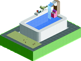
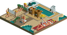
The Toilet Bowl- I couldn't believe this entry, mainly because it looked like effort had been put into it but it was still catastrophic. Mach, you're a pretty terrible member of the community as it is, but don't bother embarrassing yourself with stuff like this. Go do something else where you won't make yourself look quite such an ass.
I couldn't look at Nero's Fury because I was missing some random scenery item. Luckily this bracket largely kicked ass, and the other brackets aren't so full. But yeah, this is why i'm so damn reluctant to even bother with rct2 half the time.
Toon got my vote because the coaster layout was so original and the architecture was amazing.
MachChunk, what the fuck was that? I could do better shit. Just stop.
Attached Files
downloads: 10
I know I can do better, I just spent so much time working on the giant toilet.
However, I hate it when people put 9 cars on B&M coasters, it just looks ridiculous. For Turtle I would have suggested 7-8 cars, probably 7, for his train.
His entry really kicked ass. If only those rooves were colorable.
Turtle's was really good, too. I agree about the Posix-ness. But that can always be a good thing. Loved the landscaping.
Metro, dude, the colors in this were untouchable. The white, teal and everything all made for such an awesome entry. Great layout, too, man.
As for the other entries, I thought there was lots of good work in this round. I really liked Turtle's and thought Galbadia, Controlled Thoughts and Warped were all pretty close quality wise. The Legacy and Dragonfly also showed signs that they could develop into quality parkmakers if they work at it. Great work guys on completing the bracket and I look forward to LeighX in the next round. Bring it on!
Toon's was quite amazing. You had some great ideas and they were pulled off very well. Your archtiecture is so realistic that it doesn't even look like RCT, probably because you used a ton of custom scenery - but it really turned out nicely.
Next would be Metropole because it had a great atmosphere and excellent foliage/landscaping. The architecture was incredible too - you are definately improving with that and you aren't using those castle fences so much. My only real dislike about the entry was the water on top of the station.
Turtle's entry would be my third. You are amazing at landscaping and the architecture looked like something RRP would do in RCT2. My complaints with your entry though, were that you threw in a couple random colors sometimes, and that the layout of the coaster was a bit short.
Leighx' and Richies were good too. I really liked the music Richie had, but didn't like his architecture. On the other hand, I really liked Leighx' architecture, but I thought he had too many different types of music that were too close together that made everything sound.. chaotic. very nice entry though - I liked your detailed architecture.
8.Controlled Thoughts by leighx: I think floating like parks and desings are gonna become very popular because there has been quite a few since Cbass did them. Anyway on to the entry: I really liked this entry. It was creative, interesting and the 1/4 tile work is nice. I have only 2 complaints, 1. Too much White and Blue and 2. It seemed kinda random and a tad blocky in areas. Other than that, nice work Leighx.
9.Warped by Richie: I thought it was very nice. The custom music was a nice touch, the architecture was interesting but there could have been more, and the coaster looked pretty cool but to many heilxs and some more inversions would have been nice as Mantis said.
12.Flying Dutchman by dragonfly: I really liked that Rainbow a whole lot, nice work on that. The rest was ok, nothing really that big. I thought there could have been more architecture cause most of it seemed unfinished. Overall I didn't really like this entry that much.
Better luck next time.
5.Terra Firma by Turtle: I didn't like it much. The arhictecture has potential but didn't really impress me that much. Also the whole thing just seemed unfinished and bland. So sorry but I didn't really like this entry that much. Better luck next time.
4.Galbadia City by Metropole: This was an awsome entry Metro. I liked it more than Toon's because it was the only real full entry I have seen. The architecture was very nice and seemed to work with all of it's surrondings.
The coaster was also nice, it had a nice layout, nice supports and overall worked well with it's surrondings to. Awsome work Metro!
I can't wait to see your Soul Calibur park cause after seeing I can only imagine what that park will be like.
MachChunk: Um...I don't really find a toliet and bathroom funny. The toilet was very blocky, the bathroom walls looked like paper, and overall it was a bad entry. Try to improve and make somthing better next time.
Can't wait to take a peek at toons, my thoughts later.
Richie Offline
Thanks for the comments on mine, and i agree mostly with what you said. The coaster did have more inversions, had an extra 2, but i took them out due to pacing problems, high stats (i think coasters should have good stats). I got kinda lazy half way through, so that should explain the poor foilage selection (i spent like 5 mins).
Im happy with what i done, but obviously Leighx's was better. Again congrats to him and everyone else that won.
I went with metro's entry as overall best. I loved the layout, custom supports and the architecture. The atmosphere was perfect, some of my favourite RCT ever.
Love the Phoenix sculpture made from 1/4 tiles up on the hill too.
I think this is the first time that I have loved archetecture that uses so much custom sceanery. I'm a fan.
ride6
Toon's entry i felt that there was not enough there to be the best, the architecture and theme was definitly the best of the lot and if there was more there it would have got the vote.
Machunk, your entry made me puke on seperate occasions, Terra Firma also rocked and Flying Dutchman was brilliant, but the archy was lacking a bit...
Congrats to all winners here!
-X-