Park / Internet City
-
 20-July 06
- Views 42,403
- Downloads 1,169
- Fans 3
- Comments 211

-
 74.50%(required: 70%)
 Gold
Gold

RWE 90% Kumba 85% Ling 80% Scoop 80% Cocoa 75% G Force 75% robbie92 75% saxman1089 75% Liampie 70% csw 65% posix 65% Xeccah 55% 74.50% -
3 fans
 Fans of this park
-
 Download Park
1,169
-
 Objects
394
-
 Tags
Tags
![park_4217 [H2H8/8] MS Office Suite 2003 Resort](https://www.nedesigns.com/uploads/parks/4217/aerialt3972.png)
![park_4717 [NEDC5 - 02/10] B I T M A P](https://www.nedesigns.com/uploads/parks/4717/aerialt4590.png)
![park_4074 [H2H8 R1] Wit's End](https://www.nedesigns.com/uploads/parks/4074/aerialt3814.png)
![park_4380 [MM3 R1] A Petty Squabble](https://www.nedesigns.com/uploads/parks/4380/aerialt4172.png)


I think Kayte Ridge is the first park this season with more than one major coaster, which immediately caused it to hold my attention in game for longer. But even more than that, it was refreshing, calm, and realistic, and would be wonderful to walk through. I especially appreciated the John Allen coaster.
Kayte Ridge had actual rides, and decent ones. Internet City had a bunch of theming and fake rides that were there for show. I don't think the problem with Internet City is that it's messy, it's that it's shallow.
Therefore, I had no trouble voting for Kayte Ridge.
edit: I might add, though, that I'd be very (pleasantly) surprised if Kayte Ridge won this in the end. I would guess that a lot of people are going to vote on first looks, so the shallowness of a park doesn't really have that much of an impact as long as it's more impressive up front. Then some might realize a few months down the road that it's Kayte Ridge they're coming back to look at and not Internet City.
Edited by Panic, 21 July 2006 - 03:14 AM.
All that sounded really negative, but it's not meant to be. The Tigers park was really nice actually. Better then anything my team's produced all season so far probably. "Renegade" was cool, I really liked seeing those trains used. All in all, the more I look at it, the more I like it...but the more I wish it had more to it. Perhaps good realistic parks are really to be enjoyed in more of a full, engulfing way, a type of way a mini park could never convey. So as a H2H park, it doesn't really work quite well IMO.
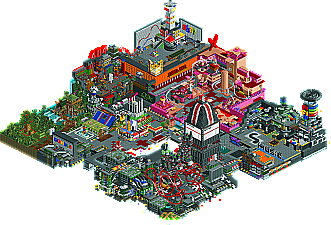
As for the Strangelove park....there too were pro's and cons. I don't know how ride6 can say it's 'so much better' then the Tigers, cause it really wasn't. If I gave the Tigers a 6.5, I'd give Internet City a 7, MAYBE a 7.5 depending on what kind of mood I was in. Each of the ideas were awesome, but I feel almost anyone can throw a bunch of ideas together. The trick is to make the parts equal a beautiful whole, and this park totally failed to do so. That being said, all the clever ideas still gave it the slight push ahead. The NE3 thing was pretty funny, I liked the error/virus area and the pop-up thing, that was cool. Almost every idea was really cool. The only thing I didn't care for was the sex area, cause it's totally played out and lost it's shock value at this point. First cBass claimed first rights to it with BOMB, but then more specifically someone (I think Levis? Might be wrong) did something almost identical to this area with that "Playboy Park" in the PT2 Prelims. So that whole area did nothing for me, which sucks cause it was the most prominent area with the only real half-interesting coaster.
A good round...and an interesting one too. This will definitely be an interesting week.
However Kayte Ridge was nice but i got bored looking at it after a short period of time.
Internet city had LOTS of different ideas to it so it didn't get boring for me.
So my vote = Strangelove
It seems to me that this H2H season has been of extremely high quality so far.
Anyways my vote went to Strangelove, of course.
Go us!!
yes that was me
The person for the other park won't be happy
but now i have voted the deciding point for me was that the cock-a-doodle-doo-a-doodle-doo in the strangelove park had no pubes.
Edited by JJ, 21 July 2006 - 06:24 AM.
Kayte Ridge - I consider this an average park, or maybe just above average. Yes, its realistic, but does that make it the better park? Not really for me. To me, this park attempts to convince the viewer by saying "I'm the same old park that has been churned out before, but because I'm realistic you need to vote for me." I know that's kind of harsh, but that's the impression I got. I did like the Initmin Rocket, however it also sort of felt out place, as the remainder of the park seemed to take an old fashioned approach.
So in the end, it was only the Rocket coaster that I enjoyed and that was not enough garner my vote based on the opposition.
Internet City - A terrific park on a lot of levels, most notably the creative level. Not so terrific on some other levels. The first impression I got was WOW, but I've learned that WOW parks can be quite deceiving upon further analysis.
Subjectively, I feel this park is an "over-conglomeration" of ideas all mushed into a small space. However, that doesn't mean that I didn't like all the ideas, I just think they should have been chosen more carefully. It is true that the park didn't have much of a layout either which in the end didn't take away much of the wow for me. Not all parks need layouts, especially when you are building on this type of fantasy level.
As for all the ideas, some were better than others. The whole porn area was a bit too much for me. It seemed like a cheap gimmick. I understand the internet and porn are directly related, but building an oversized penis and naming a coaster "Cumshot" is just too much for me too enjoy. Other ideas, like the Amazon area, NE3 thing and music area were much more appropriate and all well-executed. I also really liked that huge TV with all the 1s and 0s. That was brilliant. The colors also were very well done in this park.
All in all, I would've preferred fewer ideas and a more polished look. The park was quite messy in spots which seemed to be the end result of trying to squash too much into such a small area.
StrangeLove barely (and I re-iterate barely) squeaked out my vote for its sheer level of creativity. While the other park wasn't terrible, I didn't get enough from it to capture my vote.
First off, I am on that team and stuff... but either way, I prefer realism or an amusement park style feel over an insanely hacked fantasy park. There's not many exceptions for that in my view.
The first thing I noticed about Kayte is the fabulous John Allen woodie. It looked great from the screenshot and didn't disappoint in the game. I love classic woodies and this one was well done. I also loved the classic shuttle looper. My first coaster inversion was while riding on Montezuma's Revenge at Knott's when I was a kid (probably around 1980) so I always like to see one in an RCT park. I didn't get the LIM. It wasn't terrible but it was kind of "blah". I would have preferred to see something a little more classic to go with the other 2 coasters. Perhaps an Arrow corker or a suspended swinger? Aside from the rides the architecture was pretty good though not as good as the internet park. The landscaping wasn't bad and served it's purpose. There wasn't a lot of filler or architecture for the sake of architecture. It's just a well balanced park, IMO.
jkay, i really don't think it's the same old park that's been churned out before. That's definitely not giving it enough credit. Comparable to saying internet city was just out for looking creative, and not accomplishing it by any means. Extreme ways of viewing both parks giving neither the credit they deserve.
As i said before, i think there hasn't been any park, ever, that utilizes the proportions of buildings, pathing and coasters in such a way as Kayte Ridge. And it enhances the realism entity of it by a lot. I can't remember such a realistic park in h2h, ever, either. So calling this the same park as been churned out before seems nonsense. Besides that, the wooden and the intamin are both very well constructed coasters. Not everyone is capable of that.
Now admittadly i'm not much of a fan of the kind of park Internet City is. I for one do feel to a certain extent that this is in fact more of the same old, same old. Trying to be as creative as possible, filling the map with as much as possible. No order, just chaos. Yet i might be oh so conservative about rcting to a certain extent. Gimmicks are great, but they shouldn't surpass the whole general feel of it still being an 'rct park'. For me, atleast. And with bomb and the bedrooms having been done before, i hardly count 'just another gimmick' as too valuable.
Anyways, differences in opinion and especially very, very close matchups are what makes h2h fun. Especially when the quality, as been pointed out before, is quite nice this year.
My first main point is that KR's coasters were far far better than Internet cities. I know you intended them to be a gimmick that relates to the theme but with Ridges really strong layouts just over powered yours by far. I also have a fair idea who built both parks from seeing previous work and the kind of style you both went for.
Secondly the content of KR's was equal to IC's so i don't really think people could say it was'nt well thought out. It was'nt just buildings and a coaster it was alot more. The detail in the shops like the counters and games for the guests to play at. The single ques in such a short space and just really detailed stuff that must of been quite time consuming. Also most rides had an operation booth, such a small detail but it made the park even more impressive. The overall pinnacle of the architecture for me was the merry go round. It could'nt get any better and that kind of work was immaculate.
IC - the ideas were excellent, well thought out and pulled off brilliantly. My favourite part was all of it tbh. I loved the circuit boards and the hack area was a nice touch. I felt i would vote for this because it has so much going on but i really admired the realism in the other one. So i went for tigers.
Great matchup, the best yet. I would'nt think either park would be seen as good as they are, if it was'nt up against its complete opposite. That makes it so much more better.
Edited by J K, 22 July 2006 - 03:02 AM.
Edited by Gwazi, 21 July 2006 - 11:15 AM.
No more so than omitting MySpace, BlogSpot, AIM, and Wikipedia.
Corkscrewed Offline
IMO, both are good parks, but neither is a great park (i.e. MSM or SM). I leaned toward Internet City with its chaotic creativity motif, but Kayte Ridge certainly has its charm. But my sentiments echo Iris's.
25-24 at the moment. I feel like something like this happened last year... oh yeah... Sierra Glen vs Symphony of Pollution.
I think to have improved it would be to have chosen only a few of the areas (say four), make them and have ''internet highways'' to connect them.
It was too brash for my liking.
RFan
Both look good though, this basically boils down to what style of park you like more 'right now'.