Park / Disney's Shadowlands
-
 29-November 06
- Views 29,511
- Downloads 1,255
- Fans 7
- Comments 76
-
 80.00%(required: 70%)
 Gold
Gold

Liampie 90% no Austin55 85% no Kumba 85% yes nin 85% no Sulakke 85% no geewhzz 80% no alex 75% no pierrot 75% no Chocotopian 70% no inthemanual 70% no 80.00% 10.00% -
7 fans
 Fans of this park
-
 Full-Size Map
-
 Download Park
1,255
-
 Objects
415
-
 Tags
Tags
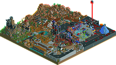
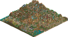
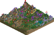
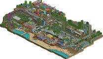
Shadowlands, where to begin.
I should love this park really and upon first glance i did! The custom flat rides, the microscopic details and the architecture.......however going back again a couple of times for voting's sake i've changed my mind a bit.
Custom rides:
I'll start with the custom flat rides, of which there were plenty. The windmill was the first i saw and i fell in love with it, it looked just like the concept art i've seen for said ride. However everytime i look at it i notice something i don't like. The platform looked messy and at first i wasn't sure which was the entrance/exit. It's location was just a bad choice, squashed between bald mountain and spirit mountain when it should really be on the otherside of the park with near the black cauldron. It's a complete waste when you spend so much time on custom rides that you tuck it out of the way (with the uninteresting side at the front) and then fill in space with the in-game twist! why?
The Siege hammer was by far my favourite and i've been longing for someone to do a Screamin Swing since i attempted mine. It looks great and i love the fact that it looks very primative (wood) however i would argue the fact that you haven't approached it realistically. Rather then install a Screamin' Swing and then dress it up to look wooden (as i'm sure would be the case in real-life) you've done the opposite and gone for theme first and then try and fit the ride around it. This looks better in the game becuase you get the feeling of immersion but for a park that's Disney Realism or whatever you want to call it, i can't help but keep thinking it's more of a structure then a ride that could actually work. For example where are the pressurised air cylinders either side of the columns and why is the queue that close to the ride without any overhead netting to protect them if any object falls from the ride?
The Virus and Boomerang were the best of the four. I love the paintings on the floor of Boomerang and it is constructed well although it could of benefitted from a strong supporting column in the middle. Virus looked amazing and you ahve put a lot of thought into it's construction. My only qualm would be that it could have used a slightly bigger footprint but that's nothing major.
I know this all sounds very critical and indeed you could retaliate and critique my custom rides and point half of these things out as well, for instance my suspended flying carpet had it's rotating arms too close together! However that wasn't a disney park and i expect higher quality here then in my parks. Don't get me wrong these are the best ones i've seen so far in RCT but i can't help give harsh criticism becuase they could have been peferfect, but are a notch lower becuase of the above.
The coasters:
Bald mountain: By far my favourite coaster. The huge statue is very creative and whilst watching it i could hear the story going over in my mind where there would ahve been 'themed' sequences in the mountain. The duel station wasn't needed but a nice addition i guess. The queue was horrible though, it was boring walking round it.
Spirit Mountain: Great woody, although why was it hacked with the BM coaster, i didnt' see what it achieved apart from the break-downs. Lovely interaction with landscape as well.
CyberSpace Mountain: Interesting. I liked the booster bike idea and i think it could work in real-life. My only problem with this is that you could have themed the whole interior rather then segments which have been opened up.
Dragon Tower: It was a good coaster but out of place. It reminded me of Indy and raging spirits with less themeing. The placement is horrible, right next to the front of the castle? I understand the idea of one of the towers was the dragons but perhaps if more of the ride was hidden (in the castle if it were bigger) then it would have been great. I love the entrance sign and teh station was good although i didn't like the use of the stone corner walls as gates. Nice Treasure cave as well.
The rest:
Okay there were loads of little touches i loved in this park. The shadow of the lettering on the wall at the parks entrance, the horse and wagon and carts, benches using the cornice pieces, the stage areas, etc. You have wonderful ideas and the execution is mostly excellent with some exceptions. Lastly the layout could have used some work methinks. The Tron area was too large and definatly in the wrong place, in fact i didn't want it in there. When i think of Disney villains i think of The witch from snow white, etc all the 'storybook' villains and i think that the park would have been better just sticking to the fantasy theme that the front half of the park follows. In fact perhaps just make that area with the castle rather then attempt to squeeze a park's worth onto such a small map.
Overall i do like the park and it will remain a favourite for many years to come i expect, however i can't help but fell upon closer inspection that it isn't a huge improvement on his last Disney park and some details whilst conceptually imaginative, could have been executed better.
Alice review up very soon.
To summarise it, i said that both parks were extremely good and both in my top 5 for this season. Alice in wonderland had some amazing architecture and the burrow was magnificent. Shadowlands was extremely good aswell, there was more ideas than space on this map, which i have always thought is great lol. I loved the futuristic area, and the awesome custom ride.
My vote went to shadowland, both parks were very tighly matched in most areas, however i felt it had the better rides overall.
-X-
On the other hand, the Shadowlands wasn't much better in the coaster area, however, the ideas were much more original and unique. Not only this, but the theming is superb, with amazing details everywhere. Definitely a park of the year candidate, an excellent Disney park.
Although I honestly thought the Hurricanes had the better park here, I'm still going to vote for AiW since I'm on the Bandits.
Edited by Jazz, 30 November 2006 - 01:50 PM.
Corkscrewed Offline
i like the other park but felt is kinda fell apart. the monster on bald mountain was AMAZING. the coasters were good but sometimes hard to follow or slow. the different ways for makeing sigsn were all great and the dragon was pretty cool as well. i thought that it had TONS of detail in some places and in other it just fell apart. there were great constom rides but beside that and coasters....
both parks were Great. i sorry to see alice's wonderland not winning but everyone has different aspects
FK+Coatermind
That's what the parkmakers and teams deserve as the whole season till now depends on this match-up.. Bit weird the second team elimination depends on one match.. Next season should also be a best of 3 imo.. Some results in past rounds don't even make sense anymore now, so Maybe just keep it to 5 match-ups for the regular season, and best of 3 for playoff and finals..
SF
Problem is we got a glitch and I don't know who he voted for, so we will need to fix it or he will need to tell us. He can still have his vote under his name, but the Tex one does not count.
Same goes for the other match-up.
Edited by Old Red, 03 December 2006 - 11:49 PM.
Relax, your innocent till proven guilty
Edited by Old Red, 03 December 2006 - 11:50 PM.
Ok, im sorry, now lets talk about the parks please.
Corkscrewed Offline
We're "only" at 72.
What gives, people?
Corkscrewed Offline
Do you live in the Southern Hemisphere? Because I coulda sworn you're from Washington.