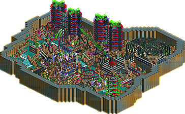
Park / Spectracution
-
 19-August 04
- Views 7,919
- Downloads 448
- Fans 0
- Comments 13

-
 No fans of this park
-
 Download Park
448
-
 Tags
Tags
 19-August 04

 No fans of this park
 Download Park
448
 Tags
Tags
 Similar Parks
 Members Reading
11.Merge Into My Future by MightyMouse011
-Winner: "Spectracution" by Hevydevy (5-0)
10.Surfing With The Alien by ride6
2.The Before and Aftermath by natelox
-Winner: "The Before and Aftermath" by natelox (5-0)
Next Round:
6.Hevydevy
2.natelox
MightyMouse- Sad. It was kind of nice except that it looked abandoned at its halfway point. Bummer too since the archetecture and such looked pretty good, just underdeveloped. Shit happens I guess.
HevyDevy- If it wasn't for how pathetic the coaster's layout is this would even beat out Nate's. Really I love the theming, it's sick and way beyond anything I could even think of. Work on the coasters though, they seem to be your weakest point.
An interesting round indeed. The only person I could've beat was MightyMouse but I was lined up with the strongest in the round insted. Nate, you got my vote.
ride6
Hevydevy For what it is, I like it. Although, I think the floorless cars would've been much cooler for the vertical towers, rather than the stand-up cars which looks to have been rather painful.
MightyMouse011 Well, its unfinished, but it looked like it was going place. I especially loved the station. I don't think you should've used the floorless cars, or if you did you should have only used two. There would be major whiplash in the back, which some poeple like..
ride6 If MightyMouse's would have been finished, I think this one may have been the weakest. Generally I'm looking for overall coaster design and it really didn't do it for me. At all. I didn't like much of the rest of it either, and the guitar was the only half-way interesting thing in my opinion. The rest of the stuff was average and the contrast between the red of the coaster and the green of the shrubs (and trees and such) made it look too messy and busy.
natelox Very interesting, original concept. I loved it, except it was hard to find the actual train to follow since it was moving so fast. Understandable though...I think your work is amazing, however, I still liked Hevy's better.
Yay for hevy. Reminded me a bit of Mantis' stuff in AoE...the alien factory area. Plus, the best ride of the bunch. Cool stuff. also liked the steel mini tower. Nicely done.
Sorry if that came off as harsh, but that is exactly how I feel about it.
I did vote for you tho (befor I read that shit) It was a cBass like idea and you did it well.
Nate, you did good and won rightfully.
ride6
RCT's rating system is absolutely ridiculous and allows you to create a very poor coaster design, like most coaster's in Mala's parks (as in, they go unrealistically fast, etc.) and get very, very high "ratings." Where as coaster designs that are actually decent (take Air in my Pro Tour entry) got extremely inaccurate ratings, where excitement was 1 or something. Whether that is a glitch in the game or not, it is obviously false. I'm sorry, but that coaster keeps decent pace and intensity throughout and I can easily see it being placed in a real-life park.
Overall, I never even look at the ratings, because I could care less if some machine thinks my coaster is fun or not.
Ride6, You would have gotten my vote since it was actually quite nifty. Not groundbreaking, but fun to look at.
Hevy Devy, It was awesome in its own little way, but hey, i can't ignore those ratings either. The cobra roll's done too fast, why not just lose a little speed there and cut the ending "short"?
Mouse, i thought it was decent, and it was kinda a rip off of mantis' work in City of Dreams, and you should've shifted that last hill over a spot..
Nate, at first glance I wouldn't know you built this entry which is strange as you usualy have such a distinctive style but it's probably because the coaster track buildings aren't finished - as they are they stick out like a sore thumb. The idea is good and pulled off quite well but it makes for boring architecture in the 'before' area and cliché disaster ridden buildings in the 'after' area. I think with the cars wizzing along the highway in the 'before' area like you planned it would have given it that extra life like factor that would have made it more appealing to me but as it is I find this one of your poorest pieces of work and you were lucky you weren't up against stronger competition.
That's not to say your entry was bad Ride6, I actualy kind of enjoyed it. It was kind of a mish mash of colours and a few buildings clashed but you seem to be heading in the right direction architecture wise and it's good to see the creativity involved in it. I've since noticed the guitar after Natelox pointed it out and it's not a sad attempt at all, in fact I think it's pretty good to be honest. I think you need to work on your coaster layouts a little and also try not to end up with everything looking so cramped. Good work nevertheless.
Mightymouse, although very unfinished there are signs of potential in this entry for sure. The coaster, although very short, serves its purpose well as a center piece for the area and I like the convential architecture it works well in this area. I think you possibly need to break the paths up with another colour because the silver becomes too overpowering otherwise. Good job on getting an entry in though.
I'm looking forward to the next round now, if Nate drops his guard at all we could be in for an upset.
Surfing With The Alien - I think the theming was a bit generic, no real purpose to it (other than the guitar, which was cool), but still a pretty good entry which was fun to look at.
The Before and Aftermath - Great concept, too bad you didn't have the time to execute it properly. That made the whole thing, especially "The Before" too life-less and uninteresting, but it could have been really cool. I was positively surprised when I opened it, so that's a good thing.
Spectracution - My favourite of this round, it reminded me of Blitz's work, but with worse coaster ratings. However, I don't care about the ratings, the theming was fantastic because of the attention to detail and how each structure had a purpose, and the coaster interacted well with it, so I'm voting for this
Great round.