Park / Alice in Wonderland
-
 29-November 06
- Views 29,511
- Downloads 1,218
- Fans 5
- Comments 76
-
 79.00%(required: 70%)
 Gold
Gold

Cocoa 85% G Force 85% Kumba 85% Liampie 85% Sulakke 85% Jaguar 80% Xeccah 80% RWE 75% Scoop 75% geewhzz 70% Ling 70% posix 65% 79.00% -
5 fans
 Fans of this park
-
 Full-Size Map
-
 Download Park
1,218
-
 Objects
455
-
 Tags
Tags
Corkscrewed Offline
Tycoon Bandits:
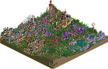
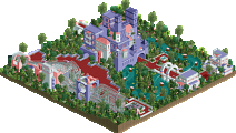
ALICE IN WONDERLAND
Hurricanes:
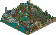
DISNEY'S SHADOWLANDS
H2H4 Playoffs Semi-Finals Page
*** FINALS PARK #1 IS DUE ON TUESDAY, DECEMBER 12, 2006, AT 11:59 PM PACIFIC STANDARD TIME. PLEASE SEND ALL ENTRIES TO NEDESIGNS@GMAIL.COM ***
The Good
The most amazing details in any park I have ever seen. Charnbog hovering over bald mountain =
The Bad
I doubt anyone knows that the Tron area is Disney related *cough* and some things seemed a tad rushed, but at leased it had 4 corners
Alice In Wonderland - Tycoon Bandits
The Good
Really awesome park, I loved the rabbit hole where the peeps fall in and some of those buildings were really well done, you created some great little atmosphears. I think the beat part is the tea table at the entrance, took me a bit to spot it, and the wine celler, awesome touch. A wonderful park indeed
The Bad
Way to many trees for a playoff park, you did mix them up well, but still it eats up about 25% of the map when you add it all up. Also none of the tracked rides had very good layouts tho the reel and other flat rides were themed very well.
Take a wild guess where my vote went...
Corkscrewed Offline
^ yup. Like I often think: "too many paths for a playoff park....or whatever park" Lol!
when it adds to and has an extra atmosphere for the park (trees whether paths) it's fine I think...
Well, I think (guess?, not sure) that at least that amount of path which eats up about 25 % of the park in the Disney park adds to the Disney-park,
but I'm sure that the trees in the Alice-park add to the wanted atmosphere that was gone for in there.....
(don't blame you Kumba, knowing you are very illeterate and won't have any knowledege of that original story, so you cannot judge that atmosphere at least...
WOW, what a park!
The details and overall execution of the concept are the best I've seen in a RCT2 park to date. From the Rabbit Hole experience where guests are literally dropped through the rabbit hole into the park to the Queen of Hearts' cellar with neat details like wine drinking and seating areas.. Be sure to check out every tile because there are pieces of the story EVERYWHERE!
Everything just adds to the story and it all connects to the overall story in perfection (even the foliage which is part of the story as well).. Congrats to the parkmakers for achieving this..
(+)
-Execution storyline into RCT park
-Rides
-Themeing
-Landscaping
-Colour schemes
-'Little things'
-Peep friendlyness
-Architecture
(-)
-Some people might oversee some details, like the basements
-Lag
DISNEY'S SHADOWLANDS
I really like this park.. Even more than an entry in a contest I've seen that looks a lot like this.. A couple of things are almost identical, but it looks nice so what can I say
I like the microscopicness in this park.. Curious as I am I've spend some time figuring out how you've got some signing and 'line-figures' there, great job on that!
It still doesn't really feel like Disney imho like when I'd visited the park(s), but it comes close.. I feel that if this parkmaker is going to make a full scale solo of a Disney park with all areas, it will go down as the best park ever in RCT history.. These couple of areas on a minimap are awesome, but as a complete full scale park will be mindblowing.. All in all a great park.
(+)
-Details
-Architecture
-Themeing
-Colour schemes
-Rides
(-)
-Too much roof (prefer more 'see-throughs')
-Lag
-Some incomplete/rushed areas
VOTE: BANDITS
SF
Edited by Six Frags, 29 November 2006 - 06:46 PM.
Corkscrewed Offline
ROFLMAO
OUCH! That came off as very, very harsh. Although funny. Mostly because we as human beings laugh at other people's misfortune.
Kumba can brush it off, though, because he's winning at the moment.
I thought those two parks were very high quality, since they were made in 1 month... I voted hurricanes's park because there was more stuff inside, also because the coasters were well executed. Great job both team!
^ Being illeterate does not have to be a "misfortune".
What you don't know, you cannot miss, and that goes for everyone on every level.....
Alice in Wonderland:
The architecture in this was amazing, especially the castle with the queen on the balcony looking down, classic touch. This was definately one of the most atmospheric parks I've ever seen. Ignore anyone that says this has too much tree/foliage, that's total bullshit, it added to the park beauitifully. I'd go as far to say that it utilises foliage better than any park I've seen. Some of the areas just seemed magical, especially the rabbit hole. The way the rides fit around the buildings was wonderful and there were some great, innovative ride ideas
I have 2 main issues with the park. The first is some of the ride names were a bit weird, such as "growing and shrinking Alice". Just seemed very forced when something altogether more inventive could have been used. The other issue is the b&m. I don't think the layout was particularly strong, and the supports were a bit awkward. This is dominated, however, by the way that I think a B&M floorless (or any b&m for that matter) was a poor choice of coaster. It somehow took away the magical essence of the area, a large roaring floorless coaster just didn't fit in. A smaller tracked coaster would have definately been nice, though I understand that many would complain for "lack of large coaster" or something and mark it down as a result, so fair enough. Finally, liked the way you used the batwing as a heart, but I think it could have been positioned more accesably(sp?) ie. with a main area of path looking onto it for guests to see the heart.
Apologies that the "negative" paragraph is longer than the "positive" one, that is ridiculous, because I truly love the park, and it is definately one of the best showcases of RCT2 I've ever seen. Well done
Shadowlands
Now why does the best park in the competition have to be against the second best park in the competition, or vice versa depending on how I look at it. Some of the sculptures in the park were just amazing, the bat on bald mountain definately striking out at me here. Stunning. The park definately shows some of the best examples of how to make innovative, wicked looking signs for rides, especially cyber space mountain and dragon tower. Another thing that makes this park fantastic is the custom flat rides. Some were built expertly, absolutely amazing work.
The bad...not much. Perhaps a little hard to look at the park due to so much going on (can't really be helped with a small map with hundreds of amazing ideas and concepts). The shadowlands sign at the front of the park on the building was a bit illegible (and probably unnecesary due to the wicked on in front of it on the water). Dragon's tower was a bit too slow in places. Nothing major.
Another amazing park, absolutely fantastic. Also one of the best showcases of RCT2 I've ever seen.
At the moment, i can't decide, i'm going to take another (longer) look at both parks before I case my vote. My congratulations go out to the makers of the park as they truly are remarkable achievements.
Alice in wonderland.
-------------------------------------------------------
Absolutely loved the park! I spent a good long time looking at it and the details I picked out again and again were really nice. Firstly the entrance area was incredible. The tea party was really nice with the chairs and the cups. A really nice entrance, that’s always crucial so it leaves a good impression.
I personally think the trees were there for the atmosphere, not just placed. I could see thought did go into it in fact a lot. But I'd want to see it around the coaster really rather than in some blank spaces. I didn’t really find the coaster very good to be honest, as it didn’t really make me want to watch it more than once. I also agree with metropole that some of the names were thought out but they didn’t fit too well. You had the atmosphere nailed but the names let some of the rides down.
I don't know why but I loved the swan area. It was peaceful and the foliage was superb. Also the little things like the guests falling onto the sacks and the caterpillar made the park even better. I also thought the use of the cards in some places was really nice and it reminded me of the film so that was fun.
Finally I’ve figured out who you are simply because I love your work and I recognised a certain section from another park of yours. Anyway you always amaze me the way you layer your buildings and the fact you’re not afraid to use completely different scenery and you continue to use different, innovative ideas.
Anyway Thumbs up, the park was class!
----------------------------------------------------------------------------
Disney Shadowlands.
Officially my favourite park of the whole competition and seeing it built in throughout the season has been amazing. I know you've worked dam hard on it and it’s paid off because this park is unbelievable.
Dark Kingdom
Such a nice area to start off with. My favourite part was the dragon tower and the custom Speed swing. They were both so well constructed and it must have taken a long time to get them just right. I also love the scorch marks on the castle entrance. Leading onto Bald Mountain, Well wow. Cernabog towering over the mountain. I can't believe how much time it must have taken you to get the mountain just right. Anyway as well as the ride another notable detail is the cracked bridge. I don't know how you do it but you just won't settle for a few details lol.
Shadowlands
I love some of the aborigine drawings on the custom ride and the rock faces. It really adds to the Australian outback theme you were going for. Also the stage coaches were cool. My favourite structure in that area was probably the Canes hotel. Also Boomerang, probably the best custom ride I’ve ever seen, not only it was custom but it was themed with boomerangs in the middle.
Electronic world
I thought this may be the most misunderstood area but the details that have been packed into this space works so well. Firstly I love cyber Space Mountain and the custom sign. Then I love the entire little arcade machines. Next the tron cycles as a que line. Seriously I could go on forever about this area. Also Virus, another amazing custom ride. I loved the colours as it was such a contrast to the rest of the areas.
-----------------------------------------------------------------------------
So in the end I had a tough decision deciding but I thought what I enjoyed the most, and what appeared different to what we’ve seen To be honest. Shadowlands has four coasters, four custom rides an evil castle and a Cernabog ! It was close but the ideas and concept and the details made me vote for my team.
Vote - Hurricanes.
I wanted to make an Alice park for that movie competition whenever it was. I made the rabbit hole, and the croquet, and the court room, and everything. It failed.
Well, the problem for me isn't that there's too many trees exactly. It's a combination of things. Some of the custom bushes look really bad I think. I begrudgingly put up with the crawling wall vines even though I've always thought they're ugly just because they can add a nice touch to a wall. I just wish it looked better. But there are some bushes in there you (meaning the anonymous parkmakers) used a lot which don't really belong in the game I think. They stand out in a bad way. Some of the flowers don't look too great either.
The other problem has to do with how they're arranged. Trees work well as filler because they act as negative space. And negative space is important to overall composition. You need a balance. And in some places you did a really nice job of using trees and bushes sparingly along with blank terrain. But in other places it's so hyper and over-detailed that it doesn't function as negative space anymore. So it's like layering details on top of other details. So it looks good if you zoom in and take a screenshot, but if you look at the trees in combination with the paths and the rides and the buildings as you scroll around the park, there's no negative space. And I think that has a detrimental effect on the overall look of the park. Taking 4 or 5 basic tree choices and repeating them in key areas would have been a lot simpler and ultimately would have looked better I think. It's okay to let the landscaping show through a little bit. You want to use trees and bushes to accent the lines of the landscape, not bury them. That's what I meant when I said the trees were too much. Well anyway, that's my opinion.
But I don't want to only be negative here. Those two castles are almost worthy of a vote on their own. And the rabbit hole was pure RCT genius. So was the mushroom slide. One of those ideas that's so good you can't believe you haven't seen it done before.
Xcoaster Offline
And yes, one of those castles was quite awesome (I don't remember the other one as well, but I loved the one with the wine cellar). Certainly not nearly enough to make me vote against DSL though. I like DSL quite a bit more, even though CyberSpace Mountain certainly could've used some more work on the layout and indoor theming, especially near the beginning. But I think the other three coasters more than make up for it (plus there's plenty of outdoor theming), and CSM still has its moments. Plus, my thoughts on the foliage of Wonderland reflect those of Ed's. Only I couldn't have put it so eloquently. Though on the other hand, DSL seems a little too bare in a few spots when viewed from above, so I certainly wouldn't say either of them are perfect in that regard. Maybe a compromise is in order. Though DSL is at a slight disadvantage with two of it's sections requiring either very sparse foliage or hardscaping, and the other section being partially scorched, crushed, and bald at that. Meh.
So yeah, go Canes, go. More thoughts on the parks later.
Oh, and shouldn't this be the west semifinals topic?
Actually had some good coasters? Did you look at the park? Ok, Disney Shadowlands first. This had a nice atmosphere, theming, great realistic touches and some brilliant custom flat rides. It's nice to see that the parkmaker knew the subject area and tried to match the theme. From the overview this was my vote. In game however, I was disappointed by the roller coasters, specifically the (intamin?) looper (Dragon Mountain?) and Bald Mountain. Both of these rollercoasters had long periods when they crawled through their layouts. I can accept that the Bandits B&M had a slow spot in the final helix but at least that was coming up into the break run. Both these rollercoasters on the other hand have long slow points midway through the ride that would completely ruin the ride when you come out of a big drop into a long slow straight section of track. The best coaster in the park was Cyber Space Mountain, nice attempt at a Vekoma Booster Bike.
Alice in Wonderland on the other hand was wonderful. While nothing in the park stands out in the same way as Bald Mountian, the theming is great, the rides look fun and exciting and the whole park has a nice atmosphere. While I've seen and prefer more realistic parks, the coasters in Disney Shadowlands spoilt the park for me so my vote is going to the Bandits. I am worried however that a park can have 2 poor, slow coasters and lots of pretty theming and beat a good all round park that's maybe not quite so spectacular on the theming front, which is more important the rides or the theming?
Edited by Leonardofury, 30 November 2006 - 07:47 AM.
Xcoaster Offline
And I didn't think Dragon's Tower ever went terribly slow, especially considering that it doesn't appear to be meant as a really big ride (it reminded me more of the Indy ride at DLP and the one at DisneySea). But I could be wrong. I'll need to look at it again, probably after destroying some scenery in order to remove some lag.
Also, there was another coaster in that park you didn't even mention, which was personally my favorite. Plus, I just I fail to see how 4 coasters, even if 2 of them are poor, can be so much worse than 2 other coasters.