Park / Timaeus' Journey
-
 19-August 04
- Views 4,169
- Downloads 292
- Fans 0
- Comments 6
-
 No fans of this park
-
 Full-Size Map
-
 Download Park
292
-
 Objects
169
-
 Tags
Tags

6.deanosrs
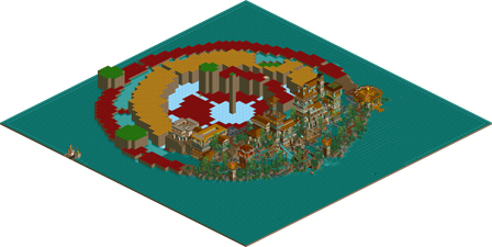
3.Timaeus' Journey by d4rkj4nu5
-Winner: "Timaeus' Journey" by d4rkj4nu5 (Forfeit)
7.Odeon by Jacko Shanty
2.aero21
-Winner: "Odeon" by Jacko Shanty (Forfeit)
Next Round:
3.d4rkj4nu5
7.Jacko Shanty
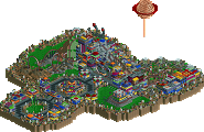
Great fun to look at, DarkJanus. You created a really great atmosphere there. I can't imagine how you could have possibly kept that out around the rest of the map, if that was your intention. However, the ride, man - log flumes and shoot-the-chutes are supposed to have big climactic finales! That means BIG DROPS! Not a lift! That's just mad. Your architecture kicked ass, though.
Odeon
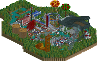
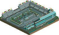
I liked this a lot Jacko. The way all the buildings appeared flooded out was really cool. Also, I caught the underground lava pool there - very nice touch. I am a big fan of hidden/indoors/underground theming, instead of just emptiness. That's what I like to see. While I have no idea what an Odeon is, you gave me a cool vision of an underwater village, and the rapids ride was cool. So you get my vote for best-of. Nice going man.
No real matchups
Odeon - Pretty nice. I liked the way the buildings was partially under water, though the idea is old (RoB) it hasn't been used much. The buildings looked a bit like you tried to put in as many objects as possible into each of them, which made every building look messy, but gave a nice overall impression. Not sure about the foilage, it felt a bit unfocused, in lack of a better way to put it. Good rapids ride anyway. What was the large coaster track sculpture supposed to be?
It'll be interesting to meet you in the next round
My own entry, well, it's somewhat unfinished. I have excuses, but whatever. I'm sorry for including an object I made myself but never used (though the original idea was based on that object, I never used it because I didn't have the time, it had to be complete for it to work), that will probably cause an error trapper for some of you when loading the park. I'm going to complete the park after the contest is over for me, whenever that will be. Hopefully not too soon
The log flume is probably strange because I've never been on a large log flume ride myself...
Jacko - The foliage selection really worked wonders for me. Just seemed very ocean like. The rapids layout was solid, the architecture was very good, especially the sunken village. But as Janus said, a little overloaded with scenery which made them seem to lack structure slightly. The landscaping was the weakest point of the park (as i think it is your weakest point as a parkmaker) but it wasn't so bad, and the mini volcanoes were good. I sound a little negative here, but really, i did enjoy the entry a lot.
Janus - This just gets it for me. What was there was absolute gold. The architecture was awesome, as was the landscaping and foliage. The log flume...i agree with Moonspoon. Need a dramatic drop at the end. Also, there wasn't that much there. It will be amazing when finished though. Good job.
Metro
Timaeus' Journey - It was good. I liked the overall feel once you first open the park - very tall and overpowering. The foliage was unique, but I think it worked. Your buildings were very well structured.. even though you added a few random colors and walls here and there.. which confused me as to what it was supposed to be. The ride was kind of boring too.. I found your architecture more interesting to look at. But what bothered me the most was the music.. you had two types right next to each other and it almost killed the atmosphere.
You are an interesting p-maker though, and I take back what I said a while ago about you not doing anything. Good luck.
Thanks for the comments, anyway.