Park / Infected
-
 20-September 04
- Views 10,296
- Downloads 578
- Fans 0
- Comments 13
-
 No fans of this park
-
 Download Park
578
-
 Objects
139
-
 Tags
Tags

![park_3211 [MM2014 R3] Heart of Darkness](https://www.nedesigns.com/uploads/parks/3211/aerialt2825.png)
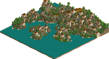
1.Oh My Goddess by x-sector
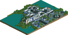
5.Primal Apocalypse by Kumba
--GCI Coaster Challenge
--Winner: "Primal Apocalypse" by Kumba (Majority Vote 3-1)
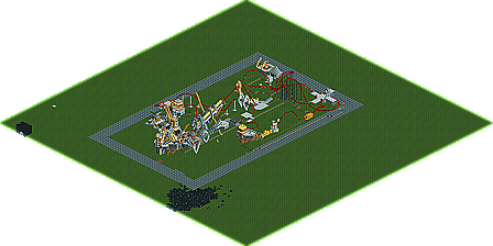
3.Infected by Kevin
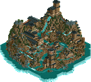
2.Paleos Bay Mine Ride by Corkscrewed
--Intamin Coaster Challenge
--Winner: "Paleos Bay Mine Ride" by Corkscrewed (Unanimous Vote 3-0)
Congratulations to Corkscrewed and Kumba who will face off in the Elite 8. Kumba pulled off a monster upset with the defeat of the legendary x-sector. Meanwhile, Corkscrewed displayed his best showing of the tournament for him, and possibly his best work ever, in a easy victory over Kevin's unfinished ride, a ride that may have been absolutely mindblowing if finished. Well, thanks to Kevin and x-sector, both showed up always to try their best, and it's greatly appreciated. And good luck to Cork and Kumba in the finals!
Corkscrewed Offline
X had some really nifty colossal architecture, with great classical pediments and capitals and stuff. It reminded me of Carnac at bit, with the temple built into the cliff. A nice showing, though definitely not X's best. In fact, I sort of like Gothica better.
Kumba, wow! Pretty cool! I like the Gwazi-esque woodies with the explosions and stuff, and it was pretty cool that you had a crashing coaster that still had ratings. Nifty stuff there. Theming is a little messy, but that's okay given the theme. Still, you'll have to do better than that against me... unless I just have no time.
Kevin... wow... nifty cBass-esque space work! Idea isn't new, of course, but the execution was marvelous. I see what Iris is talking about... had this been finished, it easily might have blown my park out of the water simply out of its innovation. Great work here... that coaster is just wickedly fast and intense. Nice work! (now go work on the collabo!
Kevin-Damn, if you'd finished this, i'd have been blown away. This had the potential to be absolutely amazing, I just hope you finish it as a future project.
X-Sector-I actually really enjoyed this entry. It had a very legendary very to it, the woodies were excellent, and the landscaping was top notch. I can only feel that it would have benefitted from more colours in there besides brown. But excellently done nonetheless
Kumba-Hm......a little farfetched on the idea front. Dinosaurs with flying machines? WTF? The woodies had ok layouts, with some awkward sections. I like the crash at the end, but I don't know how you managed to get ratings on them? Although the ideas were farfetched, the execution was excellent and that dinosaur tank thing was great. Nice work, but I prefered your previous entry.
Also congrats to corky I'll give feedback of the entrys when I have looked at them
X-Sector - Wow, boy did I get lucky, that was awsome, the archy and use of Toon Land blocks was amazing, but the coaster not makeing its rateing may have hurt you a bit, tho the layout is still very nice. I can't wait to see more work from you in the future.
Corky - Great entry, so much creative themeing too. I did find the ride a bit hard to follow, but you pulled it off well. Now if only you can try new themes!
About my entry, It is not a Gwazi clone, altho it is inspired by it and my PT final park. see one day I was reading the replys about how the park did not "flow", so I thought to myself "What if I made all the themes into one" that would be Dinos haveing a war in hell, so I kinda did that here to theme the woodies here. (No hell tho) I was going for a kinda Dino Digs meets Battlefeild look, but I did get a bit lazy in the end and skip an idea or 2, so you don't get as much action as it could have had, but still I think its my best entry yet and some of my best overall work yet.
Corky - Yeah I did need to do some hacking for it to still have reatings, that was EZ, but what I forgot to do was make it "Fixable" and by that I mean you could repire each coaster in one click (ok, well 3
Metro - I don't understand how it being "farfetched" is a bad thing, and for the record the primate slaves made that plane
I look foward to some more feedback and I hope you all enjoy the park.
Corkscrewed - OMG, how did you have the time to do this? And I thought Kevin's was amazing.
This is simply incredible, as Toon put it. I won't go into detail about the things I liked, that would take to much time, and I'm sure it will take me many more looks at this to find everything. Just, incredible.
The only thing I was a little bit annoyed about was the landscaping, didn't like all the sloping land that suddenly turned into steep cliff walls, that looked a bit strange. Best entry of the round, so far.
I'll comment on the other entries soon.
Corky's entry was just ridiculous. The drill was incredible, and the architecture and atmosphere were among the best I've seen. Damn good job to you, Corky. I hope to see more like this from you in the future.
Oh my Goddess
Very solid entry IMO. I actually preferred it to Kumba's, as the architecture was incredible, and the coaster was nothing short of great. The only downfall was the lack of color. I can't wait to see an area like this full of color.
Primal Apoccalypse
A little jumbled up for my taste, but I really liked the tank. I don't really think the colors were clicking too well, but congrats on the win none-the-less.
Infected
HOLY CRAP. This has to be one of things I've most enjoyed looking at ever. Everything was superb, albeit the coaster wasn't quite up to par with the amazing-everything-else, but still, what was there rocked. I think I'd crap myself if I saw this thing finished without warning.
Paleos Bay Mine Ride
WOW. Best RCT2 matchup of the contest yet. This has to be one of my favorite entries. About 304 x 10-to the eighth times better then the last IMO. LOL. Everything about this entry rocked. I especially loved the super cool looking bridge. Very nice entry, I just hope all your work keeps going up hill from here.
Kumba: Great entry.. but nothing really different from anything else you've made. It was a lot like your dinosaur entry in your PT. Still though, some amazing ideas pulled off beautifully. You can really find unique ways to fit scenery together into amazing things. The coasters were cool, but a bit hard to follow. My only real complaint with this entry was the lack of architecture.. that's just personal preference though. Good work!
Kevin: Um.. yeah, this was completely unexpected. Simply incredible! I don't think it was anything like cBass', other than the stars underneath it. I loved the 1/4 block pointy finger things! So cool.. and this would have made RCT history if completed. Nice..
X-Sector: Not bad.. but it's all in one color! Originally, this was how I planned Odeon. All in one solid color. But you obviously pulled it off better than I ever would have. Not my favorite of the round, but still a solid entry.
Nice round.. one of the stronger ones.
Primal Apocalypse by Kumba - A theme that only someone like Kumba could conjure up. The opening exploding / extinction sequence was done nicely and really drew me into the park. The dueling coasters were well-designed and quite smooth. The theming itself was awesome, especially that dino-tank thing, but I found some parts either confusing or sloppy. Still, an incredible entry that took you to the next round. Nice job.
Infected by Kevin - Loads of potential. I would of loved to see this finished, but with the complexity involved with that kind of toonblock work, I don't blame you for not completing this in the allotted amount of time.
Anyway...
X-Sector - Wow, very impressive. I liked all the brown, it gave it an aged feel, like it was the remains of a greater time (the ruins helped to achieve this effect)... Reminded me of the LOTR movies a lot, so that's good. I'm amazed at how you managed to make it so huge and yet pay attention to all the small details, without overdoing it. That's what really made this cool, in my opinion. However, the coaster didn't really seem to be a part of the rest of the entry...
Kumba - Very nice, not as impressive as X's at first but once I looked more closely I saw all the little touches that since Darwood Grove really has been what makes your parks so nice. Even if the basic concept of the park was a lot like Battlefield RCT but expanded (not sure if that's a good thing or not, in one way, Battlefield's amazing and more like it can't be a bad thing, but on the other hand, it might be a bit uncreative. Maybe it's just me). Loved the dino war concept anyway (go Herbivores
I liked the dueling woodies, they were very cool even if the layouts was a bit strange in some points, and finally we know why the dinosaurs went extinct!
Best round so far, I think. I vote for Corky's entry.
I can't believe I'm bumping a 13 year old park but Primal Apocalypse and Paleos Bay Mine Ride are fucking awesome.