Park / Kek-Lok-Si
-
 20-September 04
- Views 8,951
- Downloads 452
- Fans 0
- Comments 16
-
 No fans of this park
-
 Download Park
452
-
 Objects
190
-
 Tags
Tags
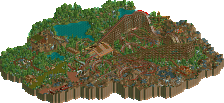
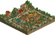
4.Kek-Lok-Si by Metropole
--Vekoma Coaster Challenge
--Winner: "Kek-Lok-Si" by Metropole (Unanimous Decision 3-0)
3.Silver Bullet by d4rkj4nu5
7.Covey Cove by Jacko Shanty
--Arrow Coaster Challenge
--Winner: "Covey Cove" by Jacko Shanty (Majority Vote 3-1)
Congratulations to Metropole and Jacko Shanty for advancing to the Elite 8. Who'd have thought that in a bracket that featured Toon, Aero21, and DarkJanus, we'd have the 4 and 7 seeds advancing to the West Bracket finals. Good luck to both, as they are two of the most promising upcoming parkmakers at our site, and thanks a lot to leighx and DarkJanus who gave it their all, throughout the whole contest.
My reviews soon...
EDIT: I got 404'd by a crow for Metro's...
Corkscrewed Offline
Leighx had an interesting idea, but the whole thing came out really chaotic and messy looking unfortunately. It could have worked out, but the result was just really odd.
Janus had some nice stuff going... a twist from his usual super fantasy self. It could have turned out pretty nicely, if it was complete, though I'm not sure it would have been super jaw dropping. It kind of reminded me of Aero's stuff, though, which has its own pleasant atmospheric feel.
Jacko definitely had the park of the round, though I liked it for its humor more than its style necessarily. The "mala" section was not too well refined, though I think that was part of the point. The "Pile as much shit as possible" land was quite excellent, getting the "Foozy style" down very well. "Nice" land was a little too disorganized, but the whole map was pretty cool. Not the strongest round of the tournament, but this was the best park of this bracket. Very funny stuff, though, Jacko. You continue to impress me.
Unlucky leigh, I'll check your entry out in a minute. And well done to Jacko for pulling off a big win against Janus. I'll leave my comments when ive seen the parks.
Your park reminded me of Butterfinger's PT park, only with less hidden stuff (unless I missed something, and that's certainly a good thing.
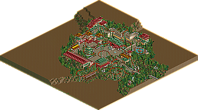
Metropole - Amazing work, as always. Fantastic coaster, probably your best theming (architecture, foilage, landscaping) yet, and pretty colours. And, of course, a great, bright atmosphere. Nothing wrong with it really, except that it was a little bit unfinished in parts, and I still don't like the station and the red/green building right next to it, but I guess they're accurate.
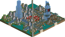
Leighx - Better than your last entry, but I still don't like this much. It's how everything is seemingly thrown together by more or less random scenery pieces and then coloured to make it fit together more that I don't like. The time machine I liked, because it was more focused, sort of. The rest of the entry, with the exception of some nice ride-theming in one of the corners and the pretty good use of landblocks, just lacks some finesse for me, it doesn't look like there was much thought put into it. Didn't really look at the coaster, so I don't know if it was good or not, but it interacted pretty well with the theming. Good entry, anyway.
Oh, and I believe my entry was called Silver Arrow, but whatever.
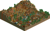
d4rkj4nu5: I loved it. I thought it was as well-executed as it could possibly be. The landscaping was amazing, as was the tree selection (which was what made it great, IMO). It reminded me of Phatage's SFWoA somewhat. Nice supports, and an overall nice looking coaster. There wasn't really anything too creative, but it was still very nicely done.
Metro: Good job with this. You really are one of the best with coasters/supports (BTW, you're still going to build that coaster in my park, right?). The tree selection and landscaping was awesome. The buildings seemed a bit boring at times.. because they all looked alike. But nice win, you def. deserved it. G/l in the next round too.
leighx: Nice! The wow factor was high when you first open the park. Pretty much all your parks are like that, which is really good. But when you look closer, everything looks a bit rushed and random. I didn't see that as much as I did with your other entries, which is good. Your style is a lot like Jkay, actually. Nice, creative entry though.
Thanks for the comments.
I spose i was luckly to even get here by a forefit. lol
Metropole: Quite nice overall really just one small thing that kind of put me off the station part were all the bushes on the platfroms but that was only minor, but yeah very nice entry.
D4rkj4nu5: Not anaful lot there but yeah i quite liked what you had there anyway. nice aswell
Jacko: Really cool, lovely and werid imo, no major holes at all really.
Also very good!
As for mine well i know 2-3 weeks is long enough for a small entry but for how slow i work.... i think that is why all my enteries came out pretty poor i mean now i look back on them i liked making them at the start, but then it just got bored and wanted to hurry to finish...... i guess i should just take my time for perfection. lol
Anyway thank you Iris and everyone who organised it, even though my entries weren't brill,
Thank you and i wait to see the next competition/event
Corkscrewed Offline
A pleasant entry, though I wouldn't count it as among this contest's elite. The buildings were pretty nice, but very blocky. I wasn't a fan of hte three roof colors, especially since they were three nearly complementary colors instead of analogous colors. The tree selection and atmosphere is very nice, though, and the coaster itself has a pretty awesome layout. I loved how it twisted within himself and such, but the architecture was probably what detracted this piece of work. A good job with this though.
Leigh...really a fun entry, I like this style and it continues to produce good stuff. Unfortunately for you, metro's area is insanely good, that coaster was one of the best suspendeds ever.
DJ...not feelin it sry?
I was proud of the layout, and proud of the overall result, but by the end, I had lost most inspiration, and did not fancy changing the first 2 buildings, or expanding the entry anymore, so I sent it in. Hopefully, my next entry will have more to it, and I won't have a split mind in making it
Anyway
Janus: Not your best work, I prefer you outlandish fantasy stuff, but I like the creative realism (
Jacko: Excellent stuff. A very complete entry with an original twist. You have shown your worth on all aspects of parkmaking, but I still think your landscaping is your weak point. Anyway, I won't give any advice, because I want some chance of beating you in the next round
Leigh: I much prefered this to your european entry, but some parts did look rushed. In theory, it could have turned out excellently, and some aspects of it did, such as the landblocks and waterfalls in areas. But some parts looked a little too messy and random. Unlucky in going out though.
Metro
Anyways, I did do a readme, so you can download it below!
Attached Files
downloads: 18
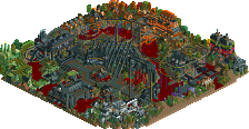
Covey Cove by Jacko Shanty - You've really got an amazing imagination Jacko! I really didn't know what to make of this entry at first, but I do know I like it. The themes you captured were not only hilarious but unique at the same time and stuff I would never think of. The "pile as much shit on one tile" land really gave me a good laugh and was pulled off nicely. You also did well with the lift hill. But what did it for me was the fact that the coaster made one run, catapulted of the end of track and exploded in front of the panda cage. It just shows how you are pushing the game to new heights. Awesome entry Jacko, definitely my favorite of the bracket.
Kek-Lok-Si by Metropole - Definitely not your best stuff IMO, but still a solid entry. The coaster layout was superb as usual, and absolutely loved the custom supports. However, I found the color schemes quite drab and some of the architecture strange in places. I think what bothered me the most was the over-use of the oriental roofs. But still, an amazing coaster nonetheless. Good to see you pulled off the advancement, congrats!
Metro, the part on your coaster where it went down into the valley with the statues below ground level, that was good stuff.
Darky J
Metro you did ok, I liked the archy even if their was not much to it. Neat stuff but im hopeing for better next round.
leighx, sorry I had an error opening it. and btw get at me so I can help you with that hack, we got bad luck on IM timeing I guess...
Since I bumped four parks, might as well comment on Silver Bullet which was another creation I'd never seen before. Looks fantastic.