Park / Chimei
-
 05-February 09
- Views 5,455
- Downloads 812
- Fans 0
- Comments 17
-

-
 72.69%(required: 65%)
 Design

RCTFAN 95% 5dave 85% nin 85% Xcoaster 85% zodiac 85% CedarPoint6 75% chapelz 75% Fr3ak 75% geewhzz 70% posix 70% Magnus 65% Milo 65% FullMetal 60% Steve 50% Evil WME 40% 72.69% -
 No fans of this park
-
 Full-Size Map
-
 Download Park
812
-
 Objects
186
-
 Tags
Tags
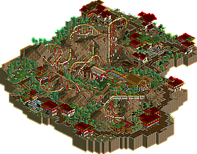
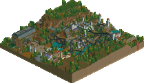
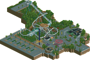

Louis! (formally known as Pineapple) has been teasing New Element for quite some time with various projects, taking stabs at both RCT2 and RCTLL. The community has seemed to only take notice to his screens, neglecting all the finished work he has under his belt. He showed promise during the Micro Madness competition, turning in three entries, two finished and one unfinished. Less prominent at New Element, but showing incredible potential with his Road Rally entry, Kingdom of Morrocco, Louis! finally shows what he can officially do with his debut Accolade Chimei. Read on...
When I first looked at it, I was concerned that it would not hold it's speed to the end. Reminded me of Tatsu with the look and feel.
Glad to see it finished and I'm looking forward to seeing more from you.
James
Good luck with Emporer!
well done louis
a much deserved accolade.
loved almost everything about it
(i though there was abit too much brown tbh)
The overall presentation of it is very good - you've managed to successfully pull off a map with a lot of brown bare land. The foliage is simple but fitting; the landscaping is really good - I really like the many tunnels the ride has, and how it's constantly diving in and out of the terrain - shows you're aware that this interaction would greatly improve the flying-coaster experience. Supports, catwalks, transfer track, and in particular the station, all very nice.
Layout. First thing I looked at were the stats - 'Extreme' intensity rating... put me off a bit. But as I then viewed the layout, I was thinking this is really REALLY good. I like how it sprawls all over the place, in and out of the rockwork, and it gradually picks up speed - you save the biggest drop for the final third of the ride - I like that. Even the immelmann - which I thought I would dislike given that that inversion is quite unrealistic on the flyer - was pulled off really well, and won me round. Overall, the layout was pretty believable, but unique as well.
And then there's a bit I hate. After exiting the immelmann, and going down the drop, the ride does this CRAZY high-speed upward twist, hidden underground, exiting straight into a barrel roll. THIS is why the ride has an Extreme intensity rating. This manoeuvre felt really REALLY force and ruined the 'believability' the ride had. I was so ready to rate the layout as perfect, but I just hated this segment. You really could have cut this bit, and had the ride head into the pretzel. The pretzel was great; and I liked how the s-bend at the base of the inversion (which is of course unrealistic, but the only way you can do a pretzel in RCT) is hidden in the rockwork. And then there's a good outro to the pretzel, with some turns up into the brakes. SUCH as shame about that random bit before the pretzel tho.
Minor other things - I think the ride deserved a bigger, more obvious 'entrance' to its queue-line... and when the queue-line splits for both sides of the station, one queue is much MUCH longer than the other - be careful with the details! I also thought the area as a whole perhaps sprawled too much - it's ok for the coaster to sprawl, but I didn't feel you needed to also make the pathways and buildings head to all corners of the map as well. It was almost like you were unnecessarily forcing them onto the map, just so you'd have a lot of pathways/buildings near the ride. A little more 'concise' would have worked better I think.
And so there's mostly good... but also a few gripes... so I think 14/20 is a fair score... it's still really impressive and with a few alterations would have been one of my fave designs. Definitely worthy of a frontpage release tho; congrats.
Xcoaster Offline
On the other hand your overall style still leaves a lot to be desired. You're fast approaching the ability to develop some very nice work but this falls just shy of that imo. Your layout of the park, architecture composition and pathing could be improved before you really come into your own. I really didn't care for the thin, 2-wide paths all throughout this. It did nothing to tie things together and seemed awkward. Your architecture is nice but again, your placement of your buildings doesn't really create a cohesive feel. To me it felt like looking through this was looking from building to building without considering anything in between. While the landscaping was well done and the foliage was good, the space between the architecture just doesn't seem like anything but distracting gaps.
It was sooooo close to being awesome but what I mentioned above prevented me from really getting into it. Maybe something to consider.... in a future project consider putting some buildings on a hillside or around some cliffs or even built into a cliff. Right now you seem to be limiting yourself to placing them on little pockets of flat space between hills. It gives your whole park/area a forced look that isn't appealing.
congrats on Design though and I look forward to your future projects *coughEmperorcough*
James - Thanks.
Mozilla - Thankyou.
SSSammy - Haha! Tell me about it
Todd Lee - Haha, I thought opinions would change when seeing it in full. Thanks Todd, glad you like it.
eyeamthu1 - Thankyou a hell of a lot. It's always nice to read a full review. I'm glad you liked what you liked, and I'm glad you explained what you didn't. To be honest when I build a coaster I don't look at the ratings as I don't see the need to. I personally just build the coaster to how I think I would enjoy it, and that's what I did here. And I think it worked out quite well. I agree with the entrance, it could have been bigger and more thought put into that, this is something i've worked on in Emperor. Again thanks for the comment.
zodiac - Yes I do, but others don't
Kumba - Thankyou.
Xcoaster - Thanks.
Milo - again thanks for the review, I've taken on board what you've had to say, and most of the points I agree with. The layout is awkward and more thought could have been put into this. I hope you like my next release better.
CoasterForce - Thanks, that was what I wanted. I wanted to build something that wasn't going to be so forgettable. Which is why I went with a flyer, we haven't had a big flyer since Salga, and I thought it was about time we had one.
Thanks for all the comments, keep 'em coming!
The layout really did not make sense to me. It sort of lingers around and the biggest element is set up last. One tunnel after another. This really explains why my vote is where it is, best.
Furthermore, the landscaping was ok in places, but i found the purple red flower combination a real turn-off. The trees were mostly flying somewhere above the flowers, with one tree obviously not belonging in this game. I think it is usable in rct, actually, but you'd have to stress its difference more.
The architecture felt monotone and not endearing. The station was nice, though.
I personally prefer more packed parks, but the minimalistic look can be pulled off well for me as well. Although it's hardly ever the case, I do think if you're building only one building instead of 4 or 5 in places, it better be atleast 3x as good (i know, you can't quantify this..) You can get away with a lot more in packed parks, at the same time you need to take more chances. When you're going for the minimalistic look, I personally think everything must be close to picture perfect. (since the rest is bare land, you know, what else are you going to be looking at or getting the feel from?)
I love the terraforming in this design and how the coaster interacts with it..
I still dislike the flowers throughout the landscape.. It looks incredibly messy and doesn't make any sense to clutter them around your landscape like that.. No park would do that.. What wme said about the minimalism makes sense; I also think it looks a little too bare in some places.. I also agree about that un-rctish tree.. It just doesn't fit and takes out the flow of your landscaping imo..
I think the lay-out (what a design is about) is nice though; I love it (in real life) when a ride is going through mountains or tunnels.. It adds a lot of excitement as a rider.. It flows nicely throughout.. Maybe it misses a big element right after he first drop though.. As a rider I always love to experience that after a boring lifthill..
All in all, a lovely deserving design.. Looking forward to Emperor!
SF
edit; I agree with eye on that weird upward twist which is causing the extreme rating.. Too bad, but other than that I have no complains..
The only thing I didn't care for, was the ghost tree in one of the corners of the park. But thats easy to get rid of.
Since it's a ghost, you already know that another tree can be placed on that tile.
Place the identical tree there, in the identical rotated position.
Then right click on it a couple times to delete it.
It might take a few attempts before it gets removed (because of the rotatable position of the object.) But it will work.
It works with any "stuck ghost" image. Objects, Track Sections, Trees, etc. Just build the same thing right over it, in the same position, and it can be deleted.
Although I haven't tried to raise or lower the land tile(s) beneath them.
You got an awsome track here Louis! Congratilations!
all in one post.
Louis!...you already know what I think of this, well done. And, when are we gonna do that duo?
Let's shoot for after I win Clockworks and the Monaco Road Rally...I'll have some free time then.