Park / Exodus

Park_784 Exodus

357 Comments

This park shares comments with 19 other parks(View Parks)
  • iris%s's Photo
    #6 Posted.
    Thanks and congrats Scarface.

    Hi-Rollers Standings
  • mantis%s's Photo
    So far, H&V:

    Raven, Ed - joint #1
    Iris, Toon - joint #2
    Pyro - #3

    41.5/50

    3 points up on Posix, so I we're really getting into the next level now, points wise. Plus this park is the first to be in the running top 3 of each of the judges, so only really lost on on points from pyro (who ranked this lower than Enchanted Waters...which I simply don't understand...)


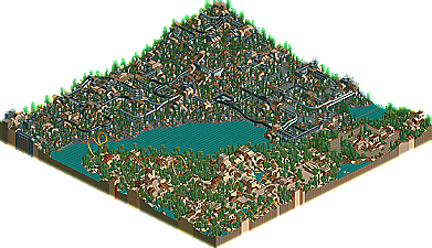
    Adam - I like this park a lot. The architecture was all pretty technical, and the cogs and industrial looking braces/beams all added to the effect. The colours were cool (brave on that grey - it payed off) and I thought the park had real atmosphere.

    There could have been a bit more landscaping, though, and the coasters were a bit weak (well, the steel twister was).

    But, I think it's definitely one of the better entries so far - and comparing this to your other work (IOA, USO, Toon) it's cool to see you trying so many different themes.

    Good work.

    ooooh, top 5 time! Corky, X, Ozone...two others? Is butterfinger entering?
  • deanosrs%s's Photo
    Wow. Well done Scarface.. it looks amazing. Definitely the best RCT2 park in the comp by a mile (well, so far anyway)
  • Coaster Ed%s's Photo
    Here's a breakdown of where RCT2 and LL parks placed cause I still find that interesting.

    01]
    02]
    03]
    04]
    05]
    06]RCT2
    07]LL
    08]RCT2
    09]LL
    10]LL
    11]LL
    12]RCT2
    13]LL
    14]RCT2
    15]LL
    16]LL
    17]RCT2
    18]LL
    19]RCT2
    20]LL
  • John%s's Photo
    I didn't like adam's entry. It just seemed overly boring. The gray was the huge downer. THAT much gray is just TOO much bland for me. Eh. But the architectural detail was very nice, I liked the red, magenta, aqua, etc. accents used, just cannot stand all that gray. :|''''
  • Turtleman%s's Photo

    I didn't like adam's entry. It just seemed overly boring. The gray was the huge downer. THAT much gray is just TOO much bland for me. Eh. But the architectural detail was very nice, I liked the red, magenta, aqua, etc. accents used, just cannot stand all that gray.  :|''''

    Agreed.
  • Corkscrewed%s's Photo
    Man oh man... you should see the points spread for the top five! :D


    Y'all better comment on my park whenever it comes out.
  • CoasterkidMWM%s's Photo
    4th dimension coaster was terrible. All it did was repeat and it spent the ENTIRE time with the trains rotated at the same degree. It is the worst coaster made in this entire contest. It's worse then Chris Sawyers attempt at making X. However the other two coasters were great so don't get down on yourself. I liked the atmosphere, it was fantastic. Archy was great too. Good job overall.
  • Ozone%s's Photo
    I loved it. The buildings were stunning, I couldn't stop looking at it. Good job adam, you deserve your parkmaker spot.

    Y'all better comment on my park whenever it comes out.

    Cork, if you wan't comments on your park, you better comment on some of the others ;)
  • Scarface%s's Photo
    I wanted it to be mainly grey with a few other colours mixed in...The techincal, futuristic look was mean't.
    Also i never knew u could rotate seats on 4d's lol....now i know..

    thanks for the comments although not many

    my guess:

    5. Corky
    4. Butter
    3. OZONE
    2. Mala
    1. X
  • jhoffa%s's Photo
    You've come a long way from asking me to do custom supports for you.
  • CoasterkidMWM%s's Photo
    Sorry I was alittle harsh about the coaster. Their's an option in the build window for seat rotation, when you start out, it's at zero, just click up or down and the seats will rotate in the direction.
  • Pym Guy%s's Photo
    Honestly, this park didn't wow me much. Sure, the architecture was pretty good, I guess. But it certainly wasn't anything to make him become a parkmaker. The overall feel of the park was good, it captured that factory/industrial theme well, but day-um, could you have laid off of all that grey? It bored me to death, to tell you the truth. The coasters weren't that good either, mediocre at best. Especially that B&M. It just didn't make me want to take a second glance at this park, really. You can't rely on architecture alone. Not one of my favs in this contest so far...
  • Scarface%s's Photo

    But it certainly wasn't anything to make him become a parkmaker. 
    Could you have laid off of all that grey?. 
    You can't rely on architecture alone.  Not one of my favs in this contest so far...

    1. Obviously it was enough because i became one.
    2. As ive said i wanted the park to be like that...Just in the same way Nate doesnt want trees in his "city of god" park.
    3. Iris stated they were some of my best rides. So i hardly rely on archy alone although this is my strong point.
  • gymkid dude%s's Photo

    But it certainly wasn't anything to make him become a parkmaker. 
    Could you have laid off of all that grey?. 
    You can't rely on architecture alone.  Not one of my favs in this contest so far...

    1. Obviously it was enough because i became one.
    2. As ive said i wanted the park to be like that...Just in the same way Nate doesnt want trees in his "city of god" park.
    3. Iris stated they were some of my best rides. So i hardly rely on archy alone although this is my strong point.

    adam, don't be discouraged by all these playa haters.

    I liked it. The grey was fine, because each area had a 2nd subcolor to go with it...like grey and ice, grey and magenta, grey and black. It was fantastic. Not only was color well used, but also texture and shape. The mechanical texture, glass, plain, everything. Nice.

    As for the coasters, they were alright, but the steel twister being in all those buildings made it fantastic. :birthday2:
  • AustinPowers%s's Photo
    I haven't commented on any of these since Bigfoot's #20...and I think all of them are very good.....so short little comments for all you guys...

    deanosrs - not bad...showed potential...I know you can do better
    Hevydevy - wasn't crazy about it....coaster track scenery all over the place just doesn't do much for me...although the colors were cool
    Micool - a joke...right? Can't really comment on much....still haven't really seen much of your work...so I don't know...
    RCTFlame...classic Flame....good theming...good coasters...just same ole' stuff
    Mantis - creative...great ideas translated well into RCT1
    Freak - OK....I expected yours to be better themed than it was
    Junya Boy - the king of hacking...but archy needs lots of work and too many trees....
    Aeroglobe - very nice RCT1 park...impressive...wish you would get back to RCT2 tho ;)
    Posix - thats the best RCT1 park so far...classic...well done...well themed...just perfect IMO
    Natelox - sorry....didn't get it....and it was boring
    TPM - very nice...very creative...loved the orange water
    Gymkid - impressed with the fact that you are trying new things...loved the ideas and the park...wasn't quite sure I liked the massive bldgs in the corner...but overall...well done
    Aviator - nice...just nice....didn't think it should have been as high as it was...but good nonetheless
    AdamRCT - loved the gray...lots of texture and detail and subtle use of color....good archy even tho I'm not crazy about the smallness of it all...definitely deserve the title of parkmaker...
    Corkscrewed - nice park...don't think it should have been as high either....nothing wrong with it...a little big and boxy for architecture...but nice park layout and coasters and such...

    I think I'm caught up now....can't wait to see the top four now....
  • Corkscrewed%s's Photo
    Dude... Iris hasn't posted the announcement about #5 yet...

    Someone's been fiddling with URLs. ;)

    Besides, architecture realistically IS big and boxy. Eh... can't please everyone. :D
  • Coaster Ed%s's Photo

    Besides, architecture realistically IS big and boxy.  Eh... can't please everyone.  :D

    Well that's true of a lot of architecture but not all architecture. Of course you know that. I'm not trying to be condescending. It's just that a lot of the architecture that I really like isn't boxy at all.

    So has yours been posted then? It still says #6.
  • Titan%s's Photo

    Well that's true of a lot of architecture but not all architecture. Of course you know that. I'm not trying to be condescending. It's just that a lot of the architecture that I really like isn't boxy at all.

    So has yours been posted then? It still says #6.

    Let me quote Corky on this.

    "fiddling with the URLs..."
  • TerrorTech%s's Photo
    5 is posted on the high-rollers index.....Corky the atmoshpere you have created in Cloverfield is sheer perfection from every angle..."small but perfectly formed in every way".....I even read the the adobe file whilst having a shit this morning....perfect.
    For me Pyro's scoring has been spot on the mark for this contest.

    I will personaly gut any peep that litters this park....with a knife from
    the Golden Ranch Knife shop.....Hell i'm going back on Outlaw.


    TerrorTech Library