Park / Earth Through The Ages

Park_782 Earth Through The Ages

357 Comments

This park shares comments with 19 other parks(View Parks)
  • gymkid dude%s's Photo
    i really loved the tropical section and the sit down. The AD section didn't push too many of my buttons though, albeit it was creative. Good work.

    I'll comment on Mantis's too. I loved Exctasy, but I hate the supports. The first hill after the drop had 5 stacked flat wooden tracks. Ugly. I'd much rather if you had taken the time to do those supports, and spend them adding more stuff to the map. The entrance, however, was spot on, and I liked the elevator idea.
  • Prince%s's Photo
    great job everyone, especially freak (people are finally seeing your potential), I cant wait to see the next entries number one will probably make the list...

    ~Prince Ashitaka~ 8@
  • Micool%s's Photo
    Well the problem with freak's stuff is that he has some kind of queer ADHD, so he can't concentrate on one part for very long. So he goes on to another part, but instead of connecting the two later, he just fills it with trees. I thought this was absolutely your best work yet, freak, but everything you make has too much green filling, especially since most of your new stuff is mostly filled with bushes. :)

    Good job!

    P.S. Now I'm really anticipating the rest of the entries...
  • Scarface%s's Photo
    Not looked at any yet...will do at the end giving a short review on each
  • mantis%s's Photo
    I forgot to post this before:

    Posted Image

    There you go.


    ----------------


    Freak - I wrote the little thingy for this, and you can probably tell I liked it. Shame about 'corridor' though :p
  • iris%s's Photo
    #14 is up, congrats to Junya.
    Thanks for entering.

    Hi-Rollers Standings
  • Drew%s's Photo

    Sorry, but the download for Mahaloe Avenue doesn't appear to be uploaded

  • iris%s's Photo
    Fixed.
  • Brent%s's Photo
    Another cool park from tha J-man, but it's too much like his last park for me to really like it that much. He seems to keep the same style for like, 4 parks or so. Wonder if Mi:Las would've been like that...
  • Micool%s's Photo
    I thought it was nice. The theme was definately not super crazy, but the colors were sure nice, and the architecture was solid. The coasters were more then anything I could do...not saying much. I've just never been impressed with Junya's RCT2 parks, because the "archy" ;) bores me in RCT2, especially after playing around with RCT2 for a while. Those buildings are soo easy to make, and there really aren't that many of them...I can see how this was the first entry submitted. With RCT2's stacking features, architecture should be innovative, even without custom scenery. I would describe it as a "nice" park, but I think things tend to look much more impressive in RCT2 then the amount of work they took.
  • Coaster Ed%s's Photo
    It's getting harder and harder for me to like work like this. Nowadays I really look for something different and innovative. Everything else just bores me. There was some skill that went into the engineering of this park. Junya Boy should be recognized for his achievments in hacking RCT2 but I've also never been a fan of hacking just for the sake of hacking and Junya didn't really do anything new here. A nice piece of work certainly but one of my least favorite entries.
  • sloB%s's Photo
    The coasters are very cool, but that seems to be overcasted by the not only boring but very overused theming. I mean really, first of all I think the theming is way too simple and basic, but you have really done this too many times.

    Anyways, the coasters of course had great layouts and they were the only reason this park was ranked at 14. I actually really enjoy hacks because they are yet another way to make something titally new.

    I still can't get my Pretzel Loop to look likes yours Junya ;)
  • deanosrs%s's Photo
    A mini GoD.... And that's not a bad thing. I would have loved it if I hadn't seen GoD, but I have so there wasn't anything that made me stick around in the game for too long. Nice park though, you can tell a Junya park a mile off. :D
  • iris%s's Photo
    #13 Added.
    Congrats & Thanks aeroglobe.

    Hi-Rollers Standings
  • sircursealot%s's Photo
    The only entry so far that I've really enjoyed. Some very cool styles showcased here, looks like a blend of Fatha', Schuessler, and Pawn. Very interesting to say the least.
  • Brent%s's Photo
    http://nedesigns.com.....0the Ages.zip

    And Brent pulls through.
  • gymkid dude%s's Photo
    I liked it. Too many steel coasters tho...I mean all 3 of em were steel twister track with a large vertical loop.

    I mean the coasters weren't poorly done, and I liked the futuristic hotel, but too many steelies!!! ;)X
  • Ozone%s's Photo
    Well, my rct2 isn't working at this time, so I'll have to just comment on the LL parks.

    Starting with the last:

    Nightmare Lake- The devil sculpture was awesome. The achritecture wasn't what it could be, too many flat roofs without any paths of fences on them. Oh and just curious, how are people supposed to get to the entrance of the mine train? All in all I think this is a vast improvement on the past stuff I've seen from Bigfoot. Well done

    Micool's Islands of Adventure Washington D.C.- Micool's style is completely wacked. I found the humor in the park, which was in fact humorous. Still, I didn't care too much for all the crazy colors. I guess I prefer somthing that I could see being more realistic. I liked going through looking for all the little things you copied from other parks. good job there.

    HappyLand- I could see where this park could have gone. The entrance was superb, the colors, detail, everything. The rest of the park.. rushed to put it gently. I would love to see the park somwhat re-done with the entrance themeing all throughout. But, what was there I enjoyed a lot. Nicely chosen names lol.

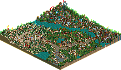
    Earth through the Ages- This park actually quite suprised me. It really showed to me that Aeroglobe has some skill, now all he needs to do is have some ideas instead of taking them from others. The first couple of loops on the silver steel coaster were nice, and so were those awnings at the begining of the map ;). Great job Aero, I'll be watching out for more from you.


    EDIT: Exile- Improvment has indeed happened here. The arcitecture, colors, and rides I thought were all better than Xanfia. There was a lot of fillers in there, the water and lots of trees. I enjoyed watching the adventure ride, as always.
  • natelox%s's Photo
    the new one looks great (haven't looked at it yet though). Again, pryo, giving it a 3 while raven gave it a NINE. wow.
  • thorpedo%s's Photo
    Way to go Aérô, I'm so proud.

    *sniffle*

    You beat out so many big names...and wow. Congrats, with one great park.