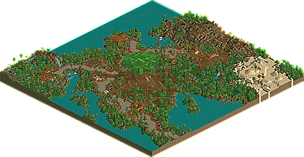
So butterfinger takes layered architecture to a new level...
Damn, I just advise everyone to turn on 'path height markers' and marvel.
Brilliant Ideas:
[*]Trojan Horse
[*]Wyvern
[*]Greek Ship
[*]Wall
[*]Custom swinging ship
[*]Chariot Race
Not so good:
[*]Kraken Weed (not good enough to warrant being funny)
[*]Unnamed buildings
[*]Octopus ride (tacky again)
Architecture wise, though, you've moved by leaps and bounds since Euroscape. The overpasses, tunnels and bridges all mix into the buildings beautifully - I can't imagine how you'd plan something like that out and make it work.
Okay, i opend rct2 yesturday cause i had some time to waste (no offense to anyone, but only when i do have time to waste is when i can start rct2). So I opened Cloverfield. My thoughts are that some of the architecture is good, but it's fairly simplistic and average throughout the park. The colour were really what brought the park down IMO, they didn't fit anything. I don't see how this park got a ten, but i guess i see things differently...
Now i have to open rct2 AGAIN! ARrgghhhh. Congradulations butterfinger
I feel your pain - but it's worth it just to see the layering! I recommend looking at Gymkid's too - there are some really cool ideas in his park.
X and Ozone will probably have used rct, so I guess the only other person that could have used rct2 is this damn mystery person. And damn them if they have
Butterfinger's park was amazing, Looks like he spent a long time hacking in rct2. The ideas were nice, and so was the themeing. Just the things I like to see in a park.
You're right. It takes me fucking ages to load an rct2 park and i'd much rather be playing rct/doing fuck all. So yes. Normally, if I want to look at an rct2 park I let it load while I eat or have a shower. Otherwise I just can't be arsed
But i'm beginning to think it's worth it for parks like this.
CORKY's- I didn't expect to see this from this park. The architecture is different than what I am used to seeing in RCT2, but I can definitley appreciate it. The park was the defintion of atmosphere. I agree that I could imagine this as a rel park somewhere (GO Pennsylvania ). The coasters were ok not AMAZING, but I did like the John Miller one, very cool.
I think that this is a love/hate park becuase it has such a different style, IMO. Its big architecture that doesn't seem to follow a single pattern. This park is much better if the viewer doesn't neccassarilly focus on a single building or such, but an entire area. All the buildings work together to form this atmosphere.
One last thing, I think this park would look a trillion times better from the POV of a person. No flat blocky looking roofs, and all the wonderful detial on the walls of every building. Great job corky
Sorry if this has already been addressed, but Cloverfield, Trojan Dynasty, and Lumbini all scored 43. What was the tie-breaker?
I'm about to look at Lumbini, but for now:
-Cloverfield- I loved it. This is truely my kind of park. I was really able to emerse myself in the environment. The readme really enhanced it a whole lot more as well. The coasters all had exciting designs, and I really didn't mind the oversized buildings. They just constitute a larger medium for detail.
-Trojan Dynasty- Well, neither the Trojans or Greeks had cannons (Archimedes, however, did engineer efficient catapults), but the battle spectacular was pretty fun to watch. I liked most of the buildings; I suppose I don't mind the repetive appearance since it is supposed to represent the whole city of Troy. I didn't really like the glitches, so I wasn't a fan of the Kraken-Weed or the horse race (though I did like the layout). The other two coasters, however, were fairly well done in my opinion. My favorite part though... the sea-gates. I dunno, there's just something I like about them.
Ozone. Your park was amazing. I loved it. My favorite park ever, despite not being a mega-park. Sounds pretty lame to be that overwhelmed by it? But yes. I love it.
I gave out two 10s. One for RCT2 and one for LL. OZONE's park was the best thing I've ever seen in LL. The use of rapids rides for skyscrapers is one those brilliant idea that don't come along very often. I'm going to have to use that idea in the future because now that I've seen it, it's impossible not to - - just like aero21 using rapid rides for stairs. The landscaping was great too and so was the coaster. I don't see how anyone can not give this park a 10. Oh well. OZONE, you are the man.
Butterfinger's park was also amazing although not as innovative. It highlights everything that is good about RCT2. The show was a nice tough as was the custom inverter ship. The rides didn't excite me a lot, but they too were well done. Butterfinger's architecture strikes me as a little too repetitive, but that is part of his style too which is unlike anyone else. In the end I took off a 1/2 point because it wasn't as eye popping as the two parks that I gave 10s to, but still this was a stunning park. I feel sorry for Butterfinger because he's just missed out on winning two contests in a row now with amazing parks.
Corkscrewed is the master of atmosphere in RCT2. Well he's not the only master, but he's one of the top 5 certainly. His park felt real to me and the architecture has a lot to do with that. I've said in the past that I prefer large modern looking architecture in RCT2 and this is as far from that as it gets, but it won me over anyway. Great work Cork.
Getting down to the final 2! Who will take home the $50 ?
The mystery person will take home the $50 as ed said he gave 2 10 points out to one LL park and one RCT2 park and that rct to park hasn't come yet.
I'll edit when I have looked at ozones.
EDIT: Great work ozone. the park was cool. I loved the colour screen and your architecture. those cool resturant cover tower things where cool. and the use of coaster track and rapids on your buildings worked really well. well done on 3rd place.
Just got around to looking at posix's entry to. great work again. you make some great stuff. Ambahikily Tropicalia was awesome I loved it loads.
Right got to go and finish off the tiny bit left I have in project 5HiNE.
Ozone - perhaps you can tell by the way I wrote the description, but anyway, i'm going to say it again. This park is mind-boggling.
It's impossible to put into words, so i'll just say that you are now one of if not the best rct-er out there. Not only have you got theming and coasters, you've got brilliant architecture, innovation and speed on your side.
I'm looking forward to the top 2. X and...hmmm. If the 3-5 places were so close together (well, tie-breaker) then the top two must be very close too.
Hi Rollers is the best competition, quality wise, ever to be held in the RCT community. There's no doubt about that.
357 Comments
mantis Offline
Damn, I just advise everyone to turn on 'path height markers' and marvel.
Brilliant Ideas:
[*]Trojan Horse
[*]Wyvern
[*]Greek Ship
[*]Wall
[*]Custom swinging ship
[*]Chariot Race
Not so good:
[*]Kraken Weed (not good enough to warrant being funny)
[*]Unnamed buildings
[*]Octopus ride (tacky again)
Architecture wise, though, you've moved by leaps and bounds since Euroscape. The overpasses, tunnels and bridges all mix into the buildings beautifully - I can't imagine how you'd plan something like that out and make it work.
Very, very, cool!
natelox Offline
Now i have to open rct2 AGAIN! ARrgghhhh. Congradulations butterfinger
mantis Offline
X and Ozone will probably have used rct, so I guess the only other person that could have used rct2 is this damn mystery person. And damn them if they have
Pym Guy Offline
CoasterkidMWM Offline
iris Offline
Ozone Offline
Butterfinger's park was amazing, Looks like he spent a long time hacking in rct2. The ideas were nice, and so was the themeing. Just the things I like to see in a park.
mantis Offline
But i'm beginning to think it's worth it for parks like this.
sloB Offline
CORKY's- I didn't expect to see this from this park. The architecture is different than what I am used to seeing in RCT2, but I can definitley appreciate it. The park was the defintion of atmosphere. I agree that I could imagine this as a rel park somewhere (GO Pennsylvania ). The coasters were ok not AMAZING, but I did like the John Miller one, very cool.
I think that this is a love/hate park becuase it has such a different style, IMO. Its big architecture that doesn't seem to follow a single pattern. This park is much better if the viewer doesn't neccassarilly focus on a single building or such, but an entire area. All the buildings work together to form this atmosphere.
One last thing, I think this park would look a trillion times better from the POV of a person. No flat blocky looking roofs, and all the wonderful detial on the walls of every building. Great job corky
iris Offline
Thanks and congrats OZONE.
Hi-Rollers Standings
Pym Guy Offline
MindBender5 Offline
I'm about to look at Lumbini, but for now:
-Cloverfield- I loved it. This is truely my kind of park. I was really able to emerse myself in the environment. The readme really enhanced it a whole lot more as well. The coasters all had exciting designs, and I really didn't mind the oversized buildings. They just constitute a larger medium for detail.
-Trojan Dynasty- Well, neither the Trojans or Greeks had cannons (Archimedes, however, did engineer efficient catapults), but the battle spectacular was pretty fun to watch. I liked most of the buildings; I suppose I don't mind the repetive appearance since it is supposed to represent the whole city of Troy. I didn't really like the glitches, so I wasn't a fan of the Kraken-Weed or the horse race (though I did like the layout). The other two coasters, however, were fairly well done in my opinion. My favorite part though... the sea-gates. I dunno, there's just something I like about them.
BigFoot Offline
Thank you.
Coaster Ed Offline
Butterfinger's park was also amazing although not as innovative. It highlights everything that is good about RCT2. The show was a nice tough as was the custom inverter ship. The rides didn't excite me a lot, but they too were well done. Butterfinger's architecture strikes me as a little too repetitive, but that is part of his style too which is unlike anyone else. In the end I took off a 1/2 point because it wasn't as eye popping as the two parks that I gave 10s to, but still this was a stunning park. I feel sorry for Butterfinger because he's just missed out on winning two contests in a row now with amazing parks.
Corkscrewed is the master of atmosphere in RCT2. Well he's not the only master, but he's one of the top 5 certainly. His park felt real to me and the architecture has a lot to do with that. I've said in the past that I prefer large modern looking architecture in RCT2 and this is as far from that as it gets, but it won me over anyway. Great work Cork.
Tech Artist Offline
x-sector Offline
I'll edit when I have looked at ozones.
EDIT: Great work ozone. the park was cool. I loved the colour screen and your architecture. those cool resturant cover tower things where cool. and the use of coaster track and rapids on your buildings worked really well. well done on 3rd place.
Just got around to looking at posix's entry to. great work again. you make some great stuff. Ambahikily Tropicalia was awesome I loved it loads.
Right got to go and finish off the tiny bit left I have in project 5HiNE.
Scarface Offline
After what X has been saying it looks like 1 and 2 will be the other way round...whether it be mala or a mystery person.
As i have said..i will write a little review on each park when the contest is over..
Ozone Offline
mantis Offline
It's impossible to put into words, so i'll just say that you are now one of if not the best rct-er out there. Not only have you got theming and coasters, you've got brilliant architecture, innovation and speed on your side.
I'm looking forward to the top 2. X and...hmmm. If the 3-5 places were so close together (well, tie-breaker) then the top two must be very close too.
Hi Rollers is the best competition, quality wise, ever to be held in the RCT community. There's no doubt about that.
sircursealot Offline