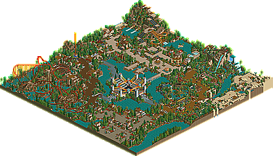
Park / Atilus Republic
-
 01-October 03
- Views 215,331
- Downloads 721
- Fans 0
- Comments 357

-
 No fans of this park
-
 Download Park
721
-
 Tags
Tags
 01-October 03

 No fans of this park
 Download Park
721
 Tags
Tags
 Similar Parks
 Members Reading
Sorry if you people feel so hard about my judging...
I gave this park a 9 because I loved it. Plain and simple. I thought it was so over the top and bulky, yet absolutely amazing in detail at the same time.
I only wish the other judged liked it as much as I did.
Raven-SDI
§
Nice coasters too may i add I really liked the Schwarzkopf and the airobatic. The water coaster was to dency-packed for me to bother to figure out the way it was layed-out.
ride6
Congrats and thanks for entering Hevydevy.
Hi-Rollers Standings
Nice hacking nice ideas, to bad it felt kinda empty.
The hacking was great, I thought the start of the Ringmaster was very cool, but most of the park was boring and quiet.
Would you have preferred it if he'd treed it all to oblivion?
Ah well, can't please everyone.
Come on people - even if you couldn't be bothered to enter (haw-haw) you should at least comment on the people who did.
It looks amazing from the overview... I think I'm gonna have to go re-buy it.
But, you can only impress me so much with a shuttle loop and a an inverted boomerang coaster. He put individual touches on each, but I mean, how much skill does a boomerang coaster take. Or a shuttle loop. Coasterwise, the park was incredibly weak...I liked Mantis', Freak's, and Aero's better. The darkness factor was cool, the tents were cool, the custom rides were cool. The coasters sucked.
This park had probably the best dark atmosphere in a park um....ever. Totally classic and a great concept.
The coasters need work. I actually liked the Ringmaster, but the Ring of Fire and Dying Trapeze need work. You tried to make them interesting, but it didn't work. Human Cannonball was actually a quite pleasing LIM bowl though.
You have wonderful ideas throughout the park..the inspiration from Ginneiagfdablahablah is obvious. The track pieces archy is really cool, you kinda have a knack for putting that together, thats obvious. The Big Top is awesome, very cool idea there. The theming is very dark, I like how you tried the atmosphere out, and it just clicked for you. I'm jealous.
HOWEVER, good parks must have downfalls. Coasters are a definite downfall here. The Fun House is very ugly. So is the Flaming Top Circus Tent or whatever by the entrance. Your regular archy is good in some places, yet not so good in others.
This is a great park, probably the best so far, besides Aérô and MiCool. Congrats, Hevydevy.
The structures were simply brilliant. Easily some of the best I've seen. The theming too, is top notch. My only suggestions are to work a bit on your coasters and do some landscaping. The park was a bit flat. I wouldn't be surprised to see you as a parkmaker one day.
Congrats and thanks Nate... (who felt the very harsh wrath of Pyro on this one...)
Anyways,
Hi-Rollers Standings
hope u were easy on me
Pryo...i saw that comming, I always thought you never really like my stuff, oh well...my bad luck that you're a judge.
Thanx for holding the contest iris and raven, it was great! Too bad i couldn't cash in, but there's always next time...
I loved both. Each was brilliant. Circus of the Lost Souls was one of the best mini-parks ever. I've never seen anything like that. I've never been too good at coasters anyway so I tend to not notice them much. The theming was brilliant. @ anyone who thinks it's too bare - much of it was packed into small sections. I liked that the theming wasn't treed around, because I could see the stuff that way.
Earth looked lazy and at times, ugly at first. From the bird's eye view. But then there was the tree.
Nice job though, that tree is insane.