Park / Heroes and Villains
-
 02-October 03
- Views 215,331
- Downloads 680
- Fans 0
- Comments 357
-
 No fans of this park
-
 Download Park
680
-
 Objects
202
-
 Tags
Tags
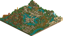
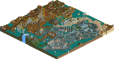
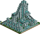
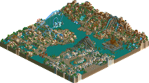
Thanks and congrats Corkscrewed.
Hi-Rollers Standings
Croky, this is magnificent. I love your buildings - they all have their own character, and the little details are so cool (like the little games, the hacked path entrances, the glass windows, the lamps...I could go on)
Plus there was that absolutely brilliant readme - it really shows the effort you put into your parks, especially in atmosphere and storyline. It makes it so much more than just a park...it's more of an experience. Lovely.
I think there was only one thing I didn't really like about the park, and that was how the nighthawk/bobcat area was mashed into the back of the park - it was very haphazard, path wise, and seemed too cut off from the rest of the park. Apart from that I thought it was all fantastic.
Looking forward to WDE even more, now! You were great in LL (don't ever say Meadowebrook wasn't a good park...it was) but RCT2 seems to suit you even better.
If this is just an indication of what's to come, then what's to come must be mind-blowing.
Corkscrewed's park was ok imo. It had some great individual buildings (perhaps a little blocky in places
Corkscrewed Offline
IMO, the main flaw of my park is the midway area, which kind of looks rushed and doesn't create a seamless transition. I actually like the Wildnerness Camp area, which is purposefully backwoods and "out of the way." It used to be in the back of the park, and the theme is ruggedness, so it should, in a sense, be a bit harder to get to. Plus, from a park planner's perspective, having the park's most popular ride is the best strategy, since that forces guests to trek through the park all the way to the back to get on it, and on the way, they might very well see something else they like.
And I want to hear Pyro's explanation for why I got a 10 and no one else did. And why no one else gave me a 10.
Also, after seeing Pyro's 10, Matt, I'm sorry, but the other Matt is my new best friend.
Hmm...still don't like the Wilderness Camp...I just think it could have been more 'open'. I think the reason I get annoyed is that on LL you can hide scenery to see buildings/features, but if you hide scenery in rct2 then EVERYTHING disappears! So I ended up having to delete bits of building to see other bits of building.
Oh well.
The only thing that sold this park to me was the realism. The queue lines, the layout and the ride styles, they were very realistic, so props for that.
I think the architecture let it down...some was blocky. There were 3 or 4 pieces i was very impressed with, and I can't help but think that if you spent more time on it, you could make the whole park have architecture like that...then it would have been very impressive indeed.
So...overall...a good park
Metro
...
Oh fuck, I liked the park, I'm just pissed that you didn't even make me a freakin' handyman. Hell, you even made Iris a handyman! Anyways, I liked the park a lot. The entrance was best, the restraunt looked pimp. I didn't really care too much for the section with the grey paths, but the other sections were fantastic.
This looked a lot better than the screens I've seen of WDE, but I haven't seen any recent screens really. Hey I got an idea, maybe you could update the topic.
Oh and Cork, I posted about your entry, now you have to post about mine.
I was looking at the index and your park was there..I didnt realize it hadnt been posted yet...sorry....
and btw....minor point about your park...I said I liked all the parks so far...just pointed out something that could have been improved upon...besides...it was just a quick look...I'm sure I will like it better the more I look at it...
Corkscrewed Offline
On the other hand, as you'll be seeing later, I now have another reason to hate Foozy.
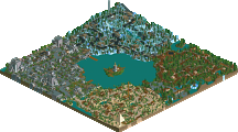
Thanks and congrats Butterfinger.
Hi-Rollers Standings
Butterfinger's park was good as well. The only thing I didn't like about it were the coasters minus The Beemer that went in and out of the mountain. The 4D looked awesome, but went a bit too fast through the elements, as did the rocket coaster type thing. The horse race was pure genious, minus the glitchyness in the game, but thats not his fault. The atmosphere was great in this park as well.
Kevin Offline
I wonder how good #1 will be.
Kraken
I liked it better than Euroscape though. Much more creativity.
This park did have awesome hacks, like the 4D coaster but some of the hacking was stupid, IMO. Like when coasters went through walls(ie the Vertical Drop Coaster). You did that in Euroscape and this and it really detracts from the quality of the park.
Anyway, the architecture was pretty cool, but i felt that it cluttered the park. I don't like it when architecture makes it difficult (or impossible for that matter) to see the path. I understand that large architecture can do this, but it happened to much in this park, IMO.
Even after all this, I enjoyed it and I agree with it being higher than Corky's. It was very cool, good job, Butta'
I can't wait to see #1 when this is so awesome and I can't believe mine still hasn't been released when imo this is so much better.
Cork well done on your entry to I know its late but I have only just got around to looking. the park look great but there was some bits to me that looked abit cramped and rushed. I liked your layout of how you have to travel through most of the park to get to certain places.