Park / Lumbini Point

Park_772 Lumbini Point

357 Comments

This park shares comments with 19 other parks(View Parks)
  • rctfreak2000%s's Photo
    1. I was naming everything and renamed the Beemer in the B.C. area corridor by accident. It should have said Exodus B.C.

    2. You forgot someone Ozone.

    3. Thanks for the high marks! (seriously)

    4. My work has greatly improved since then.

    5. Damn you Aeroglobe!
  • Aeroglobe%s's Photo
    Yes, OZONE, I know I need a little bit of originality in my work. I'm slowly looking for my own ideas, but can never seem to find them. And, while I'm on the subject, thanks for the awnings idea. :D

    But, should I really be in 13th? Maybe 14th? Since, after all, I tied with Junya Boy.

    Aérôglòbe Posted Image
  • BigFoot%s's Photo
    Alphabetically you win.

    Yay.
  • iris%s's Photo
    We had a tiebreaker judge.
  • gymkid dude%s's Photo
    the only problem is see is raven's 9. That means he has 12 other people to rank between 9 and 10.
  • Coaster Ed%s's Photo
    You're assuming that Raven had this park ranked 13th. He may have ranked it much higher than that.
  • Micool%s's Photo

    It really showed to me that Aeroglobe has some skill, now all he needs to do is have some ideas instead of taking them from others.

    Hmm, that seemed a bit ironic to me ;)

    I haven't looked at Aeroglobe's entry yet but it looked pretty cool. I'll check it out later.
  • guljam%s's Photo
    ¾öû³­ °ø¿øÀÌ´Ù.
  • gymkid dude%s's Photo

    You're assuming that Raven had this park ranked 13th. He may have ranked it much higher than that.

    good point.
  • Corkscrewed%s's Photo

    the new one looks great (haven't looked at it yet though). Again, pryo, giving it a 3 while raven gave it a NINE. wow.

    Oh man. Aren't YOU in for a surprise...
  • Prince%s's Photo
    Magnificent job aeroglobe, I'm impressed. The only thing that I would've changed is the white writing on the signs in the Shinjuku District, I also didn't care for the white station awnings in the Oasis section but they didn't take away from it. Once again, great job!

    ~Prince Ashitaka~ 8@
  • Scarface%s's Photo
    I think its good that Pyro is judging tough...I just hope he's not too tough on me :devil:
  • Ozone%s's Photo

    Hmm, that seemed a bit ironic to me ;)

    I'm not quite sure what you meant by that. Were you talking about your own Hi Rollers submission, or were you comparing me to what I said about Aeroglobe's park?

    Btw Freak, I edited my post for you. Sorry bout that.
  • Themeparkmaster%s's Photo
    I'm starting to worry that I'm going to get a 1 from Pyro.

    I really liked this park, good job Aero. Somehow you built the park in a way that made the map feel bigger than it was (to me at least). Keep this up and you'll be making some great parks soon.
  • iris%s's Photo
    #12 Posted.
    Congrats & Thanks Gymkid.

    Hi-Rollers Standings
  • deanosrs%s's Photo
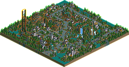
    At first sight, this park looked childish and repetitive. Flowers looked overused, as did the abstract scenery and wooden poles. However, the detail was incredible. For instance, it took me a while to notice the water falls going all the way down the side of the tower buildings, and the aqua writing from 1/4 blocks was a brilliant touch. The hacking was much more subtle on the spiral lifthill steel coaster than on the invert but both were innovative in their own ways. I'm sure I'll never see a coaster similar to the latter again. I would have loved to have viewed the water coaster but the huge detail in that corner of the park meant it ran hilariously slow on my computer. Not Gymkid's fault... I'm running a 933Mhz celeron.

    The architecture, however, I still found somewhat lacking in a base colour, such as brown or the castle walls. This could be seen as originality, and over a small park such as this it just creeps into this category. For me, it wasn't far off becoming a little... startling.

    Nevertheless, it was certainly a different approach to an RCT2 park and one I certainly enjoyed and its minor flaws were outshined by the moments of brilliance dotted around the park.
  • rctfreak2000%s's Photo
    Ozone, my entry was called Exodus. Moron ;) :D

    Gymkid, never do that again.

    Ever.

    hehe. It was nice, but I think you went a little overboard.
  • sloB%s's Photo
    I liked this park very much actually.

    Gymkid, I saw that you said that you were trying not to use any trees or bushes in this park but i think they could have helped out a lot. The flowers got to be a bit much throughout the park and even some small vegetation would have done this park very well, imo.

    I loved the hacked invert, it was very cool. Other than that though, nothing amazing in the coasters.

    Ther arhcitecture was top notch and I enjoyed the Water Processing plant very much. The water itself fit in very well with it too and i thought that was a very nice touch.

    Overall great park and glad to see people stepping out of the norm.
  • gymkid dude%s's Photo
    Lol i was hoping for top half. i tried my best. Something different. Kai should like it. And micool. And spiderman.
  • MightyMouse%s's Photo

    Lol i was hoping for top half.  i tried my best.  Something different.  Kai should like it.  And micool.  And spiderman.

    Poor Gymkid, poor poor gymkid. If it makes you feel any better, I thought your entry was better than a 12th place finish.