Park / Crepe Myrtle Islands

Park_771 Crepe Myrtle Islands

357 Comments

This park shares comments with 19 other parks(View Parks)
  • Pym Guy%s's Photo
    That park definatly didn't deserve a 2.
  • sircursealot%s's Photo
    hmm, it really didn't impress me (like Nate's recent work, DFK) but I'd have given it a 3 or 4, not a 2. There were some things I like, but overall it bored me.
  • PyroPenguin%s's Photo

    Pyro's larger voting scale gave him much, much more power than any judge in the contest, which really showed up here.

    This is the only one it really should effect because my rating was one of my lows while other judges had this as one of the highs. And Nate, no chance I hate your work. Your spotlights have been some of my favorite, DDI is definintly the most Disney park out in terms of ride construction and DBW is a close second. However, this I wasn't a fan of by any means.

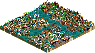
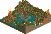
    My basic problem was while it had alot of creativity and effort put into it, the end result just didnt look good in my opinion. The one standout thing on the map, the giant tree, was porrly done in my opinion, just a tangle of track that didn't look right. The architecture looks amatuer at best, it just doesnt come together like Nate's stuff normally does. The ride in my opinion lacks any real direction other than going through a bunch of pretty scenes which really arent all that pretty. Which brings me to my biggest complaint, this park banks its entire existance on the landscape because there is nothing else there... and the landscape is decisivly boring, just fails to get anything going really. Maybe im missing what all of you see in it, but it looks like a whole lot of notihng to me.
  • Aviator%s's Photo
    I can see where he's coming from; However, a 3 or 4 would be better, just because of the creativity. We've also reached top ten... so the ratings SHOULD start gettin a little higher.
  • Turtleman%s's Photo
    Jesus CHRIST! Pyro has been really unfair in this so far...
  • PyroPenguin%s's Photo
    Yeah Aviator, I think we are out of my low low scores. And its not unfair, its my opinion. Thats why we have five judges instead of one.
  • rctfreak2000%s's Photo
    I agree with PyroPenguin. I really saw nothing impressive in this park. I love DDI, DFK was ok, and DBW was interesting at the time, not so much anymore. Anyways, this certainly is not your crowning acheivement, and that tour ride bored me to death.

    Sorry, I just don't feel this is your best work.
  • natelox%s's Photo
    the idea of 'The Tour' was anticipation. Built with music, theme and landscaping. The idea was..you waited for it, it wasn't just handed to you. The idea was to keep you anticpating and keep wondering whats gonna happen and when's it gonna happen.
  • guljam%s's Photo
    Best!! RCT1 Park Designs...
  • Blitz%s's Photo

    the idea of 'The Tour' was anticipation. Built with music, theme and landscaping. The idea was..you waited for it, it wasn't just handed to you. The idea was to keep you anticpating and keep wondering whats gonna happen and when's it gonna happen.

    well, then I should say...
    that you didn't pull it off too well. Your timing in such matters is amateur (though I don't blame you, considering it's a fairly unused concept among most). You see, we waited just a BIT too long... sort of reminds me of lord of the rings book: its really good, but the expansive amounts of explanation just made me want to put down the book, his timing in storytelling is akin to yours in this park.
  • Corkscrewed%s's Photo
    I like to think of myself as understanding Nate's work, and this one was no exception. This is a hit-or-miss park if there ever was one, and it's probably the most extreme type ever created. Nate's idea was going into a more profound level of RCTneering, one that enveloped the viewer like never before. It's about the EXPERIENCE.

    I can sense Nate's influence from his love of architecture (as a subject and art) here. This is totally about the experience. Put yourself in this thing and you'll love it. You have to use your imagination a bit--which will turn some people off, but to those who appreciate this sort of stuff (and I see the same sort of idea in you City of God), it hits home very nicely. Nate's trying to be new and unique. Forget Frank Lloyd Wright, Natelox is obliterating the box.

    And for me, this all amounts to some very nice work.
  • i c ded pplz%s's Photo

    well, then I should say...
    that you didn't pull it off too well.  Your timing in such matters is amateur (though I don't blame you, considering it's a fairly unused concept among most).  You see, we waited just a BIT too long... sort of reminds me of lord of the rings book: its really good, but the expansive amounts of explanation just made me want to put down the book, his timing in storytelling is akin to yours in this park.

    The explanation and detail is what makes LOTR's good... ;)
  • RRP%s's Photo
    I agree with pyro here.This was incredibly dull,repetative and unfinished in my eyes.No new themes or anything,the ride was so boring i couldn't watch it all in one go and the coaster buildings were just plain ugly and boring.I admit it was a nice idea but poorly executed.
  • Evil WME%s's Photo
    what i giant bowl of uglyness.. thank you pyro penguin.. woulda been a real bummer if this won, no offense to you Nate..

    :8leg:
  • Blitz%s's Photo
    but the explanations and details were too DRAWN OUT in LOTR. And thats what happened here. If the ride had been halved time wise before it reached the peak of action, or if it had some midway sections of action to spike the interest a bit (aka: appetizer), then it would have been a bit better.

    stories can't have just one spike in the action...

    0
    0
    00
    00000 interest creator
    000
    00
    0
    0
    0
    000000000 climax
    00
    0


    most stories have this pattern, in that there is an early action that sets the stage for the anticipation of the later action. Not all follow this, but no story only has ONE place where all the action happens (some movies do, but they are regaurded as boring by most sane people).
  • Marshy%s's Photo
    Id have given it a 1.
  • Themeparkmaster%s's Photo
    I have to say I don't think much of this park either. Sorry Nate, it's not a bad idea in theory but it hasn't come off very well. Maybe if you hadn't of rushed it we could have seen the full potential of the idea but as it stands it's pretty boring.

    I didn't think much of the so called tree either, must've taken some work and I give props to you for that but it doesn't IMO actualy look anything remotely like a tree
  • mantis%s's Photo
    I wrote the little blurb - you can probably tell that I loved it.
  • x-sector%s's Photo
    I actually like it. Nate has the natural look down to a tee and its completely different to most RCT parks. the tour was good but I would say it could of done with some more interesting stuff. the tree was nice and I enjoyed the mushroom house.
  • iris%s's Photo
    #9 posted.
    Thanks and congrats to Themeparkmaster.

    Hi-Rollers Standings