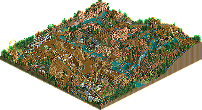
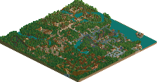
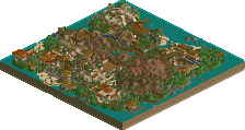
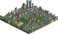
Godamnit! Why did i have to go and post screens at TN? WHY!? From Denos park i could've made about 15th. Oh well, that's the why shit goes sometimes.
Nice Aztec area, the vally was okay and the whole volcano area completly sucked, too plain, the coaster was poorly layed out and everything just looked un-cared for/about.
I gave the park a 7 but I ranked at least 5 parks below it if I remember correctly. Also, I started with 10 and then worked my way down so my scale is actually 10-5. That should balance out though because the winner is the one with the highest overall point total so all that matters is the difference between the park ratings. My spectrum wasn't as broad but I also gave a lot of half ratings too (like 5.5 etc.)
Ah well, I didn't think it was so bad. I guess the judges didn't really find my intellect very likable.
I know a lot of it was bare, but well, so is a lot of other parks I know. And I figured insteading of directly copying parks and styles, I'd just play around a bit.
Well half the suspense of the contest is over for me, I guess. That's good, in a way, now I won't be on for three hours every night checking for the Hi Rollers entry
I would've had this higher...this is great. It was good parkmaking plus a sense of humor. The archy in the beginning section was incredible. Pure Micool goodness. The theming could use work, it got really bare in some places...
but I thought it was hilarious. Congrats to Micool for this pharse of a park.
Edit: If this is number 18...then I'm scared to see what the others look like.
I'm ashamed to admit it but I didn't realize it was supposed to be a parody park. That might have influenced me somewhat. Pretty clever. I like the idea but the nature of the contest suggests ratings based on parkmaking skill not wit. I appreciate what you were doing though (now I do anyway ).
I really liked this entry and think it should've been higher up on the round.
The entrance archy was pretty tight, and the concept (while cute), was unique to say the least.
The only thing I'm not clear on is the Racetrack pieces as theming at the entrance. Did I miss something? I don't get that at all. The rest was lovely, (especially a Twister with an over 7 rating with only 2 inversions and only 2700 ft. of track)
The only thing I'm not clear on is the Racetrack pieces as theming at the entrance. Did I miss something?
The excessive and seemingly meaning less racetrack pieces as theming, in the entrance and Asian Temptations were in respect to the great Lord Bokti.
In case you're looking or anything, the park also includes "influences" from:
Schuessler Coaster Ed Bokti mantis Andrew Anyone who has done a midevil section related to "dragons" A-K Fatha'
..And of course "Blast Coaster," if I'm correct in thinking he made that Patriotic park, though that was after the park was made.
Some more subtle then others.
@Ed - It's okay. I tried to make it as obvious as I could but I just had a feeling people would see the horrible coasters and bare theming and go to the "n00b mindset." I was expecting it.
Hehe, I did the write-up so you can see what I thought of it. A really funny park - people've always thought about doing spoofs but no-one really ever makes it. Well Done, Mike, cos this thing made me laugh
I'm gonna have to say this again but it's an amazing park for an 18th place entry. The entrance was great but I think the coasters really let the park down (parody or not). Well done though.
Well..my review for the last one, by Micool is here. I loved the entrance area, but as the park progressed, it made me think "was this made in an hour?". There was no effort, little theming and a bad layout. If the whole park looked like (or had the same quality as) the entrance area it would have done much better.
And i'm not planning on looking at the Rct2 entries untill we get into the top 5...cause rct2 and me don't mix to well (city of god is comming).
Micool: kickass entrance. I understand that the coasters were SUPPOSED to suck, but in competition against good coasters, if i was a judge, i'da done the same thing.
Flame: Great. Good coasters, theming, archy. As iris said, "solid". Just "been there, done that" ish. Also, you are banned forever from western and tropical theme. Forever.
Well..my review for the last one, by Micool is here. I loved the entrance area, but as the park progressed, it made me think "was this made in an hour?". There was no effort, little theming and a bad layout. If the whole park looked like (or had the same quality as) the entrance area it would have done much better.
And i'm not planning on looking at the Rct2 entries untill we get into the top 5...cause rct2 and me don't mix to well (city of god is comming).
Great, I just love feeling screwed when someone beats around the bush by not directly telling me that I'm not good enough for him to load up rct2 .
Anywho, Yeah, it isn't anything that's new, but I just really couldn't think of anything new or exciting for this park. Everything came after words, so I'm just putting those into my new park. Semi- Builders block, if you will.
Thx though. Gymkid swears 17th isn't as bad as it sounds
it wasn't ment to be negative. I just hate opening RCT2 for all reasons, despite the fact a park is good or bad. I will open it for the top 5 parks because I want to see what elements gave them a high rating to possibly make me a better parkmaker.
In other words, Nate doesn't want to spend ten minutes waiting for an RCT 2 park to load.
Nice park, flame. It lacked variation for me, altho the B&M's were good. The woodie looked a bit rushed, it didn't seem to flow amazingly well altho the basic design was nice. A good park with all the basic rules of park making in, just nothing to make it stand out that much. That's what I thought anyway. And well done for finishing higher than me!
357 Comments
Ride6 Fan Offline
Nice Aztec area, the vally was okay and the whole volcano area completly sucked, too plain, the coaster was poorly layed out and everything just looked un-cared for/about.
ride6
Coaster Ed Offline
iris Offline
Micool's IOA DC by Micool.
Congrats, and thanks for entering.
Hi-Rollers Standings
Micool Offline
I know a lot of it was bare, but well, so is a lot of other parks I know. And I figured insteading of directly copying parks and styles, I'd just play around a bit.
Well half the suspense of the contest is over for me, I guess. That's good, in a way, now I won't be on for three hours every night checking for the Hi Rollers entry
thorpedo Offline
but I thought it was hilarious. Congrats to Micool for this pharse of a park.
Edit: If this is number 18...then I'm scared to see what the others look like.
Coaster Ed Offline
Meretrix Offline
The entrance archy was pretty tight, and the concept (while cute), was unique to say the least.
The only thing I'm not clear on is the Racetrack pieces as theming at the entrance. Did I miss something? I don't get that at all. The rest was lovely, (especially a Twister with an over 7 rating with only 2 inversions and only 2700 ft. of track)
Micool Offline
In case you're looking or anything, the park also includes "influences" from:
Schuessler
Coaster Ed
Bokti
mantis
Andrew
Anyone who has done a midevil section related to "dragons"
A-K
Fatha'
..And of course "Blast Coaster," if I'm correct in thinking he made that Patriotic park, though that was after the park was made.
Some more subtle then others.
@Ed - It's okay. I tried to make it as obvious as I could but I just had a feeling people would see the horrible coasters and bare theming and go to the "n00b mindset." I was expecting it.
mantis Offline
Themeparkmaster Offline
iris Offline
Congrats.
Hi-Rollers Standings
natelox Offline
And i'm not planning on looking at the Rct2 entries untill we get into the top 5...cause rct2 and me don't mix to well (city of god is comming).
Pym Guy Offline
EDIT: nevermind, solved it.
Edited by PymGuy, 21 September 2003 - 07:26 PM.
gymkid dude Offline
Micool: kickass entrance. I understand that the coasters were SUPPOSED to suck, but in competition against good coasters, if i was a judge, i'da done the same thing.
Flame: Great. Good coasters, theming, archy. As iris said, "solid". Just "been there, done that" ish. Also, you are banned forever from western and tropical theme. Forever.
Rct Flame Offline
Anywho, Yeah, it isn't anything that's new, but I just really couldn't think of anything new or exciting for this park. Everything came after words, so I'm just putting those into my new park. Semi- Builders block, if you will.
Thx though. Gymkid swears 17th isn't as bad as it sounds
natelox Offline
Corkscrewed Offline
guljam Offline
mantis Offline
Looks nice from the screens, Flame.
deanosrs Offline