Park / Pearl Bay
-
 17-April 10
- Views 4,231
- Downloads 964
- Fans 1
- Comments 13
-

-
 62.69%(required: 60%)
 Silver

Ozone 70% SSSammy 70% turbin3 70% ][ntamin22 70% 5dave 65% CedarPoint6 65% inVersed 65% Liampie 65% Roomie 65% robbie92 60% Six Frags 60% chapelz 55% Kumba 55% K0NG 50% posix 45% 62.69% -
1 fan
 Fans of this park
-
 Full-Size Map
-
 Download Park
964
-
 Tags
Tags
![park_4097 [H2H8 R2] Mzima Springs](https://www.nedesigns.com/uploads/parks/4097/aerialt3837.png)
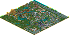
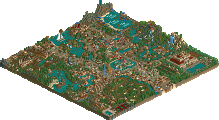
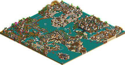
With the return of many older members, as well as the amount of higher profile members jumping onto the LL bandwagon, the number of dual players has steadily increased in recent times, even warranting the creation of a new category in the NE Awards 2009. Cocoa is one in this ever-growing group of rising NE members who exercise their proficiency and creativity in both games. Already gaining a design with his RCT2 "vanilla" design, The Curse, he turned to LL with Ancient Mesas Theme Park, an unhacked Bronze that showcased his abilities in the game without needing to turn to Codex or other trainers popular with LL players. Now, over a year later, NE would like to present Cocoa's first silver and his second LL endeavor, Pearl Bay. | Read On...
From the overview it looks really cool
Its good to see so much LL, even if I cant find my game.
My thoughts:
Feels very old school and the outdatedness you mention in the read me is fairly obvious. It's also clear that your inspiration to finish this died as many things such as the landscaping are left looking rushed and un-finished. You also seem to have sporadically thrown handymen into the park and as a result I found one that is walking back and forth on a two tiled awning, this puts me off a little.
I didn't like the entrance, the use of pathing in the architecture isn't great, especially the yellow queue pieces. The layout of the paths from this area is also quite confusing and overall what should be the most open and inviting area of a park becomes quite confusing and claustrophobic for me.
I think the strongest area was the 'Caesarea' section of the park, the open plan paths and overall ambiance was nice here. A more considered choice of colour schemes for the rides would have added to this section though.
I also liked the slides, nice and colourful.
Be careful with your banners...there's one at the entrance to the old England section that still reads 'Happyland'...things like this really turn me off a park.
Also you ask us to follow the monorail around, yet it isn't even open yet! I'm much more likely to follow a ride if I can already see the train making its way around the park.
Nice to see some more LL.
Seeing the Clipper boomerang shotgun out into the bay and then invert over the path made you really want to see how far Portsville could have really gone (section certainly did not feel outdated; a good idea for another park
The steel looper, on the other-hand, could have used some tlc. What could easily have been the park's anchor attraction instead felt cramped (the entire Britain section felt a bit packed in). You seemed to be going for something like Loch Ness Monster(BGW) but the idea was pushed into a sardine can like a zyklon loop (http://rcdb.com/1373.htm?p=17192). I also wasn't a fan of that single piece of launch track used after the first hill to give the ride speed.
In Hawaii, you laid the groundwork for a water park that had potential to be breathtaking, but, if I may pose a question, were any of the water rides in Hawaii individually thought out? I must have been blind, but I also noticed no entrance or connected path for Maui Waves to the rest of the park. Take a look at Zambaranii Point water park that Butterfinger created for the Universal Caribbean Seas Resorts [lol, I really feel like I'm digging in the archives here] and see what I mean by a water park that I could really see the attention to detail and execution in. I really feel that Hawaii section could have achieved something on that level.
All-in-all, Pearl Bay was beautiful. This is a project that could have greatly benefited from a second pair of eyes; if you ever another park as beautifully-conceived as this on that needs finishing/"retrofitting", I and, I'm certain, many others would not mind sprucing it up. A wonderful park Cocoa and well worth a silver.
-- Vertex
Thanks for the readme and logo guys. It's always fun to see your park on the home page.
Entrance area: Boring, but it looked good.
Waterpark: Messy and maybe a little too small, but it contained some nice ideas.
Jungle area: I didn't like this area much... It was very messy and there was not much to see. I didn't get the gardens too, I don't know if they're a seperate area or a part of the jungle, but they felt useless either way. The coaster was not bad.
Roman area: Again very basic and somewhat boring, but it was beuatiful nonetheless. Well done!
Castle area: This was the area I liked least. It looked very messy and confusing, there was no atmosphere and again there was not much to see. Sorry...
Port area (Portsville it was called?): Somehow I loved this area. The atmosphere was excellent! I wish it was bigger... I didn't like the colours of the boomerang however. I would've picked brighter colours as the theming is pretty dull already, not in a bad way though.
I sound more negative than I am. Overall I think this is definately Silver-worthy. For Gold I think everything had to be better: more daring/unique architecture, stronger coasters, more details, better parklayout.
Well done
James