Park / Mayra
-
 07-April 10
- Views 6,223
- Downloads 1,058
- Fans 0
- Comments 11
-

-
 65.77%(required: 65%)
 Design

geewhzz 75% Kumba 75% Ozone 75% Roomie 75% CedarPoint6 70% chapelz 70% SSSammy 70% robbie92 65% Sey 65% 5dave 60% Fr3ak 60% inVersed 60% Six Frags 60% Nokia 50% posix 45% 65.77% -
 No fans of this park
-
 Full-Size Map
-
 Download Park
1,058
-
 Tags
Tags
![park_4795 [NEFC] The Melting Pot](https://www.nedesigns.com/uploads/parks/4795/aerialt4696.png)
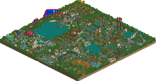
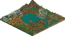
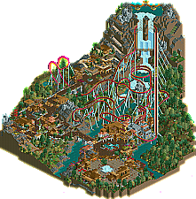
It seems that the new trend of old members making comebacks is still alive and strong, and very welcome here on the front page of NE. Continuing this trend is Splitvision, who made his first comeback in September collecting a bronze with Lake Cerulean. Now, just a short few months later, he’s back again and this time he earns an accolade with his new design Mayra. | Read On...
great job dude
Oh, and the cliffhanger ride was really sick. Could have been a bit more refined, but it was a really cool idea nonetheless.
Foliage and architecture were very good. Coaster design was unique. There were plenty of peeps. Great design in my book. Congrats man.
+ Creativity/good ideas
+ Unique atmosphere
+ Unique layout
+ The colour scheme works incredibly well with the landscaping
+ Lovely station
+ The area around the small island in the river is really beautiful
- Foliage
- A few minor layout flaws
- The colour scheme didn't work well with the theming
- Cliffhanger was very boring except for the waterfall-part.. It feels like you created the whole ride just to have that interaction! It would've been much better if the station was higher so the ride didn't have to climb for so long.
- Waterfall was blocky. Not really a bad thing, but it could've been better.
All in all I really liked this. Congratulations on the well-deserved design! 15/20
You've greatly improved since Lake Cerulean, and I already liked that one quite a lot. I hope to more work by you and eventually another big solo! Are you working on something currently?
Even though some of the diagonal track was.. well.. terrible.. the rest seemed spot on. Cool waterfall, interesting layout. The theming around it fit well, it felt very atmospheric to me. Everything was very nicely layed over the map. I'm impressed, really.
The vertical loop could have been a bit more speedy, I liked the 'death helix'.. no problem there whatsoever! and 10X, how often do you see that?
Architecture was fantastic. This completely blew Lake Cerulean out of the window. This is on a whole other level of skill compared to that.
Well done.
In:Cities & Ozone - thanks!
J K, you've given me that advice before (trying some different/more original/not so generic themes) and I'm taking it with me into my next project
zburns - thanks a lot.
Liampie - Thanks, BTW I really like the way you crit (using "+" and "-") it's simple and effective, I'm gonna steal that from you I think
Evil WME - Hmm if it just barely missed 13, I'd be pretty pissed that you didn't vote lol. But as you say what matters is that it won. Thanks a ton for liking it.
Louis - thank you.
And cena, nobody would be checking it out at all if it weren't for you. Thanks dude.
The theming is mostly brown, gray and salmon, the coaster is purely bright colours. The theming looks great and the coaster looks great, but they don't 'merge'... I can't really explain, sorry. It's not a big deal anyway. The "-" doesn't mean I hate it.