Park / Kaleidoscope Canyon
-
 29-October 09
- Views 3,732
- Downloads 767
- Fans 1
- Comments 13
-

-
 69.62%(required: 60%)
 Silver

Xcoaster 85% chapelz 80% SSSammy 80% 5dave 75% Fr3ak 75% geewhzz 70% inVersed 70% Steve 70% zodiac 70% CedarPoint6 65% riven3d 65% Six Frags 65% nin 60% Nokia 60% posix 40% 69.62% -
1 fan
 Fans of this park
-
 Full-Size Map
-
 Download Park
767
-
 Tags
Tags
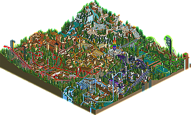

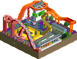
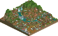
Even after Head-2-Head seasons comes to an end here at New Element, we can always expect to get left-over table scraps served to us many months down the road. Well, tonight, dinner is served as Roomie throws his Head-2-Head 5 park Kaleidoscope Canyon to the dogs. We hinted that Roomie would return with another park when releasing his last Silver winner Colorado Confluence - Riverside Boardwalk, and we wouldn't lie now, would we? This makes six parks released in one year for this RCT superstar. Read On...
when im done gawkin ill post a lil somthing about how much your making me want to quit... again.
EDIT*
wow, nightmare is just amazing to watch, was that pretty time consuming or what? WOW!
and envy, i dont even know what to say after to watching it... really, your a fucking beast roomie.
and the theming you fit in just in the little areas was very fitting, well done again sir.
Edited by rK_, 30 October 2009 - 12:44 AM.
to bad it didn't win gold (by only 0.08 point
Edited by Vert, 30 October 2009 - 10:04 PM.
Nightmare was one of the hardest rides I have ever built. Getting the swinging to work on the 45degree turns was indeed a nightmare. The brick bridge also took me ages to do.
The envy hack was inspired by Geewhz's Flyer in SWS so props to him
It sucks LL parks get so few comments these days. even people like JK who don't have LL can comment with the massive overviews these days, but as always thanks to the writeup and release guys.
Xcoaster Offline
The original plan I referred to was that it was supposed to have a ton of coasters (which it did).
I enjoyed all the coasters, especially that little Arrow in the middle. The way it kind of wrapped around all that scenery while still maintaining a simple standard layout was really cool. The swinging hack was, of course, impressive and had a nice layout. I'm guessing the green one was a Eurofighter, although it did seem to resemble and Intamin by layout.
I suppose part of what brought it down seems like the map size. It took me forever to find the entrance, which I'm assuming is over there by the start of the suspended? It seemed like the park just kind of 'happened' instead of having stuff that identifies an entrance, like a gate or ticket booths or something. The other part may be just an LL thing, as I do see it a lot, but it just seemed very difficult to follow everything. Again, maybe a product of the small size, but everything seemed on top of other stuff and hard to pick out. It seemed like you might've been strapped for space, especially with the dive coaster and the green one right up against the edge of the map. I feel you may have been benefited by giving stuff a little bit of room to breathe.
That said, I notice some little details each new time I look at the park, and it really is a lot of fun to look at. Sorry if a lot of this sounded negative, but I wanted to give it a good review. I'm looking forward to what you try for your next park. Congratulations on finishing this one!
Thanks for the comments. Always like to hear what the reviewers thought about the parks they vote on instead of just a number
Just to address the space issue CP6 made. I agree that more room would have been nice. But as when this started it was due to be an H2H park I was pretty restricted on the map size I was allowed to use. The decision to leave it pretty much entranceless (new word
Its actually almost completely due to my job i get to work on LL so often. Working offshore means i get vast amount of time where there's nothing to do. When I'm at home on land i do very little. My H2H park with JiMeMo was done almost entirely in in the middle of the Atlantic Ocean.
Dont quit dude. If anything thats the exact opposite of what i want to inspire
It was very cramped and just wasnt as aesthetically pleasing as CCRB was. I liked the idea and concept behind the park and the architecture was great stuff, just overall the park didn't do anything for me.
Congratulations on Silver though, it was definately worthy, although I wouldn't have rated it as high as some of the panelists did.
The coasters were good, although some were really hard to follow due to all the stuff going on. Try to keep your work organised!
Not your best park, but very good nonetheless.