Park / Dolphin Bay Resort
-
 17-November 09
-
 Dolphin Bay Resort
- Views 9,130
- Downloads 1,345
- Fans 7
- Comments 27
-
-
 76.54%(required: 70%)
 Gold
Gold

Fr3ak 90% SSSammy 90% Evil WME 85% Kumba 85% 5dave 80% nin 80% Steve 80% zodiac 80% CedarPoint6 75% inVersed 75% geewhzz 70% posix 70% Six Frags 65% chapelz 60% Nokia 60% 76.54% -
 Description
Dolphin Bay Resort is an All-Inclusive Resort in Turkey. I've been to turkish all-in resorts five times (different resorts!) and they're all basically the same, so inspiration/ideas was abundant. I think I did a great job at making a believable turkish resort, and I'm proud of the details here; I think it's actually my most detailed 'park' so far, although it's still very 'clean' looking.
-
7 fans
 Fans of this park
-
 Full-Size Map
-
 Download Park
1,345
-
 Tags
Tags
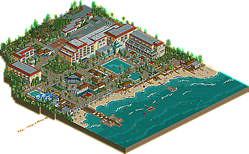
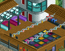
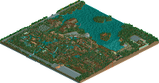
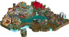
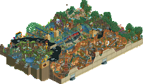
During NE's Head-2-Head 5 competition, several new stars emerged as the new faces of parkmaking. Among the brightest was Liampie, who, as a member of the 3rd place Flying Germans, rose to new prominence under a new style. Back when he joined in May 2007, he possessed the classic “Dutch” style of parkmaking. Since then, however, he transcended this, and emerged in H2H in a strong way with Calypso Quay, a week 2 park built with RRP. Although he also captured a Silver accolade with Wunderland Erlach, this newest release could be considered his solo introduction under his new style. Because of this, NE has yet another wonderful release, a Gold one to be exact, Dolphin Bay Resort. Read On...
But it was a strong release. As said the surrounding details were great, like the volleyball players and the little boat and the dolphins but the hotel itself wasn't on the same level.
Well done on achieving gold though.
Oh and fr3ak <3 the logo
completely fantastic.
reminded of RRP.
gorsh. fantastic.
I love the volleyball players, that's amazing!
The waves were nice and the little details were just as good.
Love the logo Fr3ak! The symetry of the dolphins and gradient on the sun are really professional. Our graphics team is really strong and this just adds to NE's great artwork.
However, I'm surprised to see this up already. I think something went wrong in the communication somewhere, Fr3ak sent me this logo and asked for feedback. I gave him some and expected him te return with a new version. That's why there's no logo in the readme, it just says [LOGO]. It's not a big deal and I'm not mad at anyone, I'm just surprised and it's a pity that the logo isn't exactly what I had in mind for this concept. The logo is pretty but I imagined it more luxurious. Fr3ak, don't misunderstand me! I owe you something, not the other way around. Thanks for putting time into this anyway!
@ Louis: Thanks! I agree with the part that the hotel isn't on the same level, but redoing it would be a waste of time. I want to finish Project X and move on. I can't believe Project X is getting anywhere, with 2/4 project released and the other two being both over 80% although I haven't worked on them in weeks.
@ SSSammy: Thanks! I never did it on purpose but I think RRP had a great influence on me. His work during H2H blew me away and still does.
@ Robbie: You did the writeup? Thanks, I really like it! I see why you think the architecture was underdetailed. During the contruction I felt myself too that I was pushing the boundaries in the 'wrong' direction if you know what I mean. I'm happy with the results though. With the Gold/Blockbuster talk, I understand what you mean, but I think it's just a matter of acclimatizing; concept creations are spotlight submissions now.
@ Luketh: Thanks! I'm very proud of the volleyball playes, I can't believe I found out that hack by myself.
@ Splitvision: I've been to a Turkish resort five times in a row and this is basically a mashup of the hotels I've seen there, in terms of ideas. I'm really glad you could relate to this, as that's what I was aiming for. Thanks! I will finish something large. Blykak is progressing well, I aim at a summer release.
@ J K: Thanks!
i voted 14 so i'd say this is a little overscored. to me it was a gold. not a strong gold, but still gold. and gold is after all the 2nd highest achievement for parkmakers here.
i'm looking forward to the day we find a new submission from you in our inbox
Looks like they're in a maze, but you somehow froze them in spot so they can only jump...
Edited by Luketh, 17 November 2009 - 06:49 PM.
Overall it was great, I just thought the water slides were way too out of the way from the main pool, something you never see at resorts. I would of also liked to see more detail with the streets and car park but not a big deal
Definitely I place I would like to stay at
@ Luketh: I discoverd by accident that if you lower one tile of a maze while there's a peep on it, the peep moves to a certain corner of the tile depending on the direction it was walking and freezes. I'm sure there are many other uses for this hack.
@ Comet: I didn't mind the slides being remote from the pool because I've seen it several times in real hotels too. It's clumsy, but realistic. Actually I wanted to make a waterpark next to the hotel (screen in Project X topic) but I deleted the plans because they were lacking and otherwise this would never be finished. I had to include slides somewhere, though. Any location was realistic. Thanks to you too!
@ Ozone: Thanks!
@ prodigy: Thanks! I love how you changed your avatar for me, so thanks for that too.
Unfortunatly I cant open the park at work so cant see the vollyball players. But I'm intrigued to see if this hack works in LL too.
You could make a nice looking wax figure museum if it works the way I'm imagining in my head
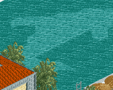
I really love the dolphin on the pool-ground and the whole hotel-structure is great!
Moreover the colours were well chosen.
Looking forward to a full-scale solo of you, you have the potential for a parkmaker.
Congrats on winning gold.
Yannik
@ Turbin3: Thanks!
I just haven't had the time to give it a second try.
I wanted to, but I was too crowded with work and other personal stuff, sorry again.
For the park. I loved it which I think you know already because of my vote.
So many little details and things to discover.
It was very fun to look at.
Great work overall and I am looking forward to seeing what else you might come up with
@Kumba: Thanks. You were my main inspiration for this actually, so here's another thanks. Thanks! I wanted to make the rides peepfriendly at first but I realised they weren't the main focus. This thing took me 1,5 years and I wanted to move on. It's not perfect, but it's good enough for me and apparently the panel liked it too! No regrets.