Park / Midwest Adventure Amusement Park
-
 25-November 09
- Views 6,788
- Downloads 1,013
- Fans 1
- Comments 21
-
 59.62%(required: 50%)
 Bronze

Ozone 75% CedarPoint6 70% Kumba 70% 5dave 65% inVersed 65% SSSammy 65% zodiac 65% chapelz 60% Six Frags 60% Fr3ak 55% posix 55% nin 50% Nokia 50% geewhzz 45% Steve 35% 59.62% -
1 fan
 Fans of this park
-
 Full-Size Map
-
 Download Park
1,013
-
 Tags
Tags
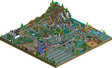
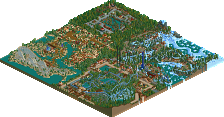
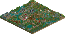
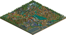
It’s been quite awhile since the community has seen a club park grace the New Element front page. With members sometimes not playing the game consistently, it’s hard to coordinate building parks through a club effort. Formed in August of 2009, RCT-Pro members have individually been showing great progress in skill, both in the Advertising District and the Place-To-Release-Your-Parks Land. However, RCT-Pro has shown as an entity that they have the determination and skill to complete a park to be proud of. Members Colorado-Fan, prodigy, Grabster, DelLagos, Turbin3, and Stanman all had a hand in creating the wonderful bronze winner: Midwest Adventure Amusement Park. Read On...
Pros
+ The woody. Awkward layout, but it looked pretty near the waterfalls.
+ Consistently detailed
+ Some pretty unique ideas, like the inverted.
Cons
- Inconsistent foliage... You should use one style for the whole park or at least make it flow more.
- The steep trainbridges
- You put effort in making the park peepable... but where the fuck are the peeps? Why are the rides closed? Maybe some life would've made this Silver.
- Bare in places
- Why has the sign in the fountain in front of the entrance footers? Is it that heavy?
All in all this was fun to explore and a well deserved bronze. Next time make something bigger! The quality was there but it needs more quantity if you want higher than bronze or silver I think.
12/20
Well done and congratulations.
it was really lacking in consistancy and flow.
nothing really linked for me.
Moreover thanks to the people, who did the write up and the logo...dont know who did them...
And finally thanks to the people, who build the park with me.
Edited by Turbin3, 25 November 2009 - 02:19 PM.
write: jusmith
both are fantastic.
I thought parts of it were fantastic, other parts were a little lacklustre. Still was a joy to look at.
Well, 0.08 points missing to silver, that's not much.
I'd love to hear, what Steve thinks about the park, he voted with 7.
Thanks to split and jusmith, I love the logo and the write-up, thank you so much!
Also thanks to all voters, the whole NE-Team and everyone who downloaded / is going to download this park.
Congratulation to the other builders!
Best regards, prod
A little more content overall, like more coasters/flatrides and other features, would be nice. I'm not saying you should have packed more stuff in, rather that you should have used a larger map. With six builders that wouldn't be much to ask I feel. That was the main con for me, along with the somewhat sloppy layout for the woodie. Really good job from all of you though, good luck with future projects!
Steve, thanks too, maybe you'll like the parks which are in progess more.
The main coaster was obviously the CCI Woodie, however it didn't feel like the main coaster as it was shoved in the corner. I understand that the coaster was built to interact with the terrain but it wasn't an amazing layout and felt too forced. It was like you built the terrain with it's sole purpose to accomodate the coaster, which doesn't happen in the real world as it would be far cheaper to just build the coaster without building a terrain for it.
I think if that small area of landscaping was built more into the rest of the park the woodie would look better and wouldn't look forced.
There wasn't really anything in the park that held my attention, the lack of architecture and flat rides being the case here. Also thought it was odd adding in the water park. It's too small to add anything special to the park and I think the park would have benefitted from another coaster being placed in the space it took up rather than the two waterslides and selection of pools.
Well done on Bronze. I look forward to the next club park to be released, it's nice to finally have another decent club in the community.
still in love with the park.