Park / Mirage
-
 28-November 09
- Views 4,992
- Downloads 986
- Fans 1
- Comments 16
-

-
 65.77%(required: 65%)
 Design

SSSammy 80% Xcoaster 80% chapelz 75% posix 75% Fr3ak 70% Six Frags 70% ][ntamin22 70% 5dave 65% inVersed 65% Steve 65% CedarPoint6 60% geewhzz 55% Kumba 55% Nokia 50% Ozone 50% 65.77% -
1 fan
 Fans of this park
-
 Full-Size Map
-
 Download Park
986
-
 Tags
Tags
![park_4712 [NEDC5 - 05/10] Fireball](https://www.nedesigns.com/uploads/parks/4712/aerialt4594.png)

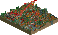
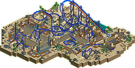
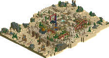
Recently, Louis! stated that he would soon be concentrating on smaller parks and designs, rather than tackling a full scale giant. Although many members were likely disappointed with this announcement, it's safe to say that if designs like this continue to grace the front page of New Element, he will surely be forgiven. Here's his latest finished design, Mirage, a utopian illusion hidden within the great depths of a sandy desert. Read On...
Just a couple of things about the park as I don't think I included a read-me.
The area doesn't have an entrance. This is due to my stupidity and when pointed out to this fact I was too far along to rebuild.
You'll also notice that there isn't a lot of architecture in the surrounding area, it's mainly localised to the station area. This is because I wanted the coaster layout to be the main focus, and also to have a lot of path/queue interaction instead of building interaction as I think it's more fun and enjoyable for peeps to have a coaster rush past them rather than it rush past a building.
Thanks go out to Sammy, Leon, Oly & Nokiaa who viewed the park at various stages of construction.
Also thanks to ][22 for the awesome logo that I absolutely love and of course Jusmith to the brilliant write-up.
So yeah enjoy the park!
looking at it again, i still really love it, but im an arse so im never going to forgive you for not putting an entrance
but dude, seriously, serious lovage here.
congrats again
RMM Offline
That said this was a clean, well executed design that had a great atmosphere and the overall effect even through a screen was very good.
You have a great selecetion of good work, now start to make it an amazing selection of work.
rK - Thanks. Glad you liked the layout and the path interaction. That was the main focus of the design so yeah glad you liked that
RMM - Yeah I dont look at ratings really. As long as the layout flows well and has decent pacing then i'm happy. Thanks.
JK - Haha! Yes sir!
Posix - Thanks a bunch. I really love getting decent comments from you as you are my #1 parkmaker. And yes, this wont be the last LL you'll see from me. I find I can be more creative with themes and have better ideas with LL.
JJ - Oh whatever
i had forgotten to mention earlier that i don't think the missing entrance is a problem. i think of designs as little areas cut out of a park. thus an entrance is not really needed, i don't think.
i really like it when people use 'fading paths' at the borders of their designs to indicate that the park goes on. really few people have done this though, unfortunately.
Good to hear; I like your LL way more than your RCT2. This is perhaps my favourite design from you! Congratulations.
Also very good to hear.
i feel so guilty *dramatic*
oh, you should never have had me test the beta version
EDIT: oh, i did tell you about that.
Liampie - Thanks, it's probably because my LL is more inspired.
Sammy - Yeah you probably did
Can't wait for more from you.
I don't know why I was unimpressed when I first opened this, looking at the aerial now this looks nicer than my memory of it from awhile back. I certainly don't want to discourage you or anyone else from creating something in LL, and I'm sorry if my low vote did that. I look forward to more from you, Louis.
As my score reflects I thought this was a very strong design.
It reminded me of Slob; With those walkways/queues interacting with the coaster (he was a god in that area), the overhangs (tents) and the way of constructing your architecture (2x2/1x1/3x1/4x1).. And really, you can't get any better compliment from me, as slob is my all time favorite parkmaker..
Louis proves that parkmaking doesn't have to be over-complicated and over-detailed to get an outstanding atmosphere across.
Well done, and please keep on releasing this kind of quality stuff!
SF
James