Park / Fenrir
-
 22-November 09
- Views 10,241
- Downloads 1,024
- Fans 5
- Comments 32
-

-
 84.17%(required: 65%)
 Design

chapelz 100% geewhzz 95% Fr3ak 90% nin 90% Nokia 90% Six Frags 90% 5dave 85% Ozone 85% inVersed 80% SSSammy 80% zodiac 80% CedarPoint6 75% Kumba 70% posix 70% 84.17% -
5 fans
 Fans of this park
-
 Full-Size Map
-
 Download Park
1,024
-
 Tags
Tags
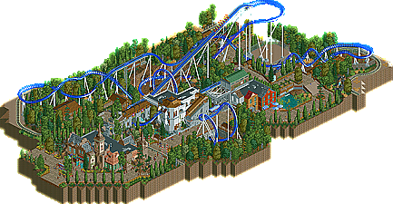
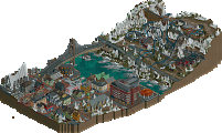
![park_2859 [PT4 R7] Medieval Climate Optimum](https://www.nedesigns.com/uploads/parks/2859/aerialt2509.png)

RMM Offline
true, but i don't think they 'planned' to have mantis that way. they must of tested the ride and eventually decided that it was better when slowed down by them brakes. it was probably a mistake. but in rct obviously, you can alter the layout. lower the drop by 1 and it might be perfect. if that means shifting entire parts of the coaster to try it out, then take the time and so be it. i guess placing random brakes in rct is almost an easy way out and i understand that view completely. i didn't check it out in game but i'll probably feel the same as JDP once i do.
Ontopic: Steve I really liked the whole thing. The layout had a nice flow and great interaction with everything. The archy, especially the little line of houses, although a bit monotone in color, was great! The station was really nice too. Reminded me a bit of my station in Canthose. I didn't like those wooden buildings that much. Maybe there were a bit too many trees in there, but still one of the better designs recently! Now finish a solo
"MFG"
And they added the trims on Mantis because people were complaining about the ride being too forceful on the legs. Many rides have trim breaks, it's because you can't account for everything in a design to be 100% perfect in real life. Take Expedition Ge-Force for example, hell they even built Millennium Force with a piece of track designed just in case trim brakes were needed down the road which would make them easy to attach and not have to get a new piece of track installed.
RMM Offline
Thank you everyone for the kind words. Really means a lot to me since I think this is the best thing I have ever built.
Those wooden building were the last thing I did. I tried to emulate the architectural style of Bergen, Norway. I was never sold on them either, but I think they fit and are decent enough I suppose. If I had to pick the weakest spot on this map it would be those buildings, though. Haha.
I'm really surprised people are into the swinging ship. I never thought that was anything too special.
zburns, I agree. I really didn't want to do a B&M for that reason. It just turned out that way. Thanks though!
Liampie, in your picture #2, those are meant to be "storyboards" that follow the myth of the Fenrir for people to look at while waiting in line. I got the idea from a Six Flags park where in the queue for Batman the Ride they have similar things for all the superheroes. I'm really glad you enjoyed this design, thank you!
Again, thank you everyone else for the kind remarks. I'd love to hear some more. Hopefully soon I'll release something other than a design.
Big thank you's to both 5Dave for the best logo this site has seen, and robbie92 for taking the time to do the write up!
its beautiful, the execution of the ride itself is more then ive seen in a very long time, an its surroundings were amazing, the coaster is very natural an perfectly placed in there. Amazing work steve, congrats on the accolade and we hopefully see something bigger from you soon.
Actually steve, if you would have just raised the cobra roll a bit, i think that would have been even better for the layout... and thanks for not taking it to heart like some people are.
-JDP
Sorry for the offtopic, Steve!
"MFG"
James
Congrats on the design and I look forward to your next project.
James