Park / Fenrir
-
 22-November 09
- Views 10,241
- Downloads 1,024
- Fans 5
- Comments 32
-

-
 84.17%(required: 65%)
 Design

chapelz 100% geewhzz 95% Fr3ak 90% nin 90% Nokia 90% Six Frags 90% 5dave 85% Ozone 85% inVersed 80% SSSammy 80% zodiac 80% CedarPoint6 75% Kumba 70% posix 70% 84.17% -
5 fans
 Fans of this park
-
 Full-Size Map
-
 Download Park
1,024
-
 Tags
Tags
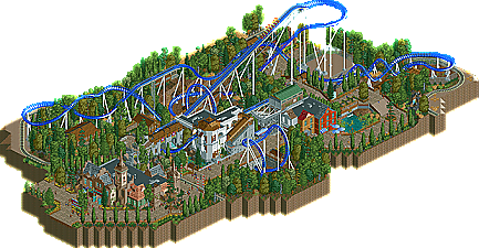
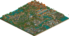
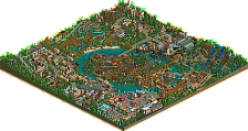
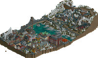
No, this is not the long-awaited second solo project from Steve. However, the once-slob-protégé, Pro Tour 2 standout, and New Element Parkmaker has graced us with his third design, Fenrir. Supported by a Norwegian theme, this royal blue-railed B&M floorless coaster succeeds parks like 5dave's Moroverden and Highball's DisneySea in showcasing all that the Scandinavian country has to offer, beyond blondes and fjords. In fact, the theming is so well done that it secures the highest score ever given to a design since the accolade voting changed its format. So, without hesitation, New Element would like to present its latest design, Fenrir. Read On...
For how small all of your designs have been I think I've spent more time looking through them than any others
Let's see some other types of designs! Suspended coaster? Corkscrew coaster? 4th dimension? An Intamin coaster?
Nonetheless, really nice design, Steve.
Steve, this was awesome. I thought the layout was almost perfect, I just didn't like the diagonal drop into a turn then into the loop as I would have thought that it would have been 'cheaper' to just build a twisted drop into the loop, but that's thinking in perfect realism and I liked the fact that it had the unique first part.
The theming and everything else was outstanding. I love all your work and this is no exception, well done
Oh and Dave, that is still such an awesome logo.
RMM Offline
funny that i also started a blue floorless with white supports yesterday. and then i seen the heartline used as a tunnle near the end, i also used the same exact thing haha. congrats on the design steve.
Everything was very well done, and had an exceptional atmosphere, which I always found one of your fortes Steve.
The layout was strong (although that turn after the first corkscrew going into the 2nd was kind of awkward) and had a great pace throughout.. The elements were placed well, and it interacted very well with its environment and the park itself.. Love the placement of the cobra roll! The chain return was also pretty innovative, with that box at the top of the lifthill.. Color scheme was spot-on and that transfer section was ace..
The architecture was detailed, varied and very strong theme-wise (still hate those cjk roofs though
The foliage selection was strong, although some parts tend to be overtreed.. But I guess it fitted the theme, and is not really that big of an issue.. Love the flower placement too, adds some color to the foliaging..
One of the best pieces of work this site has seen recently and please don't quit building, like, ever, Steve!
SF
Steve, this was brilliant! The first turn out of the station has to be one of the nicest little areas ever. Spot on atmosphere, beautiful.
Pros:
+ The composition was superb. Except for the edges, nothing looked like filler! Everywhere there was something to discover without becoming chaos.
+ Very detailed.
+ Great colours. Bright, but not too bright. I've rarely seen anything this harmonious.
+ Good layout, of course. I love the firstdrop and the interactions with the surroundings were great.
+ Perfectly detailed architecture!
+ Huge atmosphere, I'd say it's one of the strongest of 2009. I feel moderate happiness (moderate as in genuine, not like Disney) and summer.
+ Awesome logo!
+ Everything works as a whole. This thing is just so pretty...
Neutrals:
o Foliage looked unfinished on the edges. Placing some 1/4 bushes or anything like that would take not even five minutes! It didn't hurt the atmosphere much (very very little actually) but it could've been improved.
o The wooden facades near the transfertracks. They didn't do anything for me. Not bad, boring. They fit the theme though, which is a pro.
Cons:
- There's too little!
1. The strong atmosphere and architecture at it's peak. The colours work so incredibly well... Great use of objects too. Love the open doors and the planter!
2. I don't get what the coloured things are. (The unconnected support is in the screen by accident.)
Thanks again, this is one of my favourite designs ever. At first I thought I liked the Wildcat more, but the longer I look at this the more I love it. A full park with this quality stuff has a good chance of possessing #1 on my personal list. Please make it happen.
Congratulations on yet another masterpiece. 19/20
I thought it was fantastic.
The layout was good in the fact that it wasn't really standard. A Blue B&M is nothing special, but there were interesting aspects to this that I enjoyed. The curve right after the drop was unorthodox, but interesting. You included tunnels, but didn't make them exceptionally long or confusing as some are apt to do. The zero g roll was unrealistic, but well placed so that it felt rather natural and the corkscrews added a touch of realism since they're a sort of standard B&M practice.
The theming may have been my favorite part of this because it just looked so fantastic. I'm impressed how you can make brown with a touch of color look great with the scrambler building. The station form is fantastic, #1 because it's not a rectangle, and #2 because it's not over-detailed. It's very clean and for some reason I love the sloped roof covering the stairs. Don't know why, but I think it's pretty.
The foliage I can see as one of those hit or miss deals, mainly because it's so thick. While I don't think it would fly in a full park setting, it works well around this coaster, especially with the bushes. It's interesting in that it hides a lot of the coaster which would only be visible from the queue line or, in some parts, on the actual ride.
So all in all I was quite impressed and it's got to be one of my favorite designs in awhile. All I have to say is you better keep building! I'd like to see a full park out of you sometime.. maybe like a Busch Gardens or something.
Theming was just how I like it. I've said it before, I'll say it again - the theming doesn't have to be overly detailed or over the top; it just has to convey the theme and provide atmosphere. Yours does that superbly and is very nice on the eye. Likewise with the foliage. The only possible 'con' to the whole design was the fact that it maybe lacked something really novel or memorable. It ticks all the boxes and ticks them very well... but whilst it's an example of great work, it perhaps lacks something different or unique. Nonetheless, that only counts for a couple of minus points in my book - so great work, and well done on the Design.
However, it's steve. And along with steve comes amazing atmosphere that i really loved along with great easy on the eyes architecture. Even though I didn't like the design itself, everything else made up for it. So I would have rated this a 13
and I also notice you love random water falls
-JDP