Park / Knights Of The Round Table
-
 08-November 09
- Views 4,651
- Downloads 589
- Fans 0
- Comments 14
-

-
 65.38%(required: 65%)
 Design

Kumba 85% Six Frags 80% 5dave 70% Fr3ak 70% zodiac 70% CedarPoint6 65% chapelz 65% geewhzz 65% inVersed 65% nin 65% Nokia 60% Ozone 60% Steve 60% posix 55% SSSammy 50% 65.38% -
 No fans of this park
-
 Full-Size Map
-
 Download Park
589
-
 Tags
Tags
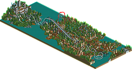
![park_2396 [H2H6] R3 - Reservoir Dogs - Copper Creek](https://www.nedesigns.com/uploads/parks/2396/aerialt2135.png)
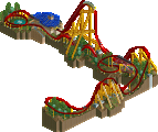
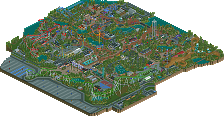
Roomie is a name that has been cropping up on the homepage a hell of a lot recently and if you haven't noticed then where on earth have you been? As the community continues to update itself with new ideas, hacks and techniques, Roomie has consistently taken this in his stride and shown that he still has what it takes to produce quality pieces of work. Since his arrival at New Element way back in 2002, Roomie has picked up a total of 6 Design winners, and today we congratulate him on his 7th, Knights Of The Round Table, which gives him the most Design wins of any member here at New Element. Read On...
Roomie 6
RRP 6
So they are equal at the moment. (Sorry Louis!)
I will give an larger review later in time. (based on the overview, don't have LL)
And RRP yes you have 6 designs and then Posix has 5.
Congrats on the design again. Hope you like the logo!
cause novice means newcomer?
We eat ham and jam and spam a lot.
We're Knights of the Round Table
Hooray!
You're on fire. I thought I would brighten your day with a little monty python fitting of the occasion.
I liked the grey castle the best, but there were some spots of greatness in the tan town. I did not like the layouts or the coaster colors, however.
Thanks for the comments
This is a ride that I have been building for a long time. And although it only just scraped the design mark (by the same amount KC missed the gold mark
I think its the pleasing asthetics of having mirrored coasters that gets me. I find the idea elegent and love the look of old rides such as Racer and Rebel yell as they peel apart and come back together. I was always sad the dueling ultra twisters that togo designed were enver built.
Although it seems the judges dont agree with me.
Im suprised im so high up in number of designs. As 4 of those 6 (JP: Rampage, Multiplicity, Zero and Knights) have all come in the last year. I hope to have War of The Worlds finnished by Xmas too.
Roomie I love the larger grey castle towards the left of the screen. That architecture was really well done.
I can't wait to see your next projects.