Park / Valium Skies
-
 02-December 09
- Views 7,329
- Downloads 1,277
- Fans 2
- Comments 19
-

-
 71.15%(required: 70%)
 Gold
Gold

SSSammy 90% Nokia 85% CedarPoint6 80% Steve 80% chapelz 75% nin 75% inVersed 70% Ozone 70% posix 70% 5dave 65% Fr3ak 65% Six Frags 65% zodiac 65% geewhzz 60% Kumba 55% 71.15% -
2 fans
 Fans of this park
-
 Full-Size Map
-
 Download Park
1,277
-
 Tags
Tags
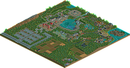
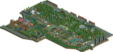
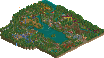
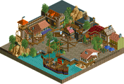
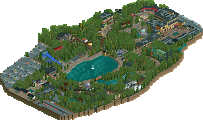
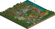

prodigy first graced our pages back in September of 2008 with the first ever Bronze winner, World of Pleasure - Mönchengladbach, he appeared once again in November of 2009 with another Bronze winner, this time as a member of RCT-Pro with
Midwest Adventure Amusement Park. Now, we present you prodigy's latest Accolade winner, a fantastic Gold park, Valium Skies!
been waiting for this !
congrats prodigy:DD
At first I want to thank the whole NE-team.
Then I want to thank Turbin3, Colorado-Fan, DelLagos and Cena for watching over the park, during it was still progressing.
And best thanks to CedarPoint6, who fixed a black hole, that was at a very unfortunately place!!!
Of course also my very best thanks to whoever created this wonderful logo and whoever wrote this amazing long and even nicer than long writeup and made the screenshots!!! I love all of it so damen much!!!
I hope you´ll enjoy this little park, it took a long time to build it
Please tell me, what you think about this park, I need some criticism for my upcoming park(s).
Best regards, prod
Great park, I just think you used to much trees.
The rest is just great.
Looking forward to your next park(s).
Yannik
Um, as for the coasters. I don't really understand your purpose of using Sch track and naming it an Inatmin. I mean, it's not like you used vertical track or any inversions... I just don't see why you didn't use the normal giga track. I also feel with your coasters that you tried too hard I guess you can say. There was a lot of unnecessary merges and track pieces. Also come on dude. You refereed your inverted coaster to B&M yet gave it had no predrop and 9 cars.
Foliage and architecture was really solid but I think when it comes to this park, you gonna either love it or hate it. After what you posted in your topic, I feel the actual park itself fails to deliver what you've shown in your screens.
Most of the work is really well done and I did love the train but I just think that this park just doesn't give off the amusement park vibe that I thought it would. 12/20
-JDP
Edited by JDP, 03 December 2009 - 01:19 AM.
nice job on the park. looking back i think my vote was a tad low and the more i look at the park the more i really like it. i think you did a great job pulling off a 'natural' feeling with the foliage, landscaping and space around the park. it was nice to see outskirts done of a park and it's something i try and plan to do more of in my own work. i really liked the farm plots and the swamp, it was a very nice touch. you also did a nice job of using scenery most people find ugly in a good way, like the rocks.
i really enjoyed the area around with the mega-splash and intamin. although i agree with jdp about the invert, i really liked the intamin and assume you were going for the newer intamin track style that resembles premier like on intimidator.
good luck with your future projects.
Everything in the park was just so nice to watch. Usually I'm not a fan of these darker, more foliage and path-oriented parks, but this one was an exception. That little seating area right next to the mack water ride and Cannonball was just so perfect. I could totally see myself standing there on a hot day drying off from that water ride and watching Cannonball haul ass almost right overhead. The station for that mack ride was really something else, too. Other things I loved were the Vekoma Junior Coaster and the Togo Looper, which was just so fun to watch for some reason. I could totally imagine watching it from the parking lot, getting pumped up to go into the park--sort of like Dragon Fire at Canada's Wonderland.
The only things I didn't really like were the B&M, which did nothing for me (bad colors, meh layout, no station, 9 cars, etc.) and the Orca coaster, which which was kind of in the middle of nowhere and just looked awkward.
Other than that, everything was sick. Again, not the most lively and bright park I've ever seen, but still very entertaining. Well-deserving of the Gold, I think.
Oh, and what was up with that little area with the Big Apple? Didn't quite get that.
also forgot to mention i wish the park was peepable, it would be much more lively then.
I also thought the area around the watercoaster ride was pretty outstanding, too.
Well done, prodigy! I can't wait to see what you build next.
i really really liked this.
everything was just so believable.
its really impressive and so enjoyable.
ive not seen this atmosphere pulled off anywhere else.
Thanks for the mention; glad to fix the black hole for you. It's such a nice park. The layout of the park was a little awkward in spots and I wish there might have been a more developed space at the rear of main street with the carousel. But overall, I thought it was really pleasant. The coaster designs were pretty interesting. I like the attempt at the new style of Intamin track; maybe the best I've seen so far, although you're certainly limited with the single rail coaster. The attempt at the Pyrenees layout on the B&M invert was pretty nice, although that was one of the weaker coasters in my opinion. The Big Thunder Mountain thing was really interesting, and I think one of my favorite parts of the map. It was so well developed and looked fantastic. Overall, there was quite a lot of nice things around the park to look at, and it's certainly one of my favorite parks for this year. I hope you'll keep building stuff; I'm pretty interested in whatever your next project becomes!
Congratulations.
In:Cities: Thanky you, glad you waited for it.
Turbin3: Thanks, you know my upcoming 2 projects (a 150x150 park together with colorado-fan and a rct-pro-design together with cocoa and sssammy).
JDP: Thanks for the critism! I´ve asked for it and it really helps! To your points according to the B&M Inverter, your absolutely right and I fret that I didn´t see it. The missing predrop and the 9 cars are a mistake of me.
The Intamin launch coaster I did that way, cause I tried to build the new track-profile with the double-backbone, that´s why I just could do a very simple layout for this coaster.
The merges on the Vekoma Junior Coaster I did, cause it´s a re-build of Fort-Fun's Devil's Mine and there are also real merges between a 2-point and a 3-point track-profil. Vekoma is doing such things often at their junior coasters, I think.
geewhzz: Really thank you, glad you like it! With your guess concerning the newer intamin track style that resembles premier like on intimidator you´re right.
zburns999: Thank you very much. I´ve had a similar experience like you´ve had at Canada's Wonderland. I´ve had it at a belgium park, called bobbejaanland, back in the old days, when there was a Vekoma Corkscrew Coaster called "Wervelwind". When we came along the road on the way to the parkinglots, we could see the lifthill of that coaster behind fields and a forest. It was a wonderful feeling and like you I had so much anticipation in that moment, it was absolutely great. That was even the point, why I´ve build the Togo-Coaster here at this place that way. Glad you´ve seen it, thanks so much!
The idea behind the small part of an other smaller park is, that here are two park, a big one called movie world germany and next to it a small one called schloss beck. The distance and situation there is similar to the one here.
geewhzz: I really love the banner!
Steve: Thank you very much. Glad you like it.
SSSammy: Best thanks for the write-up. I love it. I´m very glad that you like the park so much. I tried to get a similar atmosphere like I always feel in De Efteling. Vers small but good themed areas and between them a lot of trees, cause that in my opinion it gives the park a very relaxed feeling, not so hectically as in a few other parks.
CedarPoint6: I´m so glad you like it, cause you are my absolutely favourite parkmaker. I couldn't thank you enough for fixing the black hole, cause that recovered the whole park. I don't know, if I would have sent it in with a black hole in it.
Also glad that you've seen the Pyrenees touch in the B&M Inverter.
My upcoming projects are a duo with colorado-fan, that becomes a mix between Lake Compounce, Canobie Lake and Busch Gardens Europe; and a trio with cocoa and sssammy that becomes something like Expedition Everest.
RRP: Thanks, I´m really looking forward to your review. I've never been to Alton Towers, but I think the vibe there is similar to De Efteling. That was kind of my main impulse for this park, even if there are a few several things that are Disney-based, but the main idea for the atmoshere I tried to grab, was definitely touched by De Efteling. I'm so glad that this vibe seems to come around.
Edited by prodigy, 03 December 2009 - 03:03 PM.
- The Log Flume - WAY too many logs. I would take longer load/unload times thus causing a back up
- Orca - Seemed like an after thought. You had all this room around the park to fit this coaster in which would have left the lake looking fantastic in it's natural setting.
I would have scored this a strong 13. The parks has it's moments, but it was just missing that little extra to move it up for me. Congrats on the Gold though and I look forward to seeing more from you in the future.
James
Pros:
+ Most coasters were good
+ The area behind Diablo had an amazing atmosphere
+ Great interactions around the spillwater
+ Copper Mine has an incredible station
+ The presence of surroundings
+ Original ideas
+ Lots of great architecture
Neutrals:
+- Foliage looked both great and horrible. The birchtrunks were too bright, the swamp plants (?) looked out of place (i hate those objects anyway) and the long grass looked fake for they only grew in square patches.
+- The neighbour park was well executed but looked forced in that corner
+- The farmstuff looked forced too... The patches were way too small to be believable.
Cons:
- The mainstreet is out of place in this kind of park... The area around the merry-go-round was so bare it was ugly. Very ugly, actually. You could've done more with that...
- Too few rides in the front half of the park, too many coasters in the back half.
- The stadium was useless. There wasn't much of a stage and the whole show could be watched from the other side of the lake.
Overall a very good park, well worthy of Gold. Congratulations. My score: 14-15/20
Work hard and your next park could be a spotlight, I know you can pull it off.
This was the main disappointment for me. I thought you'd started a great timeline park with the first release but you didn’t change anything from the first version. You could have at least moved some of the flat rides at the entry around or added to it but the map was just extended instead. It almost felt like a different park. As you’d set up a style for the main entry with wide paths and lots of building, then changed completely for the rest of it.
Overall the rides were nice but there just wasn’t enough holding it all together for me, they were all singularly themed with very little tying them together or to their accompanying rides/shops.
Congrats on the win but you could have done this more justice. The original areas were much better than the additions. Great foliage throughout though
Colorado-Fan Offline
Congrats on the win and I think if you go on like this your next park could get spotlight