Park / Rangda
-
 27-December 09
- Views 6,705
- Downloads 964
- Fans 2
- Comments 24
-

-
 77.69%(required: 65%)
 Design

5dave 85% CedarPoint6 85% Kumba 85% Fr3ak 80% inVersed 80% posix 80% Six Frags 80% ][ntamin22 80% chapelz 75% geewhzz 75% Nokia 75% SSSammy 75% zodiac 75% Ozone 65% nin 60% 77.69% -
2 fans
 Fans of this park
-
 Full-Size Map
-
 Download Park
964
-
 Tags
Tags
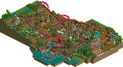
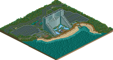
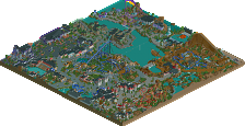
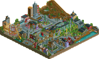
Nice to see you can get one of your 12 something projects done and on the front page
overall, a great design and would have scored it around 16 had I been on the panel. Congrats and I look forward to seeing more from you.
James
Glad I could help you out when you needed it, too!
Thought I should comment, and I've quoted Liampie here because I would have also listed all these things as positives. I want to pick up on another positive (the layout) and a negative (the pacing):
There are lots of comments about people being sick of B&Ms or Inverteds or whatever. I think Inverted coasters are a challenging coaster to work with. The train design allows for you to mess around with the layout and its interaction with the landscape and surrounding features... I think everyone wants to have a go at their take on a 'unique' Inverted coaster. So I'm glad to see your attempt... and it's a good 'un, though I wasn't blown away with it. And that's not because of your apparent 'Godlike' status here (I tend to stay away from the 'hype' and all that jazz
Maybe I'm just totally incorrect here, but I find that the majority of Inverted releases here are wrongly paced... they fly too fast through their elements. Yours is no different. I LOVED the layout. The small, Nemesis style drop - the flow from element to element... and I really thought the final corkscrew had a great visual effect... The layout had a good flow, was believable and also was far from standard. BUT the train took a lot of the elements too fast IMO. People have mentioned the brake run and final corkscrew, but even before that - the batwing and turnaround... the train is absolutely flying around. Too fast. Maybe I'm picky, or just plain wrong, but check out videos of real Inverted coasters, and they're not going that fast through their elements.
Again, I know RCT is a GAME, but it's a game about designing rides, and particularly when you go for a realistic slant (e.g. custom realistic supports), then I feel that you should get something fundamentally important, such as the pacing correct, rather than something like supports. I said Inverted coasters are challenging to build, and I know you should take RCT ratings with a pinch of salt (especially with the overly-intense and overly-nausea ratings the Inverted coaster seems to have), but if you're getting stats out saying your ride is 'Extreme' on the Intensity rating, it does generally mean there's too much high-G on the ride, and that's usually down to the train taking the elements too fast.
Anyway, the pacing outside, this was a pretty fun - and visually impressive - design. I'd have scored it around 14/20... it wasn't anything mind-blowing or completely unique, and the pacing was off, but otherwise it ticked all the right boxes in an impressive fashion! Congrats.