Park / Universal Studios Florida
-
 06-January 10
- Views 18,387
- Downloads 1,788
- Fans 4
- Comments 26
-

-
 67.31%(required: 60%)
 Silver

nin 80% posix 80% CedarPoint6 75% geewhzz 75% chapelz 70% Fr3ak 70% inVersed 70% Kumba 70% 5dave 65% robbie92 65% Steve 65% Nokia 60% SSSammy 60% Six Frags 50% ][ntamin22 40% 67.31% -
4 fans
 Fans of this park
-
 Full-Size Map
-
 Download Park
1,788
-
 Tags
Tags
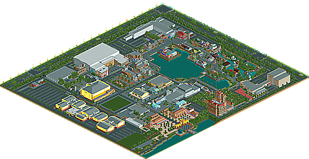
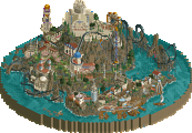
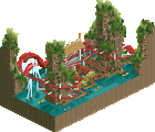
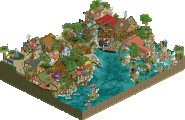
When I first saw the overview I thought "why the fuck didn't this win Gold!" but after I viewed it ingame I understood why. I'll explain:
Pros:
+ Great architecture
+ Pretty good atmosphere for a not-peepable park, especially the area round Jaws
+ Great details to discover, for example what zburns999 said.
+ The map didn't stop at the borders of the park; there were surroundings too that contributed to the atmosphere and made the park more believeable (love the minigold-sidewalks)
+ The park wasn't square
+ the map/park was pretty unique in it's execution, which is always a big plus for me.
+ Good backstage areas
Cons:
- Undetailed roofs, were very annoying
- Too few rides
- Too few outdoor rides (you should've added some hypercoaster like the B&M in Japan or the Maurer in Orlando, seriously. At least!)
- Bad rollercoasters
- No peeps, rides were closed
- The use of cactus trees
- Rock'n Rollercoaster had a boring entrance. It looked pretty, but it could've been the entrance to some restrooms too.
- Jaws should've had invisble track and more moving theming
- There were no streetlights! They could've made the meadow look better.
- The roads needed more traffic
- Emtpy interiors. I didn't expect you to fill buildings like CP6 did in Watkins Woods, but placing some stuff behind windows is the least you can do.
It looks like there are more cons, but the pros here are way more important. If you fixed some of the details, this should've been a gold. If you fixed the details and the rides, this could have been a spotlight. I hope to see another park from you, I think you have a very good chance of getting a spotlight next time when you improve the flaws mentioned. Congratulations on the very deserved Silver, thanks for sharing and good luck in the future!
Congrats on the accolade and I can't wait to see more work from you. Do you have anything else in progress?
That is exactly what happened.
I'm glad everyone enjoyed the park.
I do regret not putting more details in to the park, including opening up some of the roofs to the attractions and showing inside, and details inside some of the shops. But, this park was never meant to be released, so I didn't think of that when building.
And yes, I am working on something right now, so, I guess we'll see.
Thanks to everyone.
This is a really good Studios park; one of the best I've seen in RCT. The problem is that the style of park often doesn't translate well to RCT, because Studios parks are less ride-based, more show-based, and have a lot of their attractions indoors. Hence, they often lack 'life' in RCT. So whilst I think you've got a really good Studios park recreation, to the RCT viewer, you need to try and counter the 'lifeless' problem a bit. I think you could have opened up the buildings, made it peepable, or added an outdoor coaster such as a ride like Rip, Ride, RockIt or Hollywood Dream or whatever. But as you say, you never intended to release this...
But looking at it from a purely 'recreation' view -- I think your buildings are awesome. They capture the feel of a Studios park perfectly. The facades for most of the buildings are just spot on. You do well to make buildings which could be boring anything but, and also capture the Studios feel, which is really difficult to do in RCT.
The Disney rides... I would have rather they weren't there, and were instead original rides, or at least Universal themed. That just really clashed for me, and didn't work with the rest of the park. Yeh, it's 'half-recreation', but to sprinkle a bit of Disney into a 95% Universal park just didn't work for me. You could have chucked in some Jurassic Park or IOA influence instead. Another minor gripe was I think some of the Entrances to the attractions could have done with bigger signs or entrance plazas.
So all in all... it's a good Studios park, one of the best I've seen in RCT. But the very nature of a Studios park in RCT has its problems in that it often can't sustain a viewer's interest for as long as a normal park - I think this park needed just a bit more 'action' in it to rank it higher than a Silver. But a Silver it does indeed deserve, congrats.
I think I love this park.
Its so close to being amazing.
good call G, it is pretty great. maybe a tiny bit lifeless and lacking some details/ big wow pieces (ie the rockin rollercoaster was a nice building but didn't really show off anything interesting). but overall it was very well done.
I'm somehow viewing this for the first time and it's kind of great. That Tower of Terror facade is seriously insane.