Park / Universal Studios Florida

26 Comments

  • geewhzz%s's Photo


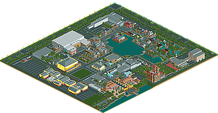
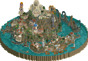
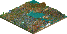
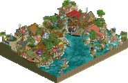
    Sure, we've all come to expect to see releases from the familiar names here at NE gracing the front page. But, every once in a while we get something unexpected from the member ranks. It's been over four years since sixflagsfreak56 has released his work here (2005's Ares, The Mission Trilogy and Lightning Racer recreation) and it appears as though he's back in the swing of things with his newest release and first NE Accolade; Universal Studios Florida. Read On...

  • In:Cities%s's Photo
    the jaws ride is brilliant!

    though i'm a bit confused with the inclusion of the disney rides.
    that took a lot away from it in my opinion.

    should have put more universal rides and attractions in those spaces instead, in order to maintain the atmosphere of the park.

    however, for the most part it portrayed the universal studios atmosphere very well though.

    nice job buddy!

    cant wait to see an IOA rec soon:]
  • rK_%s's Photo
    very pleasant an clean work, i enjoyed a quick look but don't understand the lack of attractions as in:cities stated, a few peeps wouldn't have hurt either =P
  • John%s's Photo
    I really liked what was there. At the same time, it felt like the intangible wow factor was somewhat missing. I guess it's just a consequence of the parkmaking style, though: open space plus flat roofs will definitely make a park lifeless without a whole lot of effort in spite of the attention to detail with building facades. The park could have been without the Disney rides as well... or at least without the Disney names for the Disney rides.

    Despite that (really just nitpicking), I definitely enjoyed looking around. Congrats on the accolade!
  • Turtle%s's Photo
    Hey John. :D
  • inVersed%s's Photo
    This is, hands down, the most realistic (and perhaps the best) studio park ever done in RCT. Nice work.
  • Steve%s's Photo

    I really liked what was there. At the same time, it felt like the intangible wow factor was somewhat missing. I guess it's just a consequence of the parkmaking style, though: open space plus flat roofs will definitely make a park lifeless without a whole lot of effort in spite of the attention to detail with building facades. The park could have been without the Disney rides as well... or at least without the Disney names for the Disney rides.

    Despite that (really just nitpicking), I definitely enjoyed looking around. Congrats on the accolade!

    holy shit!


    i agree with everything john has said, actually. well done sixflagsfreak56!
  • hulkpower25%s's Photo
    Good Job on Jaws, and Mummy:the ride. Excellent work throught the entire park.
  • Phatage%s's Photo
    Wow, really sucks for you that NE can't realize that this, for the most part, is an actual recreation, making it that much more fantastic. I was there a year ago and while I honestly can't vouch for a lot of the architectural accuracy, the atmosphere was literally spot on. From the short amount of time I've looked at this, one of the things I would have liked would be if more work was done on the actual mummy ride, but I understand the disadvantage you have in that it actually exists whereas everybody else has the luxury of creating indoor rides of their own that do not have to adhere to real layouts/theming. Also, a lot of people don't realize how large Universal Studios is, and your solution to truncate the park is definitely understandable as a solution, although I would have loved to see a full rec complete with MiB and the Simpsons over there. With that being said, I honestly don't mind the inclusion of ToT and RRC, you obviously realized that you didn't have the space to make a 100% true recreation so instead of making the park seem limited by that fact, you embraced it. Basically, this park was a true depiction of what the self-lighting fire of inspiration can accomplish, great job.

    Had this been a rec of the same caliber of IoA, you would have won spotlight. That's not necessarily a good thing though, all it describes is the particular tastes of the site. For example, if you put a Hulk rec in place of ToT and RRC, they would have rated this at spotlight but imo the park wouldn't be any better than it is now. At least ToT and RRC are at a studios park.
  • Louis!%s's Photo

    For example, if you put a Hulk rec in place of ToT and RRC, they would have rated this at spotlight but imo the park wouldn't be any better than it is now.


    I think you have that completely wrong here.
  • Phatage%s's Photo
    That it would be a spotlight or that the park would actually be better?
  • Kumba%s's Photo
    Really a nice park, I loved the Jaws ride and countless other things around the park that reminded me of USF. Also sorry to the staff, but thats got to be the worst logo since mine for DRC :p
  • gir%s's Photo
    I think if you fill the storefront windows with merchandise and replace the Disney rides with original creations, this wins gold.
  • turbin3%s's Photo
    I agree with Kumba. (in all points, especially with the logo)
  • Louis!%s's Photo

    That it would be a spotlight or that the park would actually be better?


    That it would be a spotlight if the Disney stuff was replaced by a Hulk recreation.
  • CedarPoint6%s's Photo
    I'll vouch for architectural accuracy, Phatage. A lot of the buildings are quite close to the actuals and well done. I might try and get some comparison pictures up later if I have some time. But it's all very close. Some buildings here and there were missing, but for the most part it was really fantastic. I wish some more of the interiors had been completed; I think it would've upped the atmosphere even more. But what was there was really nice. I hope to see some more big parks like this done soon. Glad to see this released.
  • Six Frags%s's Photo
    From the accolade topic:

    This really was a tough one for me.. The architecture was very good in places, but the rides were excruciatingly bad imho..
    And rides are pretty important in the end for me.. The coasters were all indoor, with short and bad layouts and really took the park down for me.. A good park layout and atmosphere were missing too for me..

    Especially the ToT building made me vote it an accolade though, it was the highlight of the park..
    As CP6, I also felt the Disney/Universal combination was weird..

    SF

    While I understand from the people who have been to USF (namely Phatage) the rides and park were pretty accurate.. While I don't have a clue and don't have the privilege that it brings back fond memories of the real life park, I think my initial judgment was pretty fair. That said, I enjoyed the overview as much as seeing it in-game.. I think that describes why I rated it as such..

    The architecture of some of the shops was great though.. If only the (indoor) rides were worked out better..

    Congrats on the Silver though!

    SF
  • posix%s's Photo
    i too thought it was pretty impressive. mostly because i find studio parks to be rather hard to do in rct. what i liked best was the architecture. you could find many picturesque compositions here. the indoor rides kinda blew. only natelox could do those well.

    to those who have all the knowledge in the world to truly appreciate and correctly assess the greatness of the park, can you explain to me what the bare green spot was for?
  • Cocoa%s's Photo
    ^I don't know, but I have seen them in actual studio parks in real life, they seem to use them for events and little fairground things sometimes. It seemed to fit for me, actually.

    This park really deserved a gold. Everything area was so atmospheric, and although occasionally there were details lacking, the majority of the park was perfect and beautiful, specifically ToT and the Jaws area. If we could see into the buildings and rides, it would be even more amazing and would have gotten the award that imo it deserved.

    BTW, sorry, but terrible logo :p
  • zburns999%s's Photo
    The "Jaws" hanging by the fins in Amity kicked ass.

    Rest was cool too. Nice park man.