Park / Nautílos
-
 08-January 10
- Views 5,177
- Downloads 1,068
- Fans 1
- Comments 19
-

-
 78.08%(required: 65%)
 Design

5dave 90% Kumba 90% Nokia 85% Steve 85% CedarPoint6 80% geewhzz 80% robbie92 80% SSSammy 80% chapelz 75% Fr3ak 75% Ozone 75% nin 70% posix 70% ][ntamin22 70% Six Frags 65% 78.08% -
1 fan
 Fans of this park
-
 Full-Size Map
-
 Download Park
1,068
-
 Tags
Tags
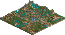
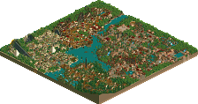
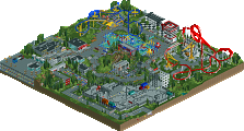
wow.
congrats!:]]
][ says something about 2x2
Congrats on getting design, it did deserve it, I just wasn't particularly exciting for me, but i'll give a proper review later.
Love the way the foliage is presented however i think you might have clung onto those red/yellow flowers to much.They look great outlining the trees in areas but you would have benfited from not using it everywhere.The area under the lift is my main concern
BTW can we see a image showng who did what?
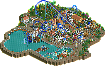
Considering the ride itself, I really liked the first half of the layout. Getting a big twisting drop with varying steepness is hard to get correct visually, but I think this worked well, and the headchopper effect with the monorail was cool. Liked the opening inversion flurry and placement - all in a line - dive loop to loop, to zero-g to the 'centrepiece' cobra roll. Pacing was also spot on. After the Midcourse brakes, it goes a little awry; the brakes are on too strong, and I feel it's a bit of a meander back to the final brakes. Though I like the way it jumps in between the buildings in this final segment.
That said, the buildings kind of felt a bit pointless - there were too many similar (2x2 style) buildings, which only seemed to be there to give the ride something to interact with. I think 'combining' some of these buildings together, or at least giving them a bit more point (make them all obvious shops, restaurants, toilets etc) would have helped. I had similar feelings with the ship which covers the entrance/exit of the cobra roll. Whilst I loved the look of the ship - v impressive - it only served as a piece of theming for the ride to interact with. What if the peeps had been able to board the ship via a plank or something? And/or there was a restaurant on there? That would have given it much more point, and increased the 'interactivity' such that you have interaction with ride, theming AND peeps.
A couple of other things -- the 'supporting' attractions were wicked. Liked the monorail station, and Aquatopia looked a lot of fun - really well presented. The Tetrapylon attraction was also a fun idea and worked really well.
So overall, a good, solid job... as I say, perhaps not ticking all the boxes to make it really 'special', but still checking all the vital boxes to make this ride more than Design-worthy. Congrats.
i liked it, but it missed theoretical content giving buildings a "point". this caused things to look experimental, and it gets me when that happens. in a bad way.
There are a few areas though that i agree where the buildings should have been better. These being the water ride station and the sea front shop simply labled 'food'.
Loved the pacing of the coaster and the fact that it was a big beemer, the monorail station, the foliage and fountain/statues around the water ride, the working kiddies playground and supporting building and the coasters que line. Really nice and dense foliage behind the station there
Over all a really solid design,just a lot less flowers and a little more fascade consideration would have made it better
congrats
Hmm, difficult to say, I 'finished' a lot of remaining stuff in here;
But these things are from me, the rest is Fisch or a mix from the two of us:
- Minor changes to some stuff in it // finishing stuff left because Fisch his 8cars was bugging.
- I changed/hacked the bumper boats, since that gave errors, because the boats normally can't go the white water rapids there.
- The hacks from the monorail station (only 1 station, on a station to station mode, huh?), and the hack on the Tetrapylon (which is easy btw).
- Putting in supports at some places where they didn't were put yet.
Obvious Fisch did most in this, since it was his design originally, I only helped out at the last moment. And for me it is quite a surprise that I see my name here, Fisch asked me if I was okay with it, I said, you can decide, it is your design. So thank you Fisch for that.
@ eyeamthu1:
Thank you very much for your reply, about the supporting rides, Fisch had the ideas, but not the hacking knowledge to do them, so that is coming from my side, thank you enjoyed them.
To all: Thank for your reply's but I think Fisch is better answerring them, since he did the most (by far).
I have a feeling it will be my favorite of 2010 for awhile
I loved how immersive it was and how many other great attractions you added in other than the obvious ones. Particularly the playground and funhouse. I could easily see something like this fitting in at a DisneySea or Europa Park
If I had one problem with it it was how bare the rest of the waterside was
After the main area there wasn't even any boardwalk along the water, I think a small outdoor cafe would've been nice to add somewhere. Or if not, it might've just been better to of cut the path off at Aquatopia and the monorail station, leaving the water as the map's boundary
The enterprise was also just clutter in my opinion in that small inlet of water
I also think it would've been cool to add a water taxi that hints at going to other lands in the park that also surround the lake, again like a DisneySea sorta thing
Anyway, overall the main area of this was absolutely brilliant
Thanks for your comments guys!
In:Cities -- Thanks!
SSSammy -- Thanks!
Louis! -- Thanks, sorry it failed to really impress you. I'm looking forward to your review
RRP -- post 1: Thanks for the good comment! First of all, there's no way to actually outline who did what because most of what is there now, was there about half a year ago as well. But back then it wasn't as finished as it is now. Lets say I did the basic design, I lost interest over the time but I still wanted to finish it. Eventually I asked Cena and he did the finetuning, finished the fooliage at parts, executed the hacks I wanted to do but wouldn't have been able to do without him etc.
He did do quite a lot though...otherwise I wouldn't have mentioned his name cuz there were quite a lot of people who had their hands on this who I just want to thank for helping me.
post2: I agree on the 2x2 buildings not being that big of a problem in most parts but I can see what everybody is saying with there being to many of them. I can't lie, I do kinda feel the same way about some of the buildings. But some of them were just rushed through like the one shop that says food on it. Those buildings that really look rushed are from the time when this design was just being a bitch and I didn't enjoy building on it at all. I just wanted to somehow fill the map and I never redid all of the stuff. The stalls were it says food over them are just HORRIBLE!! Thanks for the tip with highlighting the main buildings even more. I'll try to next time.
I'm glad you liked the queue which is one of my favorite parts of this actually!
eyeamthu1 -- Thanks a lot for your comment. Like Posix said, your comments are always some of the best out there. Great appreciation for this! Very useful criticism and I'll build less similar buildings that are just there as a filler next time and on the other hand I'll try to let as many parts of my stuff as possible interact. But I thought I actually did pretty good in terms of interaction, looking at the queue line, which is always one of my main concerns. Thanks for pointing out what you liked about the layout. I actually really could envision the inversions next to each other in real life, now that you were talking about them having a good flow. I'm glad you liked the supporting rides as well. I tried to have some special rides here and this is one of the parts were Cena's help was very useful because he was able to do all the hacks which I am unable to do.
posix -- Well in a certain way this actually is experimental. Like it says in the write-up this is not my signature style. While some might say I tend to "overdetail" my buildings (which I actually disagree on I have to say because overdetailing sounds very negative and I'm pretty fond of my detailed work) this is rather "underdetailed" comparing it to what I usually build. I did this and I made the 2 ncso designs because I find it much either to get something done without having so much detail on the buildings. It just doesn't cost as much time as for example it would've taken me to finish an area in one of my parks.
Since you live in Germany though and I'm pretty sure you've been to most of the German theme parks you should know that there sometimes is scenery which is just used as scenery and not for anything else. I'd say you see that quite often in German parks. But from now on I will definitely work on making more shops and stalls like the ones that can be found in Watkins Woods for example.
Cena -- Thanks again for working on this buddy!
Comet -- I'm glad you liked this so much. Very good point with the boardwalk. I should've done the waterfront a little better. The path around this little lake is actually pretty stupid, I gotta admit that haha! I don't know what in the world brought me to making it. Good idea with the water taxi as well. I'll take your criticism into consideration for my next work.
Again thanks everybody for the comments.
But I have 2 questions myself.
1st: Since I finished this on November 30th, will it be eligible for the Awards??
2nd: Gee or Posix, could you maybe announce the design release on the top of the forums like you do with other releases?
-JDP
The town and theming gave the whole thing a nice Mediterranean vibrancy that's often attempted but rarely pulled off well.
Beautiful work and very deserving of the win!
Ride6
Edited by rK_, 11 January 2010 - 04:52 PM.
posix -- Next time I'll make sure to place more buildings that actually have a purpose. You're right with what you said about some of them being built mindlessly. I guess some were built because I just felt it fit the whole area to have a little Greek town there or something like that. I don't even really remember what the idea behind most buildings was. Thanks for your comment.
JDP -- Haha thanks!
Ride6 -- Thanks a lot for pointing out what you liked most. I'll make sure to include most of those things in my next coaster as well.
rK_ -- Thanks!
I'd love to read more great comments. All feedback and criticism is welcome!
oh and @ admins: Again the same question...since we finished it in November of last year, will it be eligable for the awards if there'll be any?
Edited by Fisch, 13 January 2010 - 04:27 PM.
Also, major props go to 5dave, who made one of the best logos I've seen on NE, excpet for some of Dave's other logos!