Park / Sandstone Amusements
-
 14-January 10
- Views 3,308
- Downloads 687
- Fans 0
- Comments 10
-

-
 55.77%(required: 50%)
 Bronze

SSSammy 75% CedarPoint6 65% inVersed 65% Fr3ak 60% Kumba 60% tracidEdge 60% ][ntamin22 60% geewhzz 55% nin 55% Nokia 55% 5dave 50% posix 50% robbie92 50% chapelz 40% Roomie 40% 55.77% -
 No fans of this park
-
 Full-Size Map
-
 Download Park
687
-
 Tags
Tags
![park_4119 [H2H8 R4] Incident at Billy Wonka's](https://www.nedesigns.com/uploads/parks/4119/aerialt3859.png)
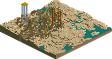
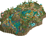
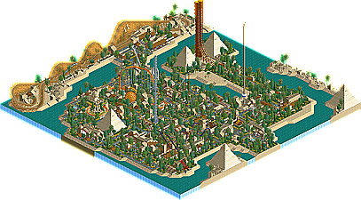
Here at New Element, we expect there to be new faces continually joining the site, picking up the game and garnering the community’s respect, eventually winning accolades. However the community has also been repeatedly surprised with older members making a comeback, with new skills but also retaining that old school touch. Our newest Bronze winner, rk_, has done just that. His stunning piece of work, Sandstone Amusements, brings viewers into a beautiful park which really captures that warm, nostalgic feel. Read On...
either way well done rk_ congrats on a good little comeback park
I'm not the best to comment on a RCT-LL park, cause I haven't installed my RCT-LL... but I would like to write a bit about the overview...
At first I really like the vibe, it's absolutely refreshing. All chosen colors are working very fine. The rides are not the most spectacular, but it's a small park and so it also works fine this way. My favourite ride would be the woody, but I think it would looks better without the helix. That there is no big architecture intensifies the old-school-feeling imo, and I think that's what it is about.
Congrats on this park!!!
This park was pleasant to look at due to the bright colors and peeps. Other than that it seemed pretty small and didn't really have all that much going on other than a bunch of flat rides surrounded by paths and flowers. It looked nice, but that's all I really got out of it. Nice work motivating yourself. I like where you're headed and I'm looking forward to that solo you mentioned.
i dont have LL so can only comment on the screen but ill echo what posix said.The rules you've set out from the start are far to restricting. Look at the entrance/exits to rides. They are all basically the same. The buildings dont really seem to represent any forms and everything else seems to be filled with another formula of bush,bush,flower,bush,flower,tree.
Overall the finish is good and you've obviously taken your time with things like the fences.Outlining just about everything. But this park does nothing for me. It's like a polished version of the old mega parks that relied on very little concept but is missing the fun factor those parks had. It would have benefitted from some original idea that could have acted as a focal point