Park / Myst
-
 11-February 10
- Views 10,763
- Downloads 1,478
- Fans 8
- Comments 44
-

-
 81.15%(required: 70%)
 Gold
Gold

chapelz 95% no Nokia 95% no SSSammy 95% yes Kumba 90% yes ][ntamin22 90% no 5dave 85% no inVersed 85% no nin 85% no Fr3ak 80% no CedarPoint6 75% no Roomie 75% no robbie92 70% no geewhzz 65% no posix 65% no Six Frags 65% no 81.15% 13.33% -
8 fans
 Fans of this park
-
 Full-Size Map
-
 Download Park
1,478
-
 Tags
Tags
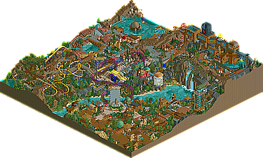
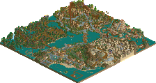
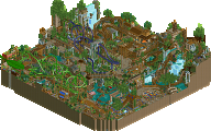
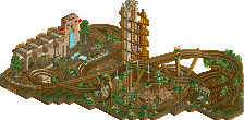
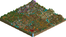
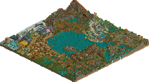
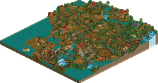
Logo.
ever!
So I will comment on this after I've seen it ingame (which will probally will take a while cause I often forget to watch parks ingame).
I haven't played the Myst series (played it one time, years ago), so I didn't get the park at all, but I assume that was intended. Maybe that's actually what makes this park so good, there is very mysterious atmosphere throughout the park (especially in the entrance area and the harbour): The fitting music, the unorthodox architecture and ride designs. The park is obvious Turtle work, but still its incomparable to anything else I've ever seen. Very, very unique!
However, I wasn't a fan of the central area of the map. Too cluttered, too messy; an unwelcome interruption of the flow and atmosphere. Relatviely of course, because it was still pretty good.
Turtle, congratulations on the deserved gold and another masterpiece, and thanks for sharing! I spent a good time on exploring the park and its nice details, and I'm not done yet.
I sincerely hope to see more work by you in the future!
16/20
Nice logo and write-up, btw.
Edited by Liampie, 11 February 2010 - 05:01 PM.
RMM Offline
this park is a prime example that pretty much fucks all the rules in the ass. it doesn't follow any rules and it's fucking gorgeous at the same time. i enjoy parks in this style more than any other style. there's so much going on yet it flows so well. probably a park that i'll keep looking back it for inspiration.
maybe i'm over exaggerating, idk... just trying to point out how the park isn't traditional, in a good way.
Edited by RMM, 11 February 2010 - 05:54 PM.
IC, Kukuanna and this . . . Dam dude your building a legendary set of parks.
Same here- but it inspired me to go find the game again and play through. Don't know if there's higher praise you can give than that.
I love that invert so much. Things shouldn't be allowed to be so unorthodox and still be executed flawlessly.
Even after picking up the game again and playing through there's still a lot here I don't quite get, but i don't need to "get" it to appreciate it. Glorious, glorious parkmaking sir.
as always when you are the low vote, it makes you feel like a complete ass to have voted it so low. but to be honest, the time i was looking at it i thought it was artistically and technically beyond but as a whole just did not make me dive into it. in a way it didn't speak to me enough.
in any case, turtle, i'm just so happy you're still around and delight us with your parkmaking. your name has "nostalgia" tagged all over it for me
I played and completed the first 3 games in the series and loved them and parts of this park capture the feel of the games wonderfully. The D'Ni area for example is superb.
On top of this the Invert is a truely great ride. Unconventional yet perfect. One of my favorite coasters of the past year.
However i feel the park lets itself down a bit on some of the other areas which dont quite capture the feel of the games for me. Then Again It was never going to be easy to capture such vivid world within RCT.
Either way this is a stunning piece of work and a worthy accolade.
congrats turtle, amazing piece of work.
I agree with the fact that you don't need to have played the games to appreciate this park, but I think you probably do need to have played the games to truly 'get', understand and totally enjoy this park. The problem for me is relating to my previous paragraph, regarding rides - I'm sure if you've played Myst, you'll see some of the architecture etc. that you've recreated and be totally wow'ed. To someone who hasn't played Myst, they'll just think, 'cool archy'... so for those people who aren't Myst fans, they'll be looking more for the rides and attractions themselves... and I don't think these are too strong, other than the Invert.
I hope I'm making my point ok here... but basically, if you know Myst, you'll see the archy and be wow'ed, and that's good enough for you. If you don't know Myst, you'll APPRECIATE the archy, won't be wow'ed, and then go looking further into the park, looking for the rides, attractions etc... and to me, there's not enough there, and not enough 'wow' rides. So I'm in the second boat, where I don't know Myst, and thus the park doesn't really scream out to me, immerse me, or interest me enough. A great park truly has to 'wow', and I think that the over-reliance on the Myst theme, to the extent where there's not enough in terms of quantity and quality of attractions means that too many people (ie. those who don't know Myst at all) will not be 'wow'ed' by this.
So all in all, I can appreciate this - and congrats on the award - but I'm in the boat of people who is never going to be totally floored by it. Hence I wouldn't have personally rated it higher than 13/20. I'm sure the Myst fans or those knowledgeable of Myst will LOVE this though... and the above comments seem to indicate so. So you've clearly done a good job.
It's a toughie though, and I commend you for giving this a good go. I've often thought about doing a very specific theme, perhaps a park themed to one film or TV show. But it does have the danger of not wowing enough people - so that means you really have to go all out to make the rides and attractions outstanding. To take an example of a Marvel Comics themed park - which I am currently considering trying to build - this is a good 'specific' theme, because although a proportion of the RCT community may not 'get' Marvel comics, the theme still allows you to build epic attractions/coasters, which ANYONE will love.
Long, convoluted, never-really-gets-to-the-point-and-trails-off-into-different-discussion post over! Congrats on the Gold spot!
And you kept the entrance building I did! I thought that was so funny for some reason, ahaha.
I agree with posix: its so great to see you building still. I really hope we get the chance to work on another project together.
As for the park, it was classic turtle; didn't expect anything more or anything less. However, this park didn't hold my attention for too long. I think it was mainly the odd coaster styles and layouts that shut me off. And I know it's not supposed to be realistic by any means, but the layouts themselves didn't seem like they had any effort put into them. I would have probably went with a 13 for this.
Either way, you showed that you're still one of the best on this site when it comes to awesome looking architecture and landscaping. Congratulations on the Gold Mr. Camble.
-JDP
RMM Offline
i wasn't accusing turtle of it, it was just a thought that popped into my head while viewing it. but yea, couldn't disagree with ya.
Edited by RMM, 12 February 2010 - 03:59 PM.
Looking forward to whatever you come up with next Jem!