Park / Crocodilopolis
-
 25-August 09
- Views 6,188
- Downloads 590
- Fans 0
- Comments 11
-
 58.08%(required: 65%)
 Design Submission

SSSammy 75% Fr3ak 70% Xcoaster 70% zodiac 70% geewhzz 65% Katapultable 60% Kumba 60% posix 60% CedarPoint6 55% nin 55% 5dave 50% chapelz 50% inVersed 45% Six Frags 45% Nokia 40% 58.08% -
 No fans of this park
-
 Download Park
590
-
 Objects
240
-
 Tags
Tags
![park_3341 [H2H7 R2] Carreira da Índia](https://www.nedesigns.com/uploads/parks/3341/aerialt2950.png)
![park_2420 [H2H6] R4 - Reservoir Dogs - Atlantis Resort](https://www.nedesigns.com/uploads/parks/2420/aerialt2160.png)
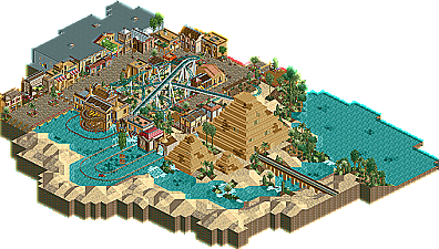
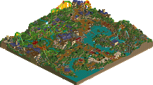
Hey, this is my failed design.
It's score was: 11.26
downloads: 299
Comments are welcome, hope you like it.
Cheers,
Yannik
but then again, i've been looking forward to this lol.
downloading now:D
but at the last drop of the water coaster, it stops too fast.
the piramids are a bit boring. but the town and the lay out of the coaster were very good.
too bad it didnt made it to design.
but be proud of it
Take for time to do things, and you can become really, really good at this game
I really enjoyed this, however, the one thing I didn't like was the coaster itself. It didn't seem that outstanding to me, plus the last drop right before the station wasn't so great
Tezee Offline
Good work.
missing here and there a few eye-catcher.
I find the houses for some, unfortunately, a bit boring.
this are a few really good.
The station of watercoasters I do not find as good.
The trains are too fast into the station.
the watery part of the Coast, I think not so beautiful because of the accruals.
which would have to delete you or replaced by an underwater rail.
weiter so!
If you did not understand what I mean, I write to you again in icq.
my English is not so good ^ ^
Fabian
Of course am I proud
@Lowenaldo: Thanks.
@Cena: I know you told me, but I had such a "idea-flood", that I builded 3 hours every day and that was the reason it got so fast
@reflex: Thanks.
@Tezee: I understand parts of it...thanks.
Airtime Offline
I thought the theming was great! And the water coaster was alright maybe could have been slightly longer but it worked well and looked nice. It also suited the theme.
I think the dark ride building was a funny shape. I think it would have been better if it was more squarish and wasnt so close to the dark ride inside, it could have been a little bigger if it wasn't kind of hugging the ride so much. And "Twister" could have been named better, loads better, to suit the theme. lol.
Apart from that I really liked the design. Real shame you didn't get it. Next time you surely will? lol.
Xcoaster Offline
The theming, archy and such was a big improvement, and definitely worthy of supporting a design, but the coaster layout itself held it back. I think I gave it a 13 or 14.
inVersed Offline