Park / Zippo's Wacky World of Wonders
-
 18-August 09
-
 Zippo's Wacky World of Wonders
- Views 28,602
- Downloads 4,408
- Fans 22
- Comments 82
-

-
 89.62%(required: 80%)
 Spotlight

5dave 100% yes geewhzz 100% yes RCTFAN 100% yes zodiac 100% yes Xcoaster 95% yes Casimir 90% yes CedarPoint6 90% yes chapelz 90% yes Katapultable 90% yes Fr3ak 85% yes Kumba 85% yes nin 85% no Evil WME 80% yes posix 75% no Ride6 75% yes 89.62% 86.67% -
22 fans
 Fans of this park
-
 Full-Size Map
-
 Download Park
4,408
-
 Objects
600
-
 Tags
Tags
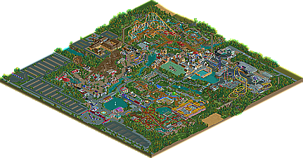
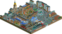
congrats xophe. i had more fun looking at this park than i have had with anything else released in like the past year. i don't know if it's quite spotlight worthy, but it's a damn good park and it's great to see it finished.
Fucking beautiful execution of the concept and possibly the best foliage I've ever seen throughout a park. Definitely worthy of a spotlight. Great job, Xophe!.
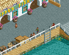
I was really looking forward to this but i can't put my finger on what it is that i don't like about it. I think it's the fact that there was plenty of architecture in some parts but then not enough. Takes Scotland, this contained the most amount of architecture and a small coaster. Then we take the cannibal section. How many stalls do i count? 3. Yep, there's 3 stalls while scotland easily has over 20. That's a big difference.
I think if your going to build a THEME park you have to think about alot of stuff and how your going to do it. To me number 1 is the coaster and number 2 is the architecture. You havce to know what to build, a realistric theme park would have more then what you have.
Yeah yeah who cares about me... Hey it's advice and if you don't want it, thats fine by me.
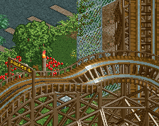
Besides from that i thought the park was good. Not great but good. The coaster were nothing short of extroardinary with none of them having an incredibly large amount of themeing besides from haggis hunt but that's not really a large coaster. I think you should have put more theming in to the invert, yes it was a great coaster but it was missing that little bit extra.
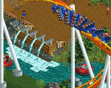
The other coasters were all good, my favourite being Meltdown mainly because of that diagonal dive under the station, that was pretty cool. The entrance area was nice, coyuld have used more guest related buildings because of the size of the park but meh.
The Ye old section was deffinitely my favourite. I love the peasants revolt, very creative ideas in there. The architecture around that section was also very nice.
The most boring area for me was the gardens. I don't see why everyone's saying stuff like "WOW those garden beds are awesome, great use of the side friction coaster!" People here obviously haven't checked out BGNA enough as in the bahamas that idea is definitely used.
The sewage plant was incredibly dirty hahaha... I like the idea of the sewage plant with the slides travelling down the pipes, another great idea.
Theres a few more things that annoyed me. Every employee starting with Zipp, that didn't really get a laugh out of me but meh... I also think some of the flat rides should have had more creative names. Half of them had Zippo's in them. I know the mascot is Zippo but i think you wen't overboard a bit.
In the end i think this does deserve spotlight but could be better, again congrats man.
Also why isn't anyone else wrighting some lenghthy reviews, shorely the creator wiould appreciate them.
Edited by Goliath123, 20 August 2009 - 04:55 AM.
Maybe the majority of us just aren't able to capture the pure essence of it all and put it into words as eloquently as you have.
Agreed. Like I mentioned before, this park doesn't make my jaw drop at all like past Spotlight winners. If you took every coaster in this park and submitted them for NE Design, I don't think any of them would get design. THAT'S how a full park should look like and this didn't have it IMO. Like someone else said, a solid gold park but not Spotlight.
Thanks posix, i didn't think anyone would agree especially someone form the managment and a parkmaker.
I truly think this is one of the best parks I have ever seen sumbitted to this site not simply because or the archy (which was fantastic) nor the rides (which offered a good selection and some wonderful unexpected custom modifications) nor the foliage (which, again, was wonderfully unique and well placed). I think it is one of the best because it encapsulates all of what RCT is about.
Xophe clearly had fun building this park. You can see it in the wacky names and themes. It's a park that doesn't take itself seriously, and I like that. Although it is good from time to time to see parks that drip with realism, it is so very refreshing to see a park that has clearly been built for the love of the game, rather than trying to impress us all with the game's potential for realism. And it's completely peep friendly which is always a massive plus!
It seems that many board members on here have fallen into the trap of thinking that realism is somehow better than the potential of RCT2 to create projects of fantasy. They forget that, despite how much we all love theme parks, there are some godawful ones out there. Realism does not always mean better. Look how much we loved the classics like 'Basics of my Brain'.
In short, I rate Xophe's park incredibly highly and I do so because it's fun and peep friendly. It's not realistic. So what? It's better than realistic. It is perhaps a blueprint for what real parks should be like. It's wacky, colourful, well laid out, original and like I said, most of all, fun!
good parkmaking = parkmaking with concept, plan or intention.
bad parkmaking = parkmaking without concept, plan or intention.
even if some people will probably disagree with this definition, i am convinced that subconsciously everybody's mind works that way when analysing a park.
the reason why realistic style parkmaking is often automatically better is because it has a concept by default: to make a park. parks have attributes that we all know and can therefore turn into practice in rct. even if someone didn't intend to, he will have some more or less vague idea in mind of what to create. mostly, these are coasters.
now, why i think fantasy parkmaking is bad is because its name is being misused. people will call everything "fantasy" that isn't straight out identifiable as realism. fantasy style parkmaking usually happens when people build "into the blue". they have no idea what really it is they want to create, but hey, let's just go wild, it's fun. the results of these ventures are then entitled "fantasy style parkmaking", when really it's just a bunch of mindlessly thrown together objects and rides mixed in with just as randomly raised and lowered land portions. the outcomes then turn out to look weird and unconventional and thus manage to catch people's interest, and that of the creators themselves. and wow, SO many of the creators actually believe they did something skillful because of this interest.
but you can't fool me. you could as well have selected a bunch of objects and scattered them over a map via a programmed mouse macro. it has nothing to do with an actual "performance".
people who build like this are responsible for the tragic reality that the name "fantasy" has had a no-concept-disease attached to it. and i really really regret this.
again, i hail phatage and cbass for not letting real fantasy die.
Realism, Fantasy and Freestyle. Sound good IMO!
SF
By the way, in case anyone didn't know, this park is a reincarnation of one I built years and years ago called Zippo's Wacky Adventure. I'll see if I can find it again. That one really was weird haha.