Park / Zippo's Wacky World of Wonders
-
 18-August 09
-
 Zippo's Wacky World of Wonders
- Views 26,548
- Downloads 4,297
- Fans 22
- Comments 82
-

-
 89.62%(required: 80%)
 Spotlight

5dave 100% yes geewhzz 100% yes RCTFAN 100% yes zodiac 100% yes Xcoaster 95% yes Casimir 90% yes CedarPoint6 90% yes chapelz 90% yes Katapultable 90% yes Fr3ak 85% yes Kumba 85% yes nin 85% no Evil WME 80% yes posix 75% no Ride6 75% yes 89.62% 86.67% -
22 fans
 Fans of this park
-
 Full-Size Map
-
 Download Park
4,297
-
 Objects
600
-
 Tags
Tags
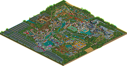
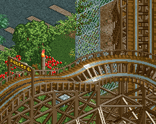
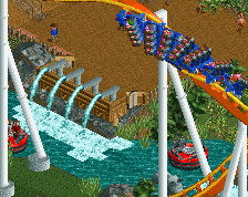
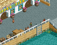
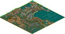
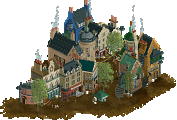
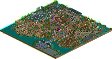
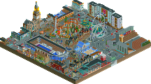
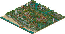
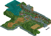
I thought the foliage and architecture was nothing short of brilliant, and most of the supporting rides were very good. Every individual tile was layered with thought as others have remarked. The park was missing something from me, though, and I think it has a lot to do with how every single ride was nearly hacked in some way. This added to the realism without a doubt--log flume rotating platform that is completely peep-able for instance--but I thought it took a lot away from the experience. Part of the challenge of RCT is playing within the limits of the game and if nearly everything, even down to the railroad entrance/exit is hacked to achieve realism appeal, the game's "boundaries" are removed and effects like the station of "The Flood" in RoB (the default station w/ entry and exit is cleverly blended with its station building and the surrounding areas) cannot be achieved. I think this lowers the greatness of the park a great deal for me; so much of this wasn't Rollercoaster Tycoon as much as Modern Realistic Park Tycoon.
That said, it was clearly built with a lot of skill and thought as I mentioned. Ye Peasantes' Revolte and the invert were good, not great coasters, but I wasn't really a fan of the rest layout-wise. Moments like the entrance to Meltdown below the top hat and the monorail in the Chinese area were well done, these little things that cumulatively add up to a meaningful whole. The other thing I liked about this park was that it had character. The themed areas were uniquely devised and convincing enough to make a meaningful whole, which was something I haven't seen in a long time.
So, where do we stand in the end? This park represents all that I like and unfortunately all that I dislike about the parkmaking that's going on today. No longer are bondaries tested, forcing us to find a way to represent today's modern rides within the limitations of RCT; we can represent them by hacking the crap out of a file and even make it peepable. Your efforts are well-intentioned, though, and the end product is a park with great foliage, good flat rides, personality, and a few decent, but not memorable coasters.
Congratulations.
FK
All in all, I do think this is one of the best parks we've seen in recent times and certainly lived up to the hype.
Well done, Xophe! I need to take a better look at this still, but it's excellent dude!
Expect a review later in the day.
jIp<
So far I only saw the overview but I've seen an older version of this ingame before and I already loved it back then! Congrats dude, this is just Xophetastic!!!
I enjoyed it a lot and did vote for it to win spotlight, just I would not say its in the elite spotlight class with the likes of RoB, BGSA and WOMB. I think all the people saying "best park ever" are under the influence of the 5Dave effect
I loved the invert, the layout was perfect imo. The rapids, invisible mini golf (how the fuck did you do that? Me and geewhzz cant even figure it out
Again congrats an a hell of a park and getting an NE Parkmaker spot
So was the gardens. Reminded me of Sydney's botanic gardens.
However, I was a little bored by some of the other areas. My
EDIT: excuse my nubeness, but what is RoB and WW?
Edited by Cocoa, 19 August 2009 - 09:47 AM.
Glad most people seem to like it. And thanks for the amazing write-up robbie!!
I'm flattered that this is being compared to the likes of RoB and WW but I don't think I could compete with them! I'm just glad I finally got something finished haha.
Oh and thanks again to Dave for the logo!
James
I am not denying the outstanding and unique creativity at all, its a great park, I love bonnie Scotland. I just don't feel that it is on the spotlight level, it would be a fantastic gold. I guess it's just not the style I like.
jIp<