Park / Thunderbird
-
 26-August 09
- Views 2,835
- Downloads 538
- Fans 0
- Comments 8
-
 54.23%(required: 65%)
 Design Submission

chapelz 85% Kumba 75% Xcoaster 70% posix 65% zodiac 65% 5dave 60% nin 50% Nokia 50% Six Frags 50% ][ntamin22 50% geewhzz 45% inVersed 45% Evil WME 40% Ozone 40% Fr3ak 30% 54.23% -
 No fans of this park
-
 Download Park
538
-
 Tags
Tags
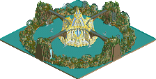
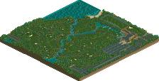
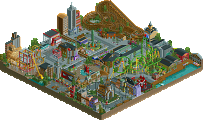
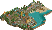
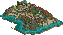
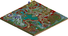
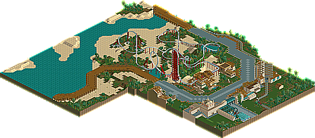
First ever completed Project, i am immensly proud of it, and i didnt expect it to win design in the first place, i figured id see how far i need to travel to get to at least design quality.
this scored 10.85. a score im proud of
please Download, take a look around, and give me some feedback if you have the time.
it would mean alot to me to see where i need to improve.
thanks alot
SSSammy
(PS, its LL
Attached Files
downloads: 260
Not to spoil the download. theres lots more that cannot be obtained from screenshots
However, the archy is sort of generic (fine for a first time) the custom supports aren't that well done, and the landscaping doesn't flow (trust me I've tried that idea before with the sand and dirt)
So yeah, some skill individually, but unable (here, at least) to fuse parts together to maximize the potential of that skill.
Good luck with LL in the future.
Airtime Offline
I think this was a really good shot at design!
I think it shows some really good technical skill! The coaster layout was the good but the it's a shame it seemed to creep over the last corksrcew. The foliage was good. The most part of the archy was good. And the path with the coaster next to the water was a good idea, but seemed glithcy to me. I don't know weather it could be done better but idk? lol.
It's a shame the coaster supports didn't connect to the loop but since it didn't work I thought it was a little unnecessary. The building in the second to last screen was too repetitive, IMO, and would have been better if it wasn't as long.
Finally I think the end result was really really nice but just didn't come together as much as it could have done.
I would have given it a 12, if i could 12.5. lol. Nice shot at it though.
Edited by Airtime, 27 August 2009 - 04:33 AM.
inVersed Offline