Park / Eshu
-
 08-September 09
- Views 2,552
- Downloads 556
- Fans 0
- Comments 7
-
 59.64%(required: 65%)
 Design Submission

nin 75% SSSammy 75% Xcoaster 70% zodiac 70% Casimir 65% CedarPoint6 65% posix 65% chapelz 60% Fr3ak 60% Katapultable 60% Nokia 55% Ride6 55% Kumba 50% 5dave 45% geewhzz 40% Evil WME 25% 59.64% -
 No fans of this park
-
 Download Park
556
-
 Objects
208
-
 Tags
Tags

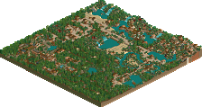
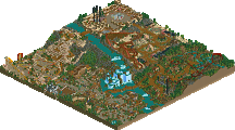
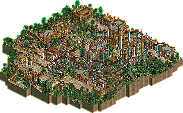
Here is my last design, "Eshu", which didn´t get a design. This scored 12.00. It will be released on the frontpage as an Honorary Mention, but it takes a bit more time.
Download:
downloads: 235
I hope you like it!
Greetz
DelLagos
PS: A few screens:
overview
station
firstdrop
theming
jIp<
Airtime Offline
I think the archy was really good! It suited the theme and looked good as well. The coaster layout was alright but not the best. I think it just seemed like there was to many turns. I think you should of had a bigger layout, I just didn't think it flowed well. The foliage was nice as well.
I think you should have had a better entrance, I know you may not have been going for a proper entrance plaza or anything but just a bigger path or something? The little problems I see is your paths, you use to many different kinds. Your fencing I think you use to many again, and you use too many different land textures it sometimes makes your foliage look more random.
I liked it though! I think it deserved a design to be honest.
Happy Birthday by the way!
Edited by Airtime, 09 September 2009 - 10:27 AM.
So as much as this was obviously a big effort, imo the design should be the single most important part of a design entry(obviously), and therefore I think the 12 rating was accurate.
delLagos, i cant remember what score i gave you, but i liked this. its still nice, even if you didnt get that chumming design
Feel like bumping this after it came up in the Discord thanks to Saxman's NEBOT in #randomizer.
Despite having panelist voted, I struggle to remember this one. Seeing it today, I think this went quite under-appreciated. The pacing of the coaster is too slow, but otherwise this is a very nice piece of RCT. The aesthetic is very strong, and the dedication to create a clear theme and flesh it out is definitely there. With some refinement in both micro and maco, I think DelLagos could've become a very good player. Had he won here, who knows what his motivational levels may have been like.